When you walk by a homeless person holding a cardboard sign, you usually see an anonymous face struggling to survive. Homeless Fonts flips that moment. It turns the most visible part of street life. The handwriting. Into something people and brands can actually pay for.
From street sign to typeface
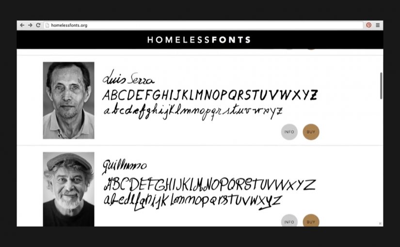
The Cyranos McCann teamed up with the Arrels Foundation in Barcelona to launch HomelessFonts.org. The site features fonts built from the real handwriting of local homeless people, available for purchase by marketers who want something more human than a default type library.
Here, a “font” is a downloadable typeface file that designers can license and use across ads, packaging, and digital interfaces, just like any other professional typeface.
In urban European cities, design-led micro-commerce can convert overlooked skills into dignified income streams.
Where the money goes
The money raised from the website is intended to support accommodation, food, social programs, and health care for people experiencing homelessness. For more information visit www.HomelessFonts.org.
Why this lands
It works because it asks brands to buy a useful asset instead of “donating to a cause.” You are not funding an abstract promise. You are paying for a tool that visibly changes the tone of your message, and the purchase itself carries a story your audience can recognize instantly.
Extractable takeaway: If you want purpose marketing to stick, attach the donation mechanic to a practical, reusable brand input (a font, a template, a dataset, a sound pack) so the act of funding also improves the work.
What it’s really trying to change
The real question is whether brands will pay for contribution instead of performative concern.
This is a stronger model than pure cause messaging because it gives people commercial value, not just visibility.
Beyond fundraising, the campaign reframes homeless people from passive recipients to contributors with identity and craft. The typefaces carry names and personality, and that shifts the conversation from pity to participation.
What to steal from Homeless Fonts
- Sell a tool, not a feeling. Build the fundraising mechanic around something buyers genuinely need.
- Make the proof visible. The output (handwriting) is instantly recognizable, which makes the story easy to retell.
- Design for everyday reuse. The more places the asset can live (print, digital, packaging), the more sustainable the model becomes.
- Keep the transaction simple. Clear product. Clear price. Clear destination for proceeds.
A few fast answers before you act
What is Homeless Fonts?
It’s a collection of purchasable fonts created from the handwriting of homeless people in Barcelona, sold via HomelessFonts.org.
Who created it?
The project was launched by the Arrels Foundation in partnership with Cyranos McCann.
How do brands actually use the fonts?
Like any licensed typeface. Designers can apply them in headlines, posters, packaging, social content, landing pages, and campaign visuals to add a distinctly human texture.
What does buying a font change versus asking for donations?
It turns support into a market exchange for a useful asset. That reduces “charity fatigue” and gives brands a concrete output that carries the story forward every time it’s used.
Where is the money intended to go?
The campaign describes proceeds being used for accommodation, food, social programs, and health care supporting people experiencing homelessness.