Sodimac: The 5-Second Skip Behavior Ad

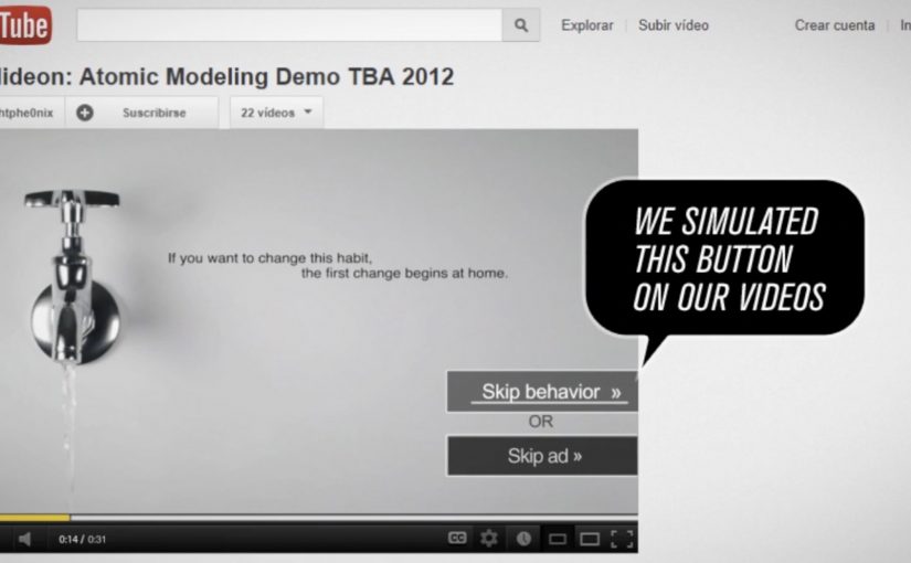
Viewers usually spend five seconds counting down to the “Skip Ad” button. Homecenter Sodimac from Chile uses that exact moment to ask a better question: do you want to skip the ad, or skip the behavior?

Working with agency MayoDraftfcb, Sodimac created a set of environmental messages that turn the skippable format into a moral choice. The button becomes the idea. Either you opt out, or you commit to changing a small wasteful habit.

A tiny mechanic that flips the meaning of “skip”

The creative move is to hijack an interface behavior people already know. That matters because it removes learning friction. The audience understands what to do instantly, and the campaign only has to change what that action means.

In brand communication, this is a neat example of interface-led storytelling. By that I mean the story is carried by a native UI element, not just the film around it.

The platform UI is not just a container for the message. It is the message.

In skippable video media, the first five seconds are the only attention you can reliably design for.

Why this works better than a standard awareness film

It uses the countdown moment as the content, so the viewer understands the choice instantly and the message lands before the skip reflex kicks in.

Extractable takeaway: If the platform gives people a default behavior, design your idea so that default action becomes the point, not the obstacle.

  • It is time-native. The idea fits the five-second window instead of fighting it.
  • It creates viewer control. The viewer makes an explicit choice, not a passive nod.
  • It is measurable. The “change” action is a click, not a vague sentiment.
  • It is consistent with the topic. Environmental habits are about small repeated actions. The format mirrors that.

Reported impact, and the real lesson

The campaign is reported to have driven over 80,000 people to choose the “change” option within a week. This is a smarter use of pre-roll than most awareness films because it makes the click mean something. The real question is whether your first five seconds invite a meaningful choice or just a reflexive skip. The bigger takeaway is structural: if you can turn a default skip behavior into a meaningful action, you get engagement that feels earned rather than bought.

Design rules for your next skippable campaign

  • Build for the first five seconds, and make the idea readable without audio.
  • Use the interface as a prop, buttons, timers, overlays, or any native UI element that viewers already trust.
  • Offer a single clean choice, so the click means something unambiguous.
  • Make the action lead somewhere useful, tips, tools, pledges, or a next step that matches the promise.

A few fast answers before you act

What is the core idea in one line?

It reframes the skippable pre-roll moment. Skip the ad, or skip the bad habit.

Why does this mechanic fit environmental messaging?

Because sustainability is built on small decisions repeated often. A skippable ad is also a small decision, repeated often.

What makes this different from a normal call-to-action?

The CTA is embedded inside a familiar platform behavior. The campaign is not asking for extra attention. It is redirecting an existing action.

What is the biggest risk with “interface hijack” ideas?

Here, “interface hijack” means repurposing a familiar UI element like the Skip button without hiding what is happening. If the viewer feels tricked, trust collapses. The choice has to feel fair, clear, and reversible.

What should you measure to prove it worked?

Click choice rate, completion rate, and downstream behavior on the landing destination, plus any lift in eco-tip engagement over the campaign window.

iFOLD: Fold More, Save Paper

Billions of business envelopes are used every day. Imagine how much paper can be saved if we just halved their size.

So while posting a letter, ask: can it be folded once more. If it can, fold more.

Use a smaller envelope. Save trees. It’s that simple. It’s called iFOLD.

A tiny behavior change, packaged as a system

The mechanism is effort-to-impact math: a simple rule where one extra fold creates a visible downstream saving. One extra fold reduces envelope size. Reduced envelope size reduces paper consumption. That works because the cause and effect are easy to understand immediately, so the behavior feels practical rather than preachy. The campaign frames this as a repeatable rule anyone can apply without new infrastructure or technology.

In high-volume corporate mailrooms and customer communications, small process changes compound into meaningful material savings.

The real question is how to turn a trivial action into a default business habit. The smart move is to build the fold into standard mailing practice, not treat it as a one-off reminder.

Why it lands

This works because it does not ask for a lifestyle shift. It asks for a micro-habit that fits inside existing routines. The instruction is binary, memorable, and immediately testable. You can literally try it with the next letter in your hand.

Extractable takeaway: When you want behavior change at scale, give people a single, repeatable decision rule that requires almost no extra effort, and make the benefit feel cumulative and obvious.

Steal this envelope logic

  • Make the rule portable: one sentence people can remember and repeat.
  • Target a high-frequency routine: boring, repetitive processes are where scale lives.
  • Prefer “do this instead” over “stop doing that”: substitution habits stick better than abstinence messages.
  • Connect the micro to the macro: one fold feels trivial. Aggregate savings makes it feel worth doing.
  • Design for adoption inside organizations: the best ideas fit procurement, operations, and compliance realities.

A few fast answers before you act

What is iFOLD?

iFOLD is a paper-saving idea that encourages people to fold letters one extra time so they can be mailed in smaller envelopes.

Why focus on envelope size?

Because envelopes are used at massive volume in business and government. Small reductions per unit add up quickly at scale.

What makes this a strong sustainability message?

It is a concrete action, not an abstract appeal. People can do it immediately without buying anything new.

Where does this work best?

In organizations that send large quantities of letters and statements, where a standard change in folding and envelope formats can be implemented consistently.

What could prevent adoption?

Template constraints, inserts that cannot be folded further, window placement, and operational inertia. The idea works best when mail formats are designed with folding flexibility in mind.

WWF: The .wwf Unprintable PDF Format

German ad agency Jung von Matt is back with another stellar idea. A new green file format called .WWF.

The WWF format is a PDF-like document that is designed not to print. The point is simple: avoid unnecessary printing by making the “do I really need paper for this?” decision explicit at the moment you save or share a file.

How the .wwf idea works

At the center is a small tool that lets you “save as WWF”. The resulting file behaves like a regular PDF for reading and sharing, but the print option is blocked by design. In other words, it is a familiar format with one permission deliberately switched off.

WWF frames this as a practical nudge within its broader “think before you print” message. It is not trying to shame printing. It is trying to stop the default reflex of printing what never needed to exist on paper in the first place.

In document-heavy organizations, small defaults like a print-disabled file option reduce waste because they change the decision moment without changing the workflow.

Why this lands beyond the gimmick

It turns a values statement into a product behavior. Plenty of sustainability campaigns ask people to care. This one asks people to choose differently in a place they already spend time: saving, sharing, and circulating documents.

Extractable takeaway: When you want less waste, change the default at the moment of action, and keep an intentional override for the few cases that truly need it.

The real question is whether you can make “think before you print” feel like a normal workflow choice, not a policy fight.

It preserves user choice. The format does not decide what “should” be printed. It pushes the decision back to the sender, who knows the context. That framing matters, because it avoids the “policy tool” vibe and keeps it as a lightweight, voluntary habit.

It spreads by forwarding. A file format is distribution. When people send documents around, the format travels with the content and keeps reintroducing the idea in a natural, non-media-buy way.

Steal this pattern for document workflows

  • Change the default, not the lecture. If you want different behavior, move the intervention into the everyday step where the behavior happens.
  • Make the “good choice” feel like a normal choice. Keep the action one click away and compatible with existing habits.
  • Design for shareability. Tools and formats can be media when they travel inside the work people already exchange.
  • Define the mechanism in one sentence. “A .wwf file is essentially a PDF with printing permissions locked, saved under a different extension to force a conscious print decision.”

A few fast answers before you act

What is a .wwf file, in plain terms?

A .wwf file is a PDF-style document saved with a different extension and configured so that printing is blocked by default.

Is it truly impossible to print a .wwf document?

The intent is to block the normal print command, not to claim physical impossibility in every edge case. The point is to remove the easy, mindless print path.

How is this different from just using a “do not print” note?

A note is social friction. A format change is functional friction. The latter works even when people ignore instructions.

Where does this work best?

In teams that pass around drafts, read-only decks, internal updates, agendas, and reference documents. Anywhere printing is mostly habit, not requirement.

What is the real behavior change goal?

To make printing a deliberate act again. The win is fewer automatic prints, not zero printing.