Project Soli: Hands Become the Interface

Google ATAP builds what people actually use

Google ATAP is tasked with creating cool new things that we’ll all actually use. At the recently concluded Google I/O event, they showcase Project Soli. A new kind of wearable technology that wants to make your hands and fingers the only user interface you’ll ever need.

This is not touchless interaction as a gimmick. It is a rethink of interface itself. Your gestures become input. Your hands become the control surface.

The breakthrough is radar, not cameras

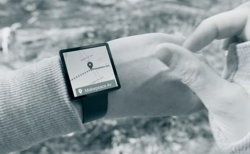
To make this possible, Project Soli uses a radar that is small enough to fit into a wearable like a smartwatch.

The small radar picks up movements in real time and interprets how gestures alter its signal. This enables precise motion sensing without relying on cameras or fixed environmental conditions.

In wearable computing and ambient interfaces, the real unlock is interaction that works in motion, without relying on tiny screens.

The real question is whether wearables can move beyond miniaturized apps and make interaction work in motion, without a screen-first mindset.

The implication is straightforward. Interaction moves from screens to motion. User interfaces become something you do, not something you tap.

Why this matters for wearable tech

Wearables struggle when they copy the smartphone model onto tiny screens. Wearable UX should treat the screen as optional, not primary.

Extractable takeaway: When the screen becomes the bottleneck, shift the interface to sensing and interpretation, then keep the gesture vocabulary small enough to learn fast.

Instead of shrinking interfaces, it removes them. The wearable becomes a sensor-driven layer that listens to intent through movement.

If this approach scales, it changes what wearable interaction can be. Less screen dependency. More natural control. Faster micro-interactions.


What Soli teaches about hands-first UX

  • Start with intent, not UI. Define the handful of moments where a gesture is faster than hunting for a screen.
  • Design for motion. Favor interactions that work while walking, commuting, or doing something else with your attention.
  • Keep the gesture set teachable. A small, consistent vocabulary beats a large library that nobody remembers.

A few fast answers before you act

Is Project Soli just gesture control?

It is gesture control powered by a radar sensor small enough for wearables, designed to make hands and fingers the primary interface.

Why use radar instead of cameras?

Radar can sense fine motion without relying on lighting, framing, or line-of-sight in the same way camera-based systems do.

What is the real promise here?

Interfaces that disappear. Interaction becomes physical, immediate, and wearable-friendly.

What should a product team prototype first?

Pick one high-frequency moment where a quick gesture could replace a screen tap, and test whether the sensing feels reliable in motion.

What is the biggest adoption risk?

If gestures feel inconsistent or hard to learn, people will default back to the screen. The bar is effortless, not novel.

Technology in 2014

A 2014 screen daydream from The Astonishing Tribe

This is essentially an experience video by Swedish interface gurus The Astonishing Tribe, envisioning the future of screen technology with stretchable screens, transparent screens and e-ink displays, to name a few. An experience video is a short concept film that prototypes interface behavior and user flows before the underlying hardware is ready for the market. E-ink is a reflective display technology designed for readability and low power use.

How the film turns “new screens” into real interactions

Instead of listing specs, the video uses everyday moments to make the screen itself feel like a material you can bend, place, and share. The point is not the exact device. The point is the interaction model that becomes possible when the display is flexible, see-through, or paper-like. That works because a familiar human moment makes an unfamiliar screen feel usable, not speculative.

In consumer electronics and enterprise device ecosystems, display form factors shape interaction patterns, content formats, and the business models built on top of them.

The real question is which interaction model you want your screens to enable before you commit to devices, layouts, and content formats.

Concept experience videos are still one of the fastest ways to align teams on interaction shifts before the hardware is ready.

Why “stretchable, transparent, e-ink” is a strong provocation

Stretchable screens challenge the idea that UI must live inside rigid rectangles. Transparent screens challenge the idea that a screen must block the physical world. E-ink displays challenge the assumption that every screen is emissive, high-refresh, and power-hungry.

Extractable takeaway: Pick one screen assumption to break (rigid, opaque, emissive) and demonstrate the behaviors that follow.

Steal these moves for your next interface pitch

  • Show behaviors, not features. Demonstrate how people move, share, and switch context when the screen stops behaving like a slab.
  • Prototype the handoffs. The “wow” is usually in the transitions, not the destination screen.
  • Use one material shift as the story engine. Flexible, transparent, or reflective. Pick one and build a coherent set of moments around it.
  • Make it boring on purpose. Ground the future in ordinary work, home, and commuting situations so the audience focuses on usability.

A few fast answers before you act

What is “Technology in 2014” about?

It is a concept experience video that imagines how screens could evolve by the year 2014. The focus is on new display form factors and the interactions they enable.

Which display ideas does it highlight?

The video spotlights stretchable screens, transparent screens, and e-ink displays. Those three examples are used to suggest different ways UI could live in the physical world.

What should marketers or product teams take from it?

Use concept films to communicate interaction shifts early, when prototypes are still rough. Anchor the story in everyday scenarios so the intended behavior is unmistakable.

How do you apply the idea without future hardware?

Focus on the interaction principles: continuity across surfaces, simple sharing moments, and readable, low-friction information layers. You can prototype those behaviors with today’s devices and materials.

What’s the biggest pitfall when making this kind of video?

Over-indexing on visual spectacle and under-explaining the user flow. If viewers cannot repeat the “how it works” in one sentence, the concept will not travel inside an organization.