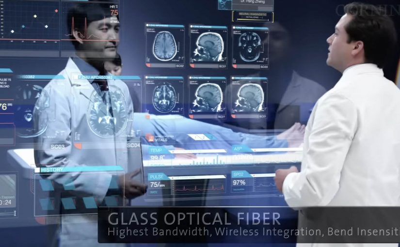
Corning is best known as a high-tech glass manufacturer. Their Gorilla Glass is used across a huge number of smartphones. In March last year they released “A day made of glass”. A futuristic look at glass technology.
Now they are back with an expanded vision for the future of glass technologies. This video continues the story of how highly engineered glass, with companion technologies, will help shape our world.
What’s new in the expanded vision
The core mechanic stays the same. Glass is no longer a cover. It becomes the interface. The expansion is about reach and density. More environments. More surfaces. More moments where information appears “in place” and responds directly to touch.
In consumer electronics, automotive interiors, and collaborative workplaces, the real shift is treating surfaces as shared touch-first interfaces rather than single-purpose screens.
The interaction pattern underneath the glass
Strip away the material science and you can see a product blueprint. Persistent identity across contexts. Content that follows the user. Direct manipulation as the default. And big surfaces that invite more than one person to participate at the same time.
In global enterprise and consumer-tech product teams, smart-surface visions only pay off when the interaction rules stay coherent across devices and contexts.
Why this vision sticks
It sells immediacy. You touch the thing you mean. You get feedback where your eyes already are. There is less “device ceremony”, meaning fewer unlocks, app switches, and mode changes, and more task flow. Because the interaction is direct and feedback stays in place, the experience feels faster and more trustworthy, which is why these concept films can persuade even before the enabling tech is fully mainstream. These concept films are worth using, but only if you translate them into interaction rules you can actually prototype. The real question is whether you can keep those rules coherent across surfaces once the demo glow fades.
Extractable takeaway: When you are designing a future-facing experience, define the interaction grammar first, meaning the repeatable set of gestures, feedback cues, and handoffs that make the experience feel consistent. If the same gestures, feedback, and handoffs work across two form factors, your concept has legs. If they don’t, the material is just a costume.
Steals from the smart-surface UX model
- Prototype the handoffs early. Moving from phone to wall to table is where visions usually collapse. Test that seam before you polish anything else.
- Design for two people, not one. Large surfaces create collaboration by default. Add rules for turn-taking, ownership, and conflict resolution.
- Keep data anchored to the decision. The strongest moments are when information shows up exactly where action happens, not in a separate dashboard.
- Make “glanceable” a first-class mode. If the surface is always there, the experience must work in 2-second looks, not only long sessions.
A few fast answers before you act
What is “A Day Made of Glass 2” actually demonstrating?
It demonstrates an interface direction. Glass surfaces behave like interactive displays, so information can appear in place and be manipulated directly by touch.
Is the value here the glass technology or the UX model?
The transferable value is the UX model. Direct manipulation, seamless handoffs, and multi-user surfaces. The materials enable it, but the interaction design makes it believable.
What is the biggest risk in “smart surfaces everywhere” thinking?
Interface overload. If every surface can talk, the environment becomes noisy. The discipline is deciding when to stay quiet and when to surface the one next action.
How do you scope a first prototype so it stays realistic?
Pick one job-to-be-done, two surfaces, and a single handoff. Then enforce a small set of interaction rules so you can observe friction before you add polish.
What is one practical next step after watching the video?
Write down the 6 to 10 interaction rules you believe the film is using. Then build a rough prototype that applies those rules in two contexts, such as phone plus kiosk, or tablet plus meeting room display.

