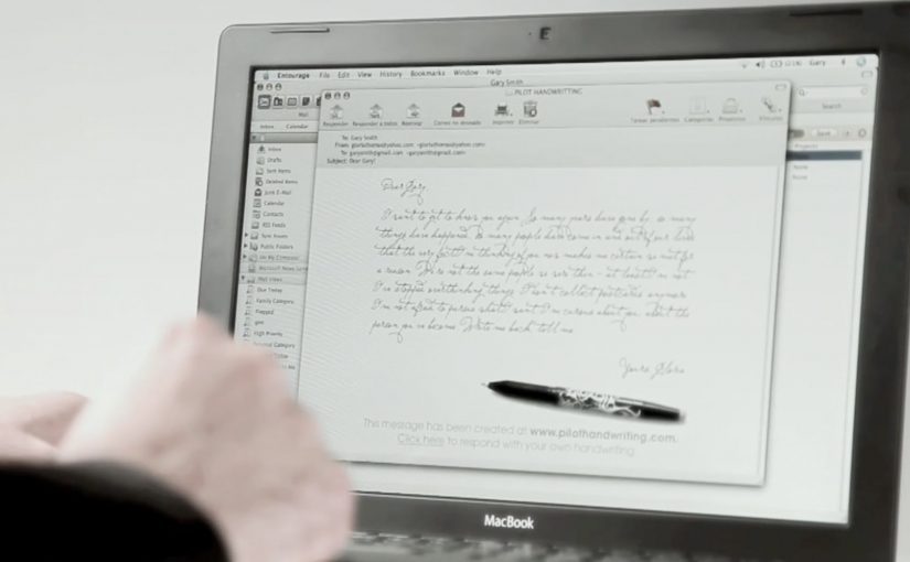
Pilot Pens Spain has made emails more personal by letting you handwrite your emails on the computer.
A pen brand that turns “your writing” into a usable tool
The mechanic is simple. You create a digital font from your own handwriting, then use that font to write emails that look like you wrote them by hand.
All you need to do is go to www.pilothandwriting.com and turn your handwriting into a digital font. After that you can start sending handwritten emails to your friends.
In everyday one-to-one communication, the feeling of personal effort often matters more than perfect typography.
Why it lands: it restores “human signal” without slowing you down
Email is fast but visually uniform. Handwriting is personal but slow. This concept bridges the gap by keeping the speed of email while reintroducing the quirks and warmth that make a message feel meant for one person. By “human signal,” this means the visible personal quirks that make a message feel authored by a specific person rather than produced by a system. It works because the digital font preserves those quirks while removing the time cost of writing by hand.
Extractable takeaway: If your brand owns a physical ritual, translate the ritual into a digital utility that keeps the emotional benefit. People do not want “more features”. They want the feeling the ritual used to create.
The business intent: make the brand present at the moment of meaning
The real question is whether a pen brand can make its core ritual useful inside digital behavior instead of just advertising around it.
This is a strong brand utility move because it turns product truth into something people can actually use. Pilot is useful when you have something worth saying, and the campaign makes the brand present at the exact moment that sentiment is expressed.
The work is commonly credited to Grey Barcelona for Pilot Pen in Spain.
How to apply this brand utility pattern
- Turn a brand asset into a tool: if you own a distinctive behavior (writing, drawing, annotating), make it usable in digital life.
- Keep the first win fast: the user should get a “wow, that’s me” moment within minutes.
- Design for sharing by default: the output should be easy to send, post, or reuse without extra steps.
- Respect authenticity: slight imperfections are a feature here. Over-smoothing kills the point.
- Measure the right signal: repeats and reuse matter more than one-time visits.
A few fast answers before you act
What is Pilot Handwriting?
It is a web experience that converts your handwriting into a digital font, so you can write emails that look handwritten.
Why does “handwritten email” feel more personal?
Because handwriting carries individual variation. That visual uniqueness signals effort and intention in a way standard typed text does not.
Is this a gimmick or a useful tool?
It can be a real utility if it reduces friction and produces an output people reuse. The best test is whether users come back and keep writing with it.
What makes a brand utility campaign work?
A clear problem, a fast first payoff, and an output that naturally travels to other people, turning use into distribution.
What’s the biggest risk in copying this idea?
Onboarding friction. If setup is slow or error-prone, the personal magic disappears before the user gets a satisfying result.