A lot of people fast-forward TV commercials when watching time-shifted shows. So Volkswagen took the opposite approach and made a deliberately slow, almost static “slowmercial”. In this context, a slowmercial is a TV ad engineered to stay legible when it is played back at high speed.
The idea is simple. When the spot is fast-forwarded on a TV recorder, it collapses into something that feels like a print ad. A single, readable message. A clear product reveal. No complicated storyline to miss.
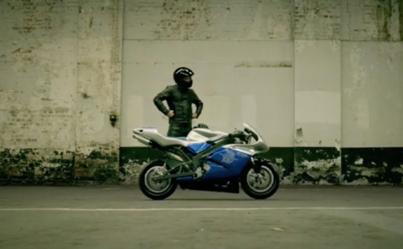
A tv spot designed for 8x speed
This is not “slow motion” for cinematic drama. It is time engineered as a media format. The frames are composed to hold meaning when they blur together, and the copy and visuals are built to survive the exact behavior viewers use to avoid ads. Because the frames stay stable and the typography stays readable, fast-forward still delivers a complete message instead of noise.
In DVR-heavy TV markets, the remote control is the real media buyer.
Why it lands
It respects the viewer’s habit without pretending it will change. Instead of trying to stop skipping, it designs for skipping. That creates a rare feeling of cleverness, because the ad meets you where you are, and still gives you a complete message. The deeper lesson is that “attention” is not binary. The real question is whether your creative is engineered for how people actually watch, not how you wish they watched.
Extractable takeaway: Treat attention as a spectrum and design one primary message that stays readable under partial attention.
Business intent: keep the message intact
Brands should design for skipping instead of trying to shame or trick viewers into watching. The intent is straightforward. Protect the core benefit and the product impression in a world where traditional 30-second storytelling gets shredded by fast-forward. The slowmercial approach makes sure the Beetle remains visible and understandable, even when the viewer refuses to watch properly.
Steal this for skip-proof creative
- Design for the behavior, not the ideal. If people skip, build a format that works while skipping.
- Make one message unmissable. One benefit. One visual proof. One clean takeaway.
- Borrow from print discipline. Composition, hierarchy, and legibility beat complexity.
- Assume partial attention as default. Build creative that degrades gracefully instead of collapsing.
A few fast answers before you act
What is a slowmercial?
A slowmercial is a TV ad designed to work even when viewers fast-forward. It uses ultra-slow pacing and print-like composition so the message remains readable at high playback speeds.
Why does fast-forward turn this into a print ad experience?
Because fast-forward compresses time and removes nuance. If the creative is built around stable frames, clear typography, and a single message, the compressed playback still delivers a coherent visual and idea.
When should a brand use this approach?
When you know a meaningful portion of viewing happens time-shifted, and when the ad’s job is to deliver one clean message rather than tell a complex story.
What is the biggest creative mistake with “anti-skipping” ideas?
Over-engineering. If the concept requires explanation, it fails. The viewer must understand the message instantly, even in partial attention.
What metrics matter for this kind of creative?
Ad recall under time-shifted viewing, brand linkage, and message takeout. If you can test it, compare recall for normal-speed versus fast-forward exposure.