Got backseat boredom? DVD players and Game Boys are so five years ago, but a concept in rear-seat entertainment that uses the windows themselves could replace squirming and snoozing with interactive scribbling, sweeping, and pinching.
General Motors Research and Development put up a challenge to researchers and students from the Future Lab at Bezalel Academy of Art and Design in Israel. The task was to conceptualize new ways to help rear-seat passengers, particularly children, have a richer experience on the road.
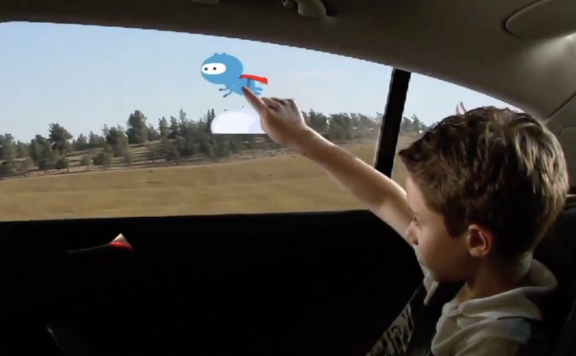
The outcome is shown below, even though GM is described as having no immediate plans to put this smart glass technology into vehicles. Here, “smart glass” means the window can act as a display surface and detect touch or gestures.
When the window becomes the interface
The mechanism is simple to grasp. Treat the rear side window as a transparent display surface, then add touch and gesture interaction so passengers can draw, play, and manipulate content directly on the glass while still looking out at the world passing by. Because it is the same surface passengers already look through, the interaction stays outward-facing rather than becoming another head-down screen.
In family car journeys, rear-seat attention is a hard constraint, and experiences that keep kids engaged without isolating them from the ride reduce friction for everyone.
What the brief is really asking for
This is not “more screens”. It is a different relationship between passengers and their surroundings. The concept is described as using the outside view as the canvas. Instead of escaping the trip, you interact with it.
The real question is whether you can turn the outside world into content without disconnecting passengers from the journey.
Why it lands
The idea feels fresh because it upgrades a dead surface into something active without adding another device to hold or another head-down screen to stare at. It also creates a shared backseat dynamic. Multiple passengers can point, draw, and react together, which changes the feel of long trips. This is the right direction for in-car entertainment because it replaces device-based distraction with shared, context-linked play.
Extractable takeaway: The best in-car entertainment does not only distract. It connects passengers to the context they are already in, and makes the journey itself part of the experience.
What GM is buying by running a concept challenge
Even without production intent, the exercise is useful. It expands the idea space around “smart glass” and passenger experience, and it generates prototypes and interaction patterns that can later inform other interfaces, materials, and interior design decisions.
Practical steals for smart-glass passenger UX
- Use the environment as content. Overlay and interact with what is already outside rather than inventing a separate world.
- Design for low instruction. If it cannot be understood in seconds, kids will abandon it and parents will ignore it.
- Favor shared play. Multi-user interactions create calm through engagement, not through isolation.
- Keep interaction lightweight. Short loops beat long missions in a moving vehicle.
- Prototype early. Concepts like this live or die on latency, glare, and ergonomics, not on storyboard polish.
A few fast answers before you act
What is “Windows of Opportunity” in one sentence?
It is a GM concept project that turns rear side windows into interactive “smart glass” displays so passengers can draw, play, and explore during the ride.
Why use windows instead of adding more screens?
Because windows are already where passengers look. Turning them interactive can keep attention outward and shared, rather than head-down and isolated.
What makes this feel useful for families?
It targets the real pain point, keeping children engaged on long journeys, while preserving a sense of connection to the trip and to each other.
What are the biggest practical risks?
Glare and readability in daylight, touch accuracy on glass, latency, durability, and avoiding distraction for the driver through reflections or overly bright visuals.
What would you measure in a pilot?
Engagement duration, repeat use, whether it reduces restlessness and conflict, and whether it avoids unintended driver distraction in real driving conditions.
