
Jimmy Kimmel: Halloween Candy Prank 2011

Here’s to starting a new week with a smile.

Talk show host Jimmy Kimmel challenged parents across America to tell their kids they ate all their Halloween candy, then videotape the reactions. Parents were asked to upload the clips to YouTube under the heading “Hey Jimmy Kimmel I told my kid I ate all their Halloween candy.”

Daring moms and dads followed through. The frenzied responses are then pieced together into a fast, best-of montage that does the work of a full segment in a few minutes.

A prank with a built-in distribution engine

The mechanism is almost frictionless: one simple prompt, one easy filming setup, one obvious upload destination, and one consistent label so submissions can be found and compiled. The audience creates the raw material. The show supplies the edit and the punchline timing.

In US broadcast entertainment, repeatable viewer challenges turn a one-way show into a repeatable participation cycle that grows through sharing.

Why it lands

It compresses a big emotional range into a tight format. Tears, outrage, bargaining, moral lectures, and sudden forgiveness all land fast. Because the viewer understands the setup in seconds and gets a fresh emotional spike every few beats, the montage keeps attention high without needing extra explanation.

Extractable takeaway. User-generated segments travel when the prompt is easy to replicate, the emotional payoff is immediate, and the brand’s role is ruthless curation, not overproduction.

It is instantly understandable. You do not need context, a premise explainer, or a character intro. Candy, kids, and betrayal are enough.

It makes the audience feel like the cast. Parents are not just watching a bit, they are contributing to it. The real question is not whether one prank is funny, but whether the format reliably turns viewers into contributors and contributors into distribution.

This is stronger as a participation system than as a one-off TV gag.

What to steal from participatory prank formats

  • Make participation a recipe. One action, one prompt, one deliverable, one naming convention.
  • Design for phone-grade production. The lower the setup cost, the higher the submission volume.
  • Optimize the edit for momentum. A “best-of” is not a dump of clips. It is pacing, contrast, and escalation.
  • Build a title that people can copy exactly. Consistent labeling is the quiet infrastructure behind scalable user-generated content.

A few fast answers before you act

What is the core mechanic of this Jimmy Kimmel segment?

A single prank prompt is sent to viewers. Viewers film reactions and upload clips. The show compiles the best moments into a montage.

Why does it work so well on YouTube?

The setup is universal and the payoff is fast. Each clip delivers a clear emotional beat that is easy to share without explanation.

Is this a “campaign” or just a TV gag?

It behaves like a campaign because it has a repeatable participation brief and a distribution loop. It is also a comedy bit because the final product is the edit.

What makes the montage feel addictive?

Pacing and variety. The edit jumps between different reactions before any single moment stalls, which keeps attention locked.

What is the transferable lesson for marketers?

If you want scale, simplify the instruction, standardize the submission label, and invest your effort in curation so the best entries become the marketing.
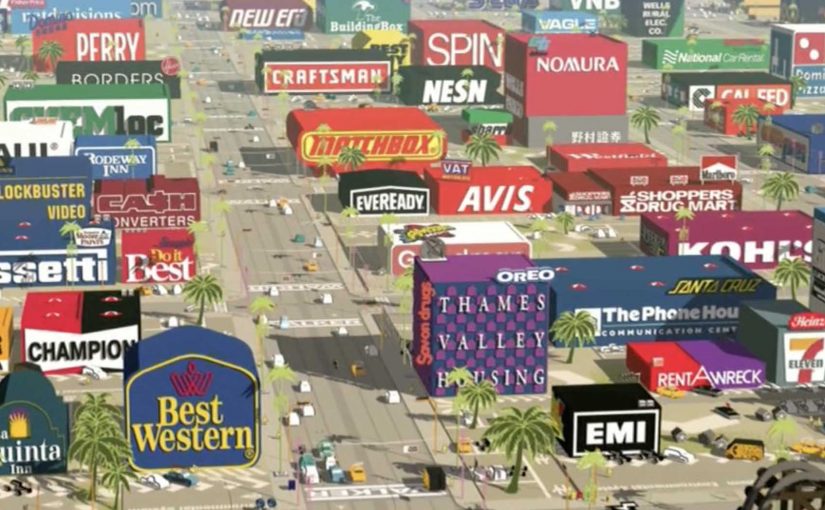
Logorama: 2,500 Logos

A seventeen-minute Hollywood-style tale where the city, the props, and even the characters are built from brand marks. The film is described as using more than 2,500 logos.

Logorama turns a familiar crime-thriller structure into something stranger. A world that looks like Los Angeles, but everything is signage. Every surface is a trademark. Every background detail is a corporate symbol you already know.

A thriller built out of trademarks

The mechanism is extreme constraint. Here, that means one hard rule: the filmmakers construct the entire environment out of existing brand identities, then animate it with blockbuster pacing, chase energy, and escalating chaos. That constraint works because instant logo recognition lets the film establish character, tone, and hierarchy without slowing down for explanation.

In brand-saturated consumer cultures, the fastest way to make people feel the weight of logos is to stop treating them as background and make them the physical world.

Why it lands, even if it feels wrong

The film works because it makes recognition do the work. You do not need exposition to understand who is powerful, who is ridiculous, and what kind of world you are in. Your brain fills in associations at speed, and the pace keeps you laughing before you have time to get comfortable. The satire lands not through speeches, but through accumulation. If everything is a logo, nothing is neutral.

Extractable takeaway: If your message is about cultural saturation, build a system where the audience cannot escape the stimulus, and let their own pattern-matching create the critique.

What the film is really demonstrating

Logorama is both craft flex and commentary. It shows how deeply brand codes have entered shared visual language, and it proves that you can tell a coherent, high-tempo story while replacing conventional production design with a library of corporate symbols.

This is not a logo stunt. It is a disciplined storytelling system that turns brand recognition into narrative force. The real question is how far a single visual rule can carry both entertainment and critique without collapsing into gimmick.

What to borrow from Logorama

  • Use constraint as a headline. One clear rule can make a piece feel instantly different.
  • Let recognition drive meaning. Familiar symbols carry narrative shortcuts, use them deliberately.
  • Keep the story engine simple. High concept needs a readable spine, chase, pursuit, escalation.
  • Make the critique experiential. People remember what they felt while watching, not what they were told.

A few fast answers before you act

What is Logorama?

An animated short that builds a Hollywood-style thriller world entirely out of brand logos and mascots, using recognition as both storytelling fuel and satire.

Why does the “all logos” rule matter?

It turns branding from decoration into environment. That shift makes consumer culture feel unavoidable, which is the point the film is pressing on.

How many logos are in the film?

The film is commonly described as featuring more than 2,500 logos.

What is the main creative risk of this approach?

If the narrative spine is weak, the piece becomes a spot-the-logo gimmick. The story has to keep moving, so the constraint serves meaning rather than replacing it.

What can marketers learn from it?

High constraint plus simple story structure can produce work that is both memorable and interpretable. The audience does the decoding, which increases engagement.