
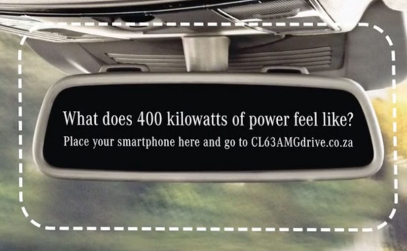
Mercedes-Benz Interactive Print Ad

The interactive print ad mania continues. After RWB and Axa, we have Mercedes Benz joining in with their ad for the new Mercedes CL63 AMG. Here, “interactive print” means a printed ad that triggers a second action beyond the page itself.

Why “interactive print” keeps showing up

Print is fighting for attention against screens, so the stronger responses are the ones that make print behave a little more like digital. That works because the page stops acting like a finished message and starts acting like a trigger, which gives people a reason to continue.

Extractable takeaway: Interactive print works when the page creates one obvious next step that makes the brand promise feel more vivid, not when it adds novelty without payoff.

In brand marketing, this matters because print only earns another look when it turns attention into a deliberate next step.

What Mercedes-Benz is trying to do

The real question is not whether print can be made interactive, but whether the interaction makes the brand feel more immediate and memorable.

Interactive print is only worth doing when the mechanic sharpens the brand idea rather than distracting from it.

For Mercedes-Benz, the business intent is to make the CL63 AMG feel more active, premium, and attention-worthy by turning a static print placement into a more engaging brand encounter.

The useful takeaway for brands

  • Give print a job. Not just to inform, but to activate.
  • Keep the interaction obvious. If the mechanic needs explanation, it dies on the page.
  • Let the reveal earn the attention. The payoff should justify the extra step.

A few fast answers before you act

What is this Mercedes-Benz post pointing to?

It points to Mercedes-Benz joining the interactive print wave with an execution for the Mercedes CL63 AMG.

What were the earlier references in this interactive print trend?

Earlier examples referenced here include the RWB execution and an AXA-related print activation.

What is the core mechanic of interactive print ads?

The print ad becomes a trigger that invites a second step, so the experience continues beyond the page.

Why does the format matter in 2011?

It helps print compete by creating engagement rather than relying on a static message alone.

What should brands learn from this format?

Brands should use interactivity only when it makes the printed asset more useful, more memorable, or more aligned to the brand idea.

POWA: Waking Up the Neighbourhood

This social experiment was carried out using hidden cameras in a townhouse complex in Johannesburg. The message is pretty clear: “Don’t condone violence by doing nothing”.

It is structured as a test of what people will react to. When something is merely annoying, neighbors complain quickly. When something is genuinely harmful, the same neighbors often hesitate, rationalize, or stay silent.

How the experiment is engineered

The mechanism is simple and uncomfortable: place residents in a situation where intervention feels “socially costly”, then reveal how easily people default to inaction even when the signals are obvious. Here, “socially costly” means risking awkwardness, conflict, or reputational blowback with the people you live next to. That engineered discomfort is why the film persuades. It forces the viewer to notice the exact moment hesitation becomes a decision.

In close-quarter urban living, social friction often gets managed faster than serious harm because “not getting involved” is treated as the safest norm.

Why it lands

It attacks the real barrier. Many people do not support violence, but they also do not act. The work focuses on that gap between belief and behavior.

Extractable takeaway: Anti-violence communication changes behavior when it targets the bystander decision point. Make inaction feel like a choice with consequences, and intervention feel like the socially supported default.

It reframes intervention as normal. By showing how readily people mobilize for minor disturbances, it implies that speaking up about violence should be even more expected.

It removes the viewer’s excuses. The hidden-camera format makes “I wasn’t sure” feel less credible, because the audience sees the same signals and the same hesitation play out.

The real question is whether you want to be the neighbor who notices and still stays silent. Campaigns should be judged on whether they move bystanders into safe action, not on whether they earn agreement.

Design cues that wake bystanders

  • Design for the moment people freeze. Identify the exact instant where hesitation happens, then build the story around breaking it.
  • Use contrast to make the point undeniable. A “small problem” people act on is a sharp mirror for the “big problem” they avoid.
  • Keep the message actionable. A clear instruction beats a general plea, especially for behavior people are scared to perform.

A few fast answers before you act

What is the core message of this experiment?

That doing nothing enables violence. If you suspect abuse, silence is not neutral. It is permission.

Why use hidden cameras for a topic like this?

Because it captures real hesitation, not rehearsed opinions. The credibility comes from watching ordinary behavior under social pressure.

What behavior is the campaign trying to change?

It aims to reduce bystander inaction. The target is the moment someone hears or suspects violence and chooses not to intervene.

What makes this approach effective compared to statistics?

It is experiential. Viewers can imagine themselves in the same setting, which makes the moral choice feel immediate rather than abstract.

What is the most transferable lesson for brands or NGOs?

If you want action, dramatize the decision point, show the cost of inaction, and make the desired intervention feel socially acceptable and doable.