Max Zorn and Ilana Yahav: Tape and Sand Art

Max Zorn and Ilana Yahav: Tape and Sand Art

Here is a novel approach to two different kinds of art.

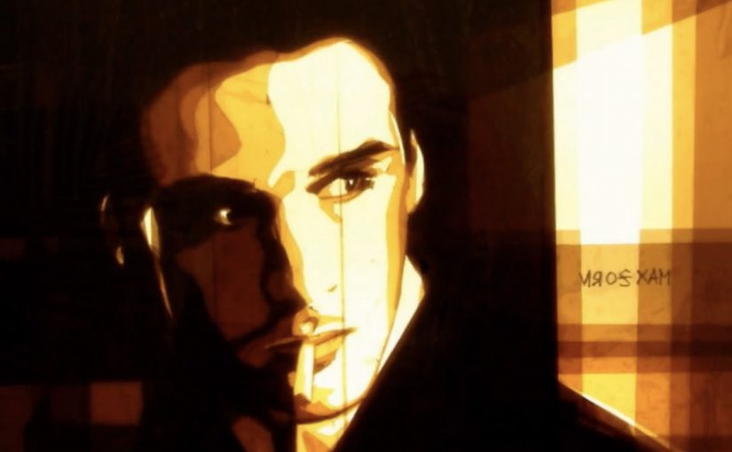
Tape Art by Max Zorn

Tape art is exactly what it sounds like: images built from cut and layered tape rather than paint. What makes this version so watchable is the reveal. The scene sharpens as light passes through the tape and the darker cuts define faces, shadows, and edges.

Sand Art by Ilana Yahav

Sand art in this form is live sand animation: a performer draws with sand on a lit surface while the camera captures the transformation in real time. The image keeps evolving. Characters become landscapes, then dissolve into the next beat of the story.

What both techniques have in common

Both styles use humble materials and a strong constraint to create drama. Tape relies on cutting, layering, and backlight. Sand relies on gesture, timing, and continuous change. In both cases, the process is not a behind-the-scenes detail. It is the point.

In brand and content environments where attention is earned through demonstration, process-first art formats, meaning the making is the narrative, work because the transformation is visible.

The real question is whether your content can make progress legible enough that people want to watch to the end.

Brands should design for the reveal, not just the final frame.

Why it lands

Both formats turn craft into suspense by letting the viewer track progress in real time and feel the constraint working.

Extractable takeaway: Highly shareable art formats make the transformation readable in motion. When the audience can follow the image changing step by step, the process becomes the hook and the result becomes the proof.

It turns craft into suspense. You are not waiting for a final reveal. You are watching the image assemble itself in front of you.

It is instantly legible. Even without context, the viewer can track progress: shapes become meaning, and meaning becomes a scene.

It makes constraint feel like a superpower. Limiting the toolset (tape or sand) increases appreciation, because the outcome feels “impossible” relative to the materials.

Borrowable moves

  • Design for a visible build. If the audience can’t track progress, you lose the “how did they do that?” effect.
  • Commit to one constraint. One material. One rule. The constraint is what gives the work its identity.
  • Use light as a storytelling tool. Backlight and contrast do more than look good. They guide attention and make detail emerge at the right time.
  • Let the medium define the pacing. These pieces work because the rhythm matches how the image is formed, not how an editor wants to cut it.

A few fast answers before you act

What is “tape art” in this context?

Artwork created by cutting and layering tape to form images. The look often depends on light, translucency, and negative space rather than brushstrokes.

What is “sand animation”?

A live performance where images are drawn with sand on a lit surface and continuously transformed, so the story emerges through motion rather than static frames.

Why do these formats work so well on video?

Because the making is the story. Viewers stay for the transformation, then share because the craft feels both simple and astonishing.

What makes the work feel “novel” even when the materials are basic?

The constraint is unusual and the reveal is staged. The audience watches ordinary materials produce an unexpectedly cinematic result.

How can a brand borrow this without copying it?

Borrow the structure: one clear constraint, a readable transformation, and a finish that feels earned by the process.

Rise of the Machines: Siri and Quadrotors

Rise of the Machines: Siri and Quadrotors

Here are two videos (fictional and real) that create the same feeling. A Skynet reality does not seem too far away.

Two clips, one unsettling takeaway

One is a short parody where a voice assistant turns from helpful to threatening. The other is a real lab demo where tiny quadrotors fly as a coordinated swarm. Put them next to each other and the “machines are getting clever” idea stops being a movie line and starts feeling like a trajectory.

Fiction, then engineering

Psycho Siri

Andrew Films USA delivers a compact piece of sci-fi anxiety. Siri is framed as familiar, then reframed as unpredictable, with polished visual effects that make the escalation feel plausible.

A swarm of Nano Quadrotors

GRASP Lab at the University of Pennsylvania shows coordinated micro flight with a team of nano quadrotors, presented as experiments in swarm behavior and formation control. The choreography is the point. It looks like one organism, not many small machines.

Here, “swarm behavior” means several machines coordinating as one system rather than acting as isolated units.

In consumer technology and robotics, capabilities move from demo to everyday life faster than most people update their mental models.

The real question is not whether machines look intelligent, but whether people can understand, predict, and control what they do.

Why it lands: the same story from two directions

Parody works because it exaggerates a fear people already carry. When the “assistant” becomes the aggressor, the joke is that the interface you trust most is the one you cannot physically switch off in the moment.

Extractable takeaway: When technology feels “sudden”, it is often because interface adoption outpaces public understanding of the underlying capability. Brands and product teams win trust by making capabilities legible, bounded, and explainable before they become ambient.

The swarm demo lands for the opposite reason. It is not exaggerated. It is controlled, repeatable engineering that still feels uncanny because coordination at that scale used to belong to animation.

Smart systems should earn trust through visible boundaries and user control, not spectacle alone.

What to steal if you build products around “smart” systems

  • Show constraints, not just power: users relax when they understand what the system cannot do.
  • Design for graceful failure: surprise is fun in demos, but costly in daily use.
  • Make control obvious: clear opt-outs and visible states reduce anxiety.
  • Translate capability into plain language: the best trust-building copy explains behavior, not architecture.

A few fast answers before you act

What is the point of pairing these two videos?

They tell the same story from different angles. One is cultural fear through fiction. The other is real capability through engineering. Together they make the “Skynet” feeling emotionally credible.

What makes swarm robotics feel unsettling to non-experts?

Coordination. Many small machines behaving like one system reads as intelligence, even when it is pre-programmed control and sensing.

Is this actually “AI taking over”?

No. One clip is fiction. The other is a technical demonstration of coordinated flight. The useful takeaway is about perception, trust, and control, not doomsday prediction.

What should product teams do to reduce user anxiety around smart systems?

Make system boundaries explicit, provide obvious controls, and communicate how decisions are made and when humans can override them.

What is a practical business use of swarm behavior?

Tasks that benefit from coverage and redundancy, like inspection, mapping, search, and coordinated movement in constrained spaces. The key is safety, predictability, and clear operational limits.

Deadlines vs Creativity: 10 Seconds 10 Minutes

Deadlines vs Creativity: 10 Seconds 10 Minutes

A simple client lesson, told by school kids

Café Creative, a Hungarian ad agency, sets out to prove a point to deadline-setting clients. If you want good and original ideas to be born, you have to give them enough time.

So they ask school children to perform two tasks:

  1. Complete a drawing in ten seconds and
  2. Complete the same drawing in ten minutes.

The results are captured in the video below, described as having been shortlisted at the 2011 Golden Drum Advertising Festival.

The mechanic: one brief. Two clocks. One unavoidable comparison

The setup is intentionally unfair. Ten seconds forces instinct and shortcuts. Ten minutes gives space for choices, revisions, and detail. Because the brief stays constant, the difference you see is time, not talent.

In creative work, the quality gap usually comes from iteration time, meaning time to review, refine, and improve the same idea, rather than a “better idea” arriving fully formed.

In agency-client work, deadline debates are usually really debates about how many improvement cycles an idea gets before it is judged.

The real question is how much originality you destroy when you compress all iteration into almost no time.

Why it lands

It translates an abstract argument. “We need more time”. Into a visual contrast that clients can’t debate. The children’s drawings make the point without cynicism, and the experiment format keeps it watchable because the viewer wants to see how big the difference becomes. That works because a controlled comparison turns a subjective complaint about timing into proof a client can inspect.

Extractable takeaway: When you’re negotiating timelines, show a side-by-side outcome under two time constraints. A visible comparison wins faster than a rational explanation.

What to steal for your next client conversation

  • Use one brief and change one variable. It isolates the real driver of quality.
  • Make the output visual. Visual proof travels further than process arguments.
  • Keep it humane. A light format can carry a serious point without sounding defensive.
  • Frame time as iteration fuel. You’re not asking for delay. You’re buying cycles of improvement.

A few fast answers before you act

What is the “Deadlines vs Creativity” experiment?

It’s a short film where children draw the same subject twice. First in ten seconds, then in ten minutes, to show how time changes outcomes.

What does the ten-second version demonstrate?

It shows what happens under pressure. People default to the most obvious interpretation with minimal refinement.

What does the ten-minute version demonstrate?

It shows the value of iteration time. Details emerge, composition improves, and the work becomes more original and complete.

Why is this a useful argument for clients?

Because it replaces opinion with comparison. The viewer can see what time buys.

How do you apply this lesson without running your own experiment?

Use before-and-after examples from your own work. Show what changed between first draft and final, and tie each improvement to the time used to iterate.