You open Instagram and land on Ikea_ps_2014. The grid does not look like a typical brand feed. Each tile behaves like a navigation button. Benches. Tables. Storage. You tap a category image, reveal hidden tags, and jump straight into product views. Instagram becomes the website.
The idea. A catalog built inside Instagram
Ikea has made a name for itself as a trustworthy and affordable source of stylish home decor. In Russia, to promote the PS 2014 collection, Ikea teams up with Moscow-based agency Instinct to approach Instagram in an entirely new way.
How it works. Categories in the grid, products in the tags
The Ikea_ps_2014 Instagram account serves as the campaign website. Each post represents a product category like benches or tables. When you tap a category image, hidden tags reveal “links” to the products within that category.
Here, “hidden tags” are simply Instagram photo tags used as tap targets, so navigation stays inside native Instagram behavior.
Every one of the 34 items in the collection also receives its own Instagram account. For example ps_laptop_station and ps_side_table.
The real question is whether you can turn a platform habit into structured product discovery without forcing people out of the app.
In consumer brands promoting a collection across many items, this pattern uses a social grid as a lightweight category tree.
Why it matters. An app used beyond its intended design
The Instagram app is certainly never meant to be an Ikea catalog website. The mechanism is simple: category posts behave like menu tiles, and tags behave like links, so thumbs do what they already do in Instagram. That is why the experience feels like browsing, not “clicking out”. This is worth copying when the native UI can carry the journey end-to-end, not when you need heavy comparison, configuration, or checkout.
Extractable takeaway: If a platform already has a grid, a tag system, and a tap habit, you can repurpose those primitives into navigation and keep discovery inside one familiar surface.
Where it connects. Earlier “feed as experience” examples
Earlier this year, Mazda and JWT Canada turned the car-maker’s Instagram feed into an interactive road trip, replacing specs with images and videos that followed the vehicle on an epic adventure. Over the course of four months, the campaign “Long Drive Home” helped grow Mazda Canada’s Instagram following by more than 300%.
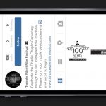
Similarly, the Toronto Silent Film Festival turned its feed tsff2014 on its side, creating an interactive timeline complete with factoids and video clips to celebrate Charlie Chaplin’s 100 years on film.
What to copy from this build
- Start with categories. Treat the grid as a menu so users can self-select a path.
- Use tags as links. Turn existing tap targets into jumps to deeper product views.
- Keep the journey native. Let the platform’s follow, view, and tag behaviors do the work.
- Design for scan first. Make each tile legible as navigation, not just as content.
A few fast answers before you act
What is the Ikea PS 2014 Instagram website?
A campaign that uses an Instagram account as a navigable catalog. Grid posts act as categories, and photo tags act as links to product accounts.
How do people navigate it?
Users tap category images in the grid, reveal the photo tags, and jump to specific product pages inside Instagram.
What is the key execution detail?
Each PS 2014 product gets its own Instagram account, so exploration happens via Instagram’s native follow, view, and tag behaviors.
Why does this work on mobile?
It turns a familiar mobile habit, browsing a feed, into structured discovery without forcing users into a new interface.
What is the transferable pattern?
Treat platform constraints as UI elements. Build navigation out of what the platform already provides instead of fighting it.