A lingerie purchase. A beep at the exit. A message you cannot ignore
A woman buys a bra in a busy H&M store in central Warsaw. She heads for the exit. The security gate beeps, like it does when something is wrong, and everyone turns their head.
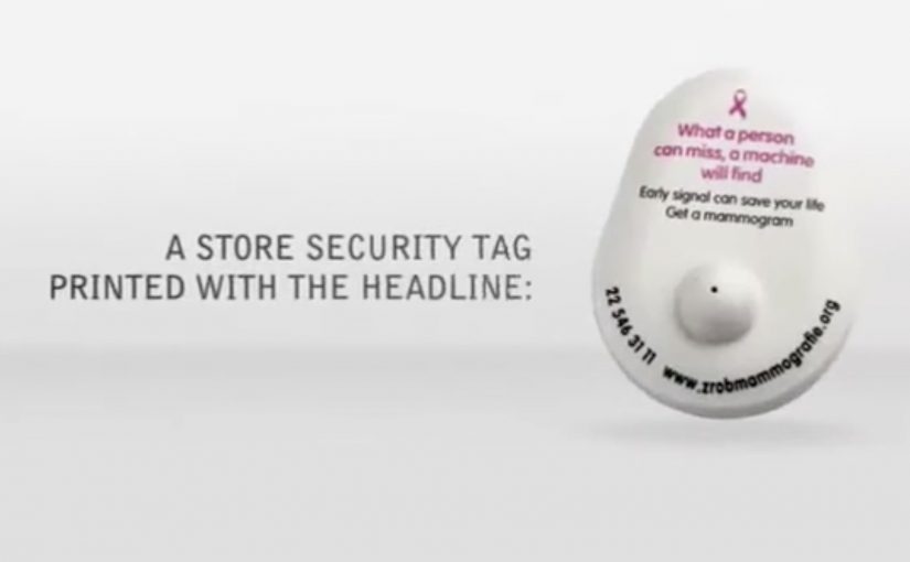
Then the twist lands. The “problem” is not theft. It is a special tag added to the purchase, designed to trigger the gate and force a second look at what you are carrying, and what you might be missing.
How it works: a mammogram metaphor built into the store’s own infrastructure
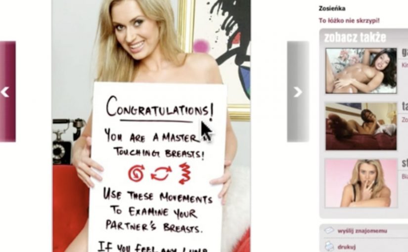
Most women know breast self-examination, and many see it as “good enough”, even if they do it irregularly. The Polish Federation of Cancer Survivors wanted to disrupt that assumption with a simple line. “What a person can miss the machine will find”. The aim was to get more women to sign up for regular mammogram scanning. Here, screening mammography refers to an imaging test designed to detect abnormalities that manual self-examination can miss.
The mechanic explains itself. A shop assistant adds the special tag to a bra purchase. The gate beeps on the way out. The tag copy then connects the feeling of “something is wrong” to the idea of early detection, and provides a fast path to book a mammogram appointment.
In mass retail and FMCG environments, point-of-sale public health activations work best when they use an existing habit and environment cue, then translate it into a single, unavoidable moment of attention.
Why it lands: it turns “I already check” into doubt, without lecturing
This is not a scare poster. It is a physical interruption at the exact moment a woman is already thinking about bras and bodies. Because the beep creates instant relevance and social visibility, the tag message lands as an explanation and next step, not a lecture. This is the kind of retail nudge worth copying because it uses friction to prompt action without shaming the customer.
Extractable takeaway: When you can borrow an existing “something is wrong” cue and attach a single booking step, you can convert attention into action without fear-based messaging.
The intent: change behaviour, not just awareness
The campaign targets a specific behavioural gap. Women believed self-checks were sufficient, so they delayed or skipped mammograms. This activation reframes the choice as a capability gap. humans miss things. machines catch them.
The real question is whether your activation turns a moment of attention into a booked appointment.
The initiative was supported by the Federation of Amazonki, the Ministry of Health and the Oncology Center in Warsaw. H&M hosted the action because it naturally reaches a wide age range, from teenagers to women in their fifties and sixties.
What to steal if you are designing a health nudge in retail
- Use a familiar signal. The security gate beep already means “pay attention”. You borrow that meaning instantly.
- Make the explanation self-contained. The tag is the media unit. No staff briefing needed to “sell” it.
- Choose the moment with maximum relevance. Bra shopping is context. The message becomes harder to dismiss.
- Design the next step to be frictionless. The tag points to how to book, while motivation is highest.
In the campaign write-up at the time, the team reported 330 tags given away in 2 days, 1,650 unique visitors to the site, and a 10% lift in phone calls versus the pre-action period. It also described a longer tail effect when women later heard similar beeps in other stores.
A few fast answers before you act
What is Mammogram Tags: What a Person Can Miss?
It is a Polish breast cancer screening activation where a special retail tag on a bra purchase triggers a store security gate beep, then explains why mammography can detect what self-checks may miss and how to book screening.
How does the in-store mechanic work?
A shop assistant adds a special tag to the bra purchase. When the customer exits, the security gate beeps. The tag reveals the message and directs the customer to the next step to book a mammogram.
Why use a store security gate as the medium?
The beep is a built-in attention trigger with public visibility. It creates an instant “stop and look” moment that the campaign reframes into a health reminder without needing a lecture.
What behavior change is the campaign trying to create?
It targets the belief that self-examination is “good enough” and nudges women toward regular screening mammography by positioning detection as a machine advantage, not a personal diligence test.
What is the campaign’s key message in plain language?
Humans can miss signs. Imaging can find abnormalities earlier. Do not rely on self-checks alone if screening is available.
What results were reported in the campaign write-up?
The write-up reported 330 special tags distributed in 2 days, 1,650 unique visitors to the site, and a 10% lift in phone calls versus the pre-action period.