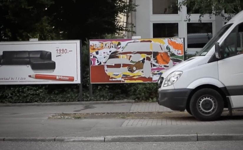
A “MINI” has only the things it really needs. That means getting rid of the superfluous and keeping an eye on the essentials. MINI calls this “Minimalism”.
So Draftfcb/Lowe Group in Zürich creates a poster series across Switzerland that demonstrates the MINI art of omission in an intentionally simple way. Here, “art of omission” means the idea is carried by what you remove, not what you add. Reportedly, more than 20 executions appear in the wild, framed as genuine, unique works of art rather than disposable tactical print.
Minimalism as a communication system, not a slogan
The mechanism is straightforward: take the brand’s “minimum necessary” philosophy and express it through omission, letting what is missing do as much work as what is shown.
In European automotive advertising, stripping a message down to a single visual point is often the fastest way to win attention in cluttered public spaces.
Why omission cuts through
Most posters fight for attention by adding. More copy. More product shots. More badges. Omission flips that logic. The real question is whether your idea is strong enough to survive subtraction. If simplicity is part of the product truth, omission beats piling on claims. The viewer has to resolve the idea themselves, and that small moment of mental completion makes the message stick.
Extractable takeaway: If the audience can reconstruct the meaning from what you remove, the idea is strong. If they need you to explain it, you are not done simplifying.
What the street placement adds
Putting the work across Switzerland turns “Minimalism” into a repeated encounter, not a one-off reveal. Repetition is the multiplier here, because every new variation reinforces the same discipline: remove anything that does not earn its place.
How to apply omission in your next poster
- Use subtraction as the creative device. If you cannot remove an element without losing the point, it is probably essential.
- Let the format carry the proof. A minimalist brand idea is more believable when the execution is minimalist too.
- Design for one-second comprehension. The fastest posters are the ones that do not ask for reading.
- Build a series, not a single hero. Variations teach the audience the “rule” of the campaign.
A few fast answers before you act
What is this MINI “Minimalism” poster idea in one line?
A Swiss poster series that communicates MINI’s “keep only what you need” philosophy by using omission as the main creative device.
Why does omission work better than adding more message?
Because it interrupts expectations in public space and forces a quick mental “solve”, which increases recall.
What makes this feel clutter-breaking?
The work reduces visual noise instead of competing with it, so the absence becomes the attention trigger.
When should a brand use this pattern?
When the brand truth can be expressed as one visual point, and when simplicity is a credible part of the product story.
How do you decide what to remove without losing meaning?
Strip the execution until the message breaks, then add back only the one element that restores the point. If you need multiple add-backs, the idea is not single-point yet.


