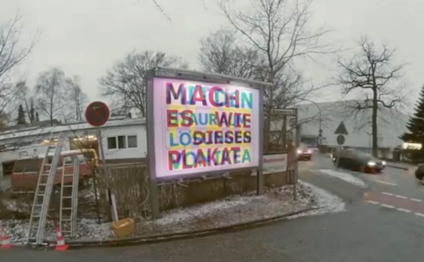
German ad agency Thjnk and production studio I Made This teamed up to create a unique RGB Billboard that revealed different messages depending on the colored lights.
The billboard featured three different messages in three different colors. Cyan, magenta and yellow. At night, the billboard was lit up by red, green and blue (RGB) light bulbs, which made the different messages visible depending on the shining light bulb.
The red showed the cyan text. The green made the magenta text visible. And the blue light revealed the yellow text. With this simple visual trick, the billboard made the most of its limited space and embodied IKEA’s space-saving message.
How the RGB trick works
The idea leans on a simple perception hack, meaning the light color determines which printed layer stands out to the eye. You print multiple messages in different ink colors, then you control which one becomes dominant by changing the light color that hits the surface.
By switching between red, green, and blue lighting, the billboard effectively “filters” what you see. One physical surface. Multiple readable layers. No moving parts required. That works because each light color makes one printed layer readable while pushing the others back.
In crowded retail and FMCG environments, that kind of space efficiency matters because one surface often has to carry more than one job.
Why this is a very IKEA way to communicate
IKEA’s promise often comes down to doing more with less space. This billboard does the same thing. It demonstrates the benefit while delivering the message. The medium becomes the proof.
Extractable takeaway: When the medium visibly demonstrates the product promise, the ad explains itself faster and sticks longer.
What the idea is trying to do for the brand
The real question is not whether people notice the trick, but whether the trick makes IKEA’s value proposition easier to remember.
That is exactly the right move for out-of-home. The business intent is to turn a space-saving claim into a live demonstration, so one billboard works as both message and proof.
What to borrow for your next OOH idea
- Make the constraint the concept. Limited space becomes the creative engine.
- Use a mechanism people can explain. “Different lights reveal different messages” travels fast.
- Build a repeatable reveal. The change over time, or over conditions like day and night, creates a reason to look twice.
A few fast answers before you act
What is the IKEA RGB Billboard?
It is a billboard designed to reveal different messages depending on whether it is lit by red, green, or blue light.
Who created it?
German ad agency Thjnk and production studio I Made This.
How many messages did it contain?
Three messages, printed in cyan, magenta, and yellow.
What lighting was used at night?
Red, green, and blue (RGB) light bulbs.
Why was it a good fit for IKEA?
It demonstrated a space-saving principle by making one billboard placement do the work of multiple messages.


