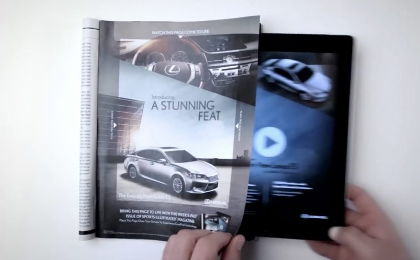
You are flipping through Sports Illustrated and a Lexus ES print ad starts behaving like a screen. The car appears to change color, its headlights flare on, the interior reveals itself, and the whole moment syncs to music.
On a number of occasions I have featured examples of brands creating interactive print ads. By “interactive print ad”, I mean a print page that becomes dynamic when paired with a tablet, with the page acting as the interface and the screen supplying light and motion. Here, the new Lexus 2013 ES is seen changing colors, turning on its headlights and exposing its interiors while music plays in this interactive print ad for the Oct. 15 Sports Illustrated issue.
Paper as a “display”
The trick is not that the magazine suddenly has electronics inside it. The page becomes a physical overlay, and the motion comes from a second screen underneath it. Place the ad over an iPad while the matching Lexus ES video plays, and the printed ink acts like a mask that makes the animation feel like it is happening on the paper itself.
An interactive print ad is a print execution that becomes dynamic when paired with a second screen, using the page as the interface and the tablet as the light and motion source.
In premium automotive marketing and magazine environments, this approach keeps the experience on the page while still delivering the “wow” of moving imagery.
Why this beats the usual print-to-digital handoff
Most interactive print ideas send you away from the page via QR codes, short links, or app installs. This one does the opposite. It pulls the digital layer into the print moment, so the reward arrives immediately and visually, without asking the viewer to leave the ad context.
Extractable takeaway: When a medium is already in someone’s hands, bring the digital layer into that moment instead of routing people elsewhere.
What Lexus is buying with this execution
This is not primarily a spec demo. It is a perception demo. The real question is whether the format makes “advanced technology elevated by style” feel true before the viewer even reads the copy. The ES positioning is “advanced technology elevated by style”, and the format reinforces that promise by making a traditionally static medium feel newly technical. The ad itself becomes proof of the claim.
Stealable moves for interactive print
- Keep the interaction on the page. If you can deliver the payoff in the same frame, attention holds.
- Use a familiar object as the interface. A magazine page is intuitive. No learning curve.
- Design one signature reveal. Headlights, interior, color shift. Pick the one moment people will retell.
- Make it work in low light. If the illusion depends on contrast, design the experience so it still reads in real life.
A few fast answers before you act
How does this “interactive print ad” actually work?
The print page is placed over an iPad while a synced video plays underneath. The page acts as a mask, so the animation appears to live on the paper.
Is the interactivity coming from electronics inside the magazine?
No. The motion, light, and sound come from the tablet. The magazine page provides the physical overlay and the illusion of print moving.
Why is this more engaging than a QR code in a print ad?
The payoff is immediate and stays on the page. QR flows add steps and send the viewer away, which increases drop-off.
What is the brand advantage of doing it this way?
The medium becomes the message. The execution demonstrates “technology plus design” through the experience itself, not just through copy.
What is the key execution risk?
If alignment, lighting, or setup friction is too high, the illusion breaks and the viewer quits before the reveal lands.

