
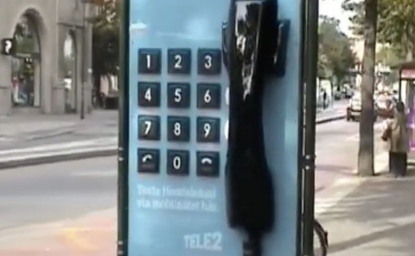
Tele2: Giant Phone

Tele2 is launching a new offer that sounds technical on paper. Fixed telephony delivered through the mobile network. In plain terms, that means a home-phone style service carried over the mobile network instead of a traditional fixed line. The fastest way to make that believable is to let people use it like a normal landline.

So Forsman & Bodenfors builds giant, working phones in Sweden’s three biggest cities. Passersby can pick up the handset and call whoever they want for free, whether that is a friend, a taxi, or the first number that comes to mind.

To keep the street theatre alive, Tele2 occasionally calls the giant phones. Whoever answers at that moment wins a prize.

The giant-phone mechanic

The mechanic is a physical demo of a simple promise. A “home phone” style service that rides the mobile network behaves exactly like the thing people already understand: pick up, dial, talk. The oversized installation does two jobs at once. It acts as out-of-home media you cannot ignore, and it removes friction by turning product education into a one-step trial.

In technical product launches, the most reliable shortcut to trust is an immediate, public, hands-on trial that converts jargon into a familiar behavior.

Why the simplicity message sticks

This works because the audience does not have to believe a claim. They verify it themselves in seconds. The scale makes it socially safe to participate, because the act of “trying it” is also the entertainment. The prize-call twist adds intermittent reward, which keeps attention and creates a reason to stay nearby a little longer.

Extractable takeaway: When your value proposition is hard to explain, design a live interaction where the user completes the core promise in one obvious action, then let the environment do the storytelling.

What Tele2 is really selling

The obvious message is “it’s easy.” The real question is whether the new delivery model feels familiar enough to trust. The deeper message is “it’s close enough to the old thing that switching feels low-risk.” The activation reframes a potentially abstract network feature as continuity: you still have a phone experience, just delivered differently.

Launch lessons from the giant-phone demo

  • Prototype the promise. Build a demo that behaves like the old habit, even if the technology underneath is new.
  • Make the demo the media. If the unit cannot be ignored, you buy awareness and comprehension with the same spend.
  • Keep participation effortless. “Pick up and call” beats any explanation panel.
  • Add a timed trigger. A random callback, reward, or live moment gives people a reason to linger and talk about it.

A few fast answers before you act

What was Tele2 trying to prove with the giant phones?

That its fixed-telephony offer delivered over the mobile network feels as straightforward as a traditional landline. You pick up a handset, dial, and it works.

Why use giant phones instead of a standard street team?

The scale creates instant attention and makes the demo impossible to miss. It also turns the product trial into a public spectacle that others notice and join.

What makes this an effective “technical product” launch pattern?

It replaces explanations with verification. A user experiences the core benefit directly, which reduces skepticism and increases recall.

How does the prize-call element help the concept?

It creates anticipation and a reason to stay engaged, while adding a simple narrative hook people can repeat to others.

Where does this approach work best today?

Any launch where the promise is “this new infrastructure behaves like the old familiar thing,” such as networks, payments, or connected services that need trust before adoption.
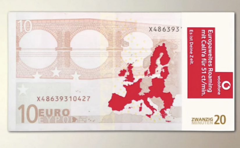
Vodafone: Banknote Sticker for Roaming

To promote Vodafone’s cheap roaming tariff for Europe, Scholz & Friends chose a medium that does not compete for attention. They modified banknotes with stickers, so the message reaches people in a very specific place, their wallet.

The idea is as low-tech as it is disruptive. Instead of asking travellers to notice another poster, banner, or leaflet, the campaign piggybacks on something they already handle repeatedly while travelling.

Roaming costs are a practical irritation. The sticker works because it shows up when travellers are already handling money.

Why a sticker on cash beats a billboard

Most media fights for a glance. A banknote already has “permission” to be looked at, checked, counted, and passed along. Adding a sticker turns that routine behavior into repeated exposure, without needing a second of extra attention budget.

Extractable takeaway: If the offer is about saving money or reducing travel friction, place it inside a ritual people already repeat, not in a channel that asks for attention first.

It is also inherently portable. Cash moves through hands, venues, and neighborhoods, which gives the idea a built-in distribution logic that feels organic rather than broadcast.

For price-led travel offers, wallet insertion beats billboard spend because it shows up at decision time.

What the mechanic is really doing

  • Context targeting: travellers touch cash, exchange cash, and pay in unfamiliar places.
  • Frequency: one note can generate dozens of impressions across multiple days.
  • Zero clutter: the message lives where ads rarely live, inside the payment ritual.

That is the core “clutter breaking” move. It replaces interruption with insertion.

For European travellers moving across borders, wallet-level touchpoints cut through because they appear at the exact moment people are thinking about money and connectivity.

The real question is whether you can attach your promise to a repeated behavior, instead of paying to interrupt one.

Business intent under the simplicity

The immediate goal is recall for “cheap EU roaming” at the moment a traveller is likely to make a connectivity decision. The deeper goal is brand association with practical travel confidence, meaning Vodafone as the network that makes cross-border usage feel less stressful.

Wallet-level touchpoints to borrow

  • Choose a touchpoint people already trust, then add a light layer of message.
  • Exploit repeated rituals, paying, checking, stamping, validating, not one-off exposure.
  • Keep the promise instantly legible, one benefit, one reading, no decoding.
  • Design for pass-along, so distribution is a property of the medium, not a separate plan.

A few fast answers before you act

What makes this “ambient” instead of traditional advertising?

The message is placed inside an everyday object people already use, rather than in a dedicated ad space that competes for attention.

Why is the wallet a powerful media channel for travel offers?

Because it is handled frequently during travel, and it naturally frames the offer around cost and practicality.

What is the main risk with banknote-based ideas?

Control and coverage. You cannot fully control who receives the notes, and scale depends on distribution logistics and how widely the notes circulate.

How do you measure impact when the medium is not digital?

Use proxies like search lift for the tariff term, store inquiries, roaming plan activations, and time-boxed correlation against the distribution window.

What is the transferable lesson beyond telecom roaming?

If your promise is about saving money or reducing travel friction, placing it inside a payment or travel ritual can outperform louder media because it arrives in-context.