Corning: A Day Made of Glass

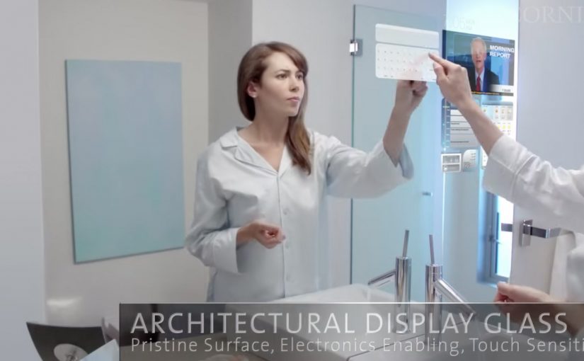
Here is a future vision video by Corning, on where they see multi-touch digital displays over the next few years. Multi-touch means the surface can track several fingers or hands at once, so gestures like pinch, rotate, and shared interaction become natural.

What the film is really demonstrating

The core mechanic is simple. Turn glass from “protective cover” into “primary interface”. Every surface becomes a screen. Every screen becomes responsive to direct manipulation. Information follows you across contexts, from home to school to office, with the same touch-first language, meaning a shared set of gestures and feedback that stays consistent across devices.

In consumer electronics and workplace IT, concept films like this are used to align designers, suppliers, and product teams around a shared interface direction.

The real question is whether your interaction language can stay consistent as screens spread across surfaces and contexts.

Treat the glass as incidental. The interaction model is the product.

Why it lands

It removes the usual friction between people and devices. No boot-up rituals, no “find the remote,” no hunting through menus. You touch the thing you want to change, and the system answers in place. That immediacy is the real promise, not the glass itself. Because the system responds at the point of intent, it reduces both cognitive load and coordination cost in multi-screen tasks.

Extractable takeaway: When you are pitching a new interface paradigm, show behavior before hardware. Make the gestures, feedback loops, and handoffs between screens unmistakable, so the idea remains valuable even if the materials and form factors change.

What to steal for your own work

  • Design the interaction language first. Define the small set of gestures and responses that can travel across surfaces, sizes, and contexts.
  • Keep information anchored to the object or task. The winning moments happen when data appears exactly where the decision is being made.
  • Plan for multi-user moments. Big surfaces invite collaboration. Design for two people at the same time, not just one user plus spectators.
  • Prototype the “seams.” The handoff between phone, table, wall, and car is where most visions break. That is the first place to test.

A few fast answers before you act

What is “A Day Made of Glass” trying to communicate?

It is a vision of glass becoming an interactive medium, where touch-first displays move from dedicated devices into everyday surfaces.

What’s the practical value of watching concept videos like this?

They are useful for spotting interface patterns early, then translating the patterns into near-term prototypes and roadmap language for teams and partners.

What’s the biggest product risk in “glass everywhere” thinking?

Over-indexing on the surface and under-investing in the interaction model. If the gestures, feedback, and context switching are weak, the material does not matter.

What is one immediate takeaway a UX or product team can apply?

Write a short “interaction grammar” for your experience, then test it across at least two form factors. If the grammar does not travel, the concept will not scale.

Who should use this kind of vision film internally?

Use it when you need to align design, product, and IT partners on a shared interaction direction before you lock hardware decisions.

Nokia: Mixed Reality interaction vision

A glimpse into Nokia’s crystal ball comes in the form of its “Mixed Reality” concept video. It strings together a set of interaction ideas: near-to-eye displays (glasses-style screens close to the eye), gaze direction tracking (sensing where you look), 3D audio (spatial sound), 3D video, gesture, and touch.

The film plays like a day-in-the-life demo. Interfaces float in view. Sound behaves spatially. Attention (where you look) becomes an input. Hands and touch add another control layer, shifting “navigation” from menus to movement.

Future-vision films bundle emerging interaction modalities into a single, easy-to-grasp story.

What this video is really doing

It is less a product announcement and more a “stack sketch”, meaning a quick story that layers several interaction technologies into one routine. Concept films are useful for alignment, but they are not validation until the interaction is prototyped and tested.

The mechanism: attention as input, environment as output

The core mechanic is gaze-led discovery. If your eyes are already pointing at something, the system treats that as intent. Gesture and touch then refine or confirm. 3D audio becomes a navigation cue, guiding you to people, objects, or information without forcing you to stare at a map-like UI. This works because it turns existing attention into a low-effort selection signal, then uses deliberate actions to reduce accidental activation.

In product and experience teams building hands-free, glanceable interfaces, this shift from menu navigation to attention-led cues is the core design trade-off.

Why it lands: it reduces “interface effort”

By “interface effort” I mean the mental and physical work of hunting through apps and menus. Even as a concept, the appeal is obvious. It tries to remove that friction by bringing information to where you are looking, and actions feel closer to how you already move in the world. The real question is whether you can make attention-led interfaces feel stable and trustworthy in everyday use.

Extractable takeaway: The fastest way to communicate a complex interaction future is to show one human routine and let multiple inputs, gaze, gesture, touch, and audio, naturally layer into it without heavy explanation.

That is also the risk. If a system reacts too eagerly to gaze or motion, it can feel jumpy or intrusive. The design challenge is making the interface feel calm while still being responsive.

What Nokia is positioning

This vision implicitly reframes the phone from “a screen you hold” into “a personal perception layer”, meaning a persistent interface that sits closer to your senses than a handset UI. It suggests a brand future built on research-led interaction design rather than only on industrial design or hardware specs.

What to steal for your own product and experience work

  • Design around one primary input. If gaze is the lead, make gesture and touch supporting, not competing.
  • Use spatial audio as a UI primitive. Direction and distance can be an interface, not just a soundtrack.
  • Show intent, then ask for confirmation. Let the system suggest based on attention, but require an explicit action to commit.
  • Keep overlays purposeful. Persistent HUD clutter kills trust. Reveal only what helps in the moment.
  • Prototype the “feel,” not just the screens. Latency, comfort, and social acceptability decide whether this works in real life.

A few fast answers before you act

What is Nokia “Mixed Reality” in this context?

It is a concept vision of future interaction that combines near-to-eye displays with gaze tracking, spatial audio, gesture, and touch to make navigation feel more ambient and less menu-driven.

What does “near-to-eye display” mean?

A near-to-eye display sits close to the eye, often in glasses-style hardware, so digital information can appear in your field of view without holding up a phone screen.

How does gaze tracking change interface design?

It lets the system infer what you are attending to, so selection and navigation can start from where you look. Good designs still require a secondary action to confirm, to avoid accidental triggers.

Why include 3D audio in a mixed reality interface?

Because sound can guide attention without demanding visual focus. Directional cues can help you locate people, alerts, or content while keeping your eyes on the real environment.

What is the biggest UX risk with gaze and gesture interfaces?

Unwanted activation. If the interface reacts to normal eye movement or casual gestures, it feels unstable. The cure is clear feedback plus deliberate “confirm” actions.