Bud Light: Clothing Drive

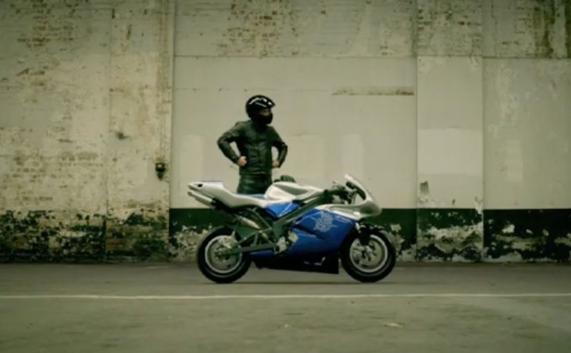
A simple gag, executed cleanly

A Bud Light ad credited to DDB USA plays as a pure setup-and-payoff joke. It does not over-explain itself. It just commits to the visual premise and lets timing do the work.

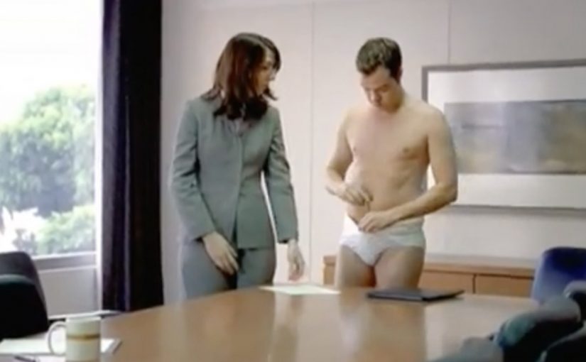
How the “clothing drive” trick works

The spot relies on controlled misdirection. Here, controlled misdirection means giving viewers just enough information to make the wrong prediction before the reveal corrects it. It establishes a familiar situation, encourages the viewer to predict what happens next, then flips that expectation with one sharp visual turn. The humor lands because the logic is coherent after the fact, even if you did not see it coming.

In mass-reach FMCG advertising, tight visual gags are a dependable way to earn attention without asking for extra cognitive effort.

The real question is whether the viewer gets the joke in a single beat and remembers the brand at the same time. For broad-reach comedy, restraint is the right call: one clean reversal beats extra explanation.

Why it lands

The joke is readable on mute, which makes it travel. The premise is also self-contained, so viewers can share it without needing context or explanation. When a brand already owns “easy-going fun,” this kind of execution reinforces that identity without resorting to slogans.

Extractable takeaway: If you want broad shareability, build a gag that is visually legible, hinges on one clear reversal, and resolves fast enough that people will replay it immediately.

Steal the visual-gag discipline

  • Make the setup ordinary. Normal scenes make the twist feel bigger.
  • Let the camera be the narrator. Clean framing and timing beat extra dialogue.
  • Optimize for mute viewing. If the joke works without audio, it works in feeds.
  • End on the cleanest frame. The final beat should be the one people remember and reshare.

A few fast answers before you act

What is Bud Light’s “Clothing Drive” ad?

It is a short comedic spot built around a “clothing drive” visual premise, using misdirection and a quick reveal to land the punchline.

What is the core creative mechanic?

Expectation management. A familiar setup invites a predictable outcome, then one visual reversal delivers the joke.

Why does mute readability matter here?

It makes the ad work in feeds, social clips, and distracted viewing environments where audio may be off but the visual payoff still has to land instantly.

Why are visual gags effective for beer brands?

They match the social, low-friction viewing context. Bars, parties, and feeds reward jokes that land quickly without explanation.

What’s the most transferable lesson for marketers?

Design the payoff so it is instantly understandable, even with no sound, and keep the entire arc short enough to trigger an immediate replay.

Toshiba: Space Chair to the edge of space

To promote its new line of LCD TVs, Toshiba sends an ultra-lightweight biodegradable chair toward the edge of space using a helium balloon, and films the entire mission in high definition with its IK-HR1S camera system.

The chair rig rises to 98,268 feet. The climb is reported as taking 83 minutes. Once the balloon pops, the fall back to earth is reported as taking 24 minutes.

Armchair viewing, taken literally

The creative move is almost aggressively simple. “Armchair viewing” is a cliché. So Toshiba turns it into a physical event. A chair. A balloon. A horizon line that curves. The resulting footage does the persuasion without needing exposition.

If the product claim is abstract. clarity, detail, realism. put a real object into an extreme, undeniable environment and let the camera do the talking.

Physics as production value

This is not “space” as a metaphor. The production is built around constraints that make it believable. Weight limits. fragile materials. freezing temperatures. low pressure. The rig has to survive long enough to capture usable footage, and the team has to recover it afterwards.

That operational reality becomes part of the brand signal. If you can shoot a commercial in those conditions, “HD” stops sounding like a spec sheet and starts sounding like capability.

In consumer electronics marketing, extreme real-world demonstrations are used to make “picture quality” feel like engineering proof, not advertising promise.

Why it lands as a TV ad, not just a stunt

The footage is the product demo. The shots are what a screen is for. It is scale, texture, contrast, and atmosphere. The chair is simply the reference object that lets the viewer feel distance and altitude.

Extractable takeaway: When the claim is “better quality,” build a proof moment the viewer can judge with their own eyes, and keep the story simple enough that the footage carries the persuasion.

It also avoids the typical trap of “innovation” campaigns. Over-claiming. Instead, the story is modest. Here is what we did. Here is what we captured. Judge the images. For picture-quality claims, a single verifiable proof moment beats layers of copy and metaphor.

The real question is whether your “proof” would still hold attention if the logo were removed.

Steal the Space Chair pattern

  • Make the demo inseparable from the claim. If you sell image quality, build an image that earns attention on its own.
  • Use one hero object. A single recognisable object makes scale and risk instantly legible.
  • Let constraints show. Real limits make real footage feel trustworthy.
  • Design for replay. If viewers rewatch because the visuals are stunning, the brand message repeats without extra media.
  • Keep copy light. When proof is the asset, words should not compete with it.

A few fast answers before you act

What is Toshiba “Space Chair”?

It is a Toshiba commercial built from real high-definition footage of a chair carried toward near space on a helium balloon, created to showcase Toshiba’s LCD TV picture quality.

How high did the chair go?

The flight is described as reaching 98,268 feet before the balloon broke apart and the rig descended.

How long did the ascent and descent take?

The timings are commonly reported as about 83 minutes up and about 24 minutes down.

What makes this feel credible instead of CGI?

It reads as real because it uses “documentary grammar,” meaning small signals like changing light, wind noise, tracking drift, and a rig visibly fighting extreme conditions.

What is the core lesson for brands doing “innovation” stories?

Build a proof moment people can replay and share for its own sake. If the audience wants to watch it again, the product message gets repeated for free.

Yamaha: Coast

A TV spot built around one clean optical trick

A neat optical illusion by Clemenger BBDO Adelaide for the TV ad.

How it works: perception as the hook

The mechanism is simple. The viewer’s brain tries to resolve what it is seeing, then the illusion “clicks” and the ad earns a second look. That moment of resolution does the heavy lifting. It buys attention without shouting for it.

In mass-reach brand communication, perceptual puzzles can act as a fast attention magnet because they create a micro-challenge the viewer wants to complete.

The real question is whether a single perceptual device can earn attention at scale without weakening the brand’s premium cues.

Why it lands: the viewer completes the experience

Optical illusions work because they recruit the viewer’s pattern recognition. You are not just watching. You are solving. That tiny sense of participation creates a stronger memory trace than a standard montage of claims. Here, “memory trace” just means how likely the viewer is to recall the ad and brand later.

Extractable takeaway: If you can make the viewer do one tiny piece of perceptual work, you can earn attention and memory without adding noise.

The business intent: make the brand feel smart and premium

Using a clean visual device signals confidence. It suggests craft, control, and intelligence. The brand benefits from the association: if the ad is clever and precise, the product inherits some of that perceived quality.

This approach is strongest when you want mass attention but need the brand to feel calm and premium.

Practical takeaways from a one-device illusion ad

  • Use one primary device. A single clear trick beats three competing ideas.
  • Design for the “click” moment. Structure the reveal so the viewer feels the resolution, not just sees it.
  • Keep the frame uncluttered. Illusions need visual discipline to land quickly.
  • Let craft do the persuasion. A well-executed device can communicate confidence better than copy.

A few fast answers before you act

What is the core creative idea in “Yamaha: Coast”?

A TV spot built around a single optical illusion that creates an “aha” moment and earns a second look through perceptual surprise.

What is the core mechanism?

A perceptual puzzle. The viewer’s brain tries to resolve what it is seeing, and the moment the illusion “clicks” becomes the engagement engine.

Why do optical illusions increase attention?

They create a micro-challenge the viewer wants to complete. That small participation moment makes the experience more memorable than a standard claim-led montage.

What is the business intent of using a clean visual trick?

To signal craft and confidence, and transfer a sense of intelligence and premium precision from the ad to the brand.

What is the most transferable takeaway?

Use one primary device, design for a clear “click” moment, and keep the frame disciplined so the effect lands instantly.