Strongbow Gold: StartCap Bottle Top

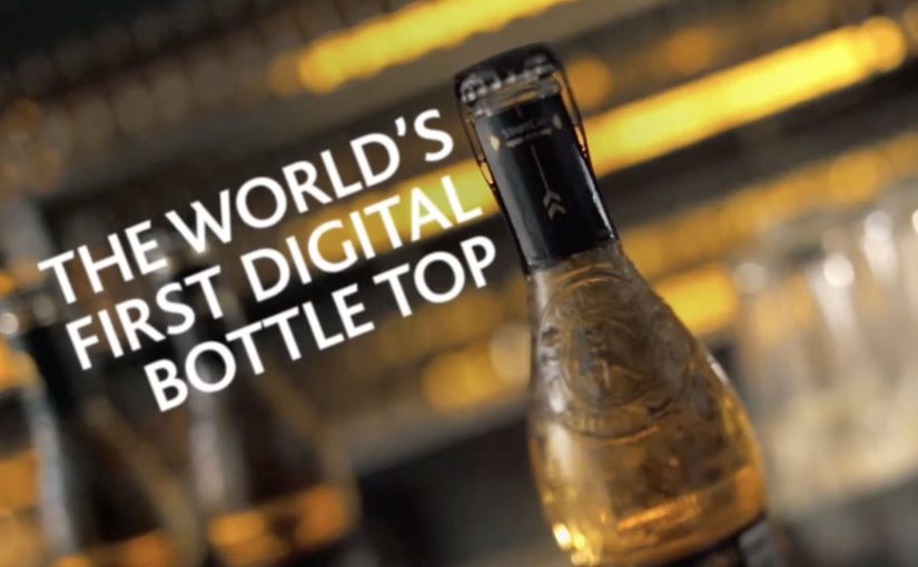
Strongbow Gold is testing what is being billed as the world’s first digitally enabled bottle top. Trigger it, and the bottle top activates a surprise designed to make the night feel more refreshing, more unexpected and more exciting.

For its first public appearance, the Strongbow Gold team rigged an entire bar in central Budapest with RFID readers, antennas and wires. Then during the night, StartCap triggered a string of memorable activations.

A bottle that behaves like a remote control

The core mechanism is packaging as a trigger. An RFID element in the cap signals nearby readers when the bottle is opened, and that signal kicks off a pre-set sequence in the environment, lights, music, props, anything the system is wired to control.

In European FMCG brand launches, connected packaging is a direct way to turn a product claim into a lived experience because the consumer action, opening the bottle, becomes the start button for the story.

Why this lands in a bar context

Bars already run on anticipation. People are there for the next moment. StartCap simply makes that “next moment” programmable, and ties it to the brand in a way that feels earned rather than announced. Because the trigger is the same action guests already perform, the surprise reads as part of the night, not a branded interruption.

Extractable takeaway: In any shared venue, tie a visible “room moment” to a natural product action and the crowd will supply the reaction and conversation without extra prompts.

What the brand is really proving

This is less about a new cap and more about a new role for the brand. Strongbow Gold positions itself as the catalyst for a better night out, not just a drink choice. Connected packaging is only worth doing when the payoff is unmistakable in the room. The technology is the proof device that makes that positioning tangible.

The real question is whether you can choreograph a repeatable “room moment” without making the tech the headline.

Connected-packaging stealables for your next idea

Connected packaging here means the package contains an identifier or sensor that can trigger a response in a nearby system, turning a normal use action into an experience cue.

  • Make the trigger unavoidable. Opening, pouring, unwrapping. The action must be natural.
  • Design for surprise, not complexity. One clean signal, one clear payoff, then scale the choreography.
  • Use the environment as media. If the space reacts, you earn attention without buying more screens.
  • Keep it safe and reliable. In live venues, failure is public. Redundancy matters.

A few fast answers before you act

What is StartCap in one sentence?

A digitally connected bottle top that uses RFID to trigger events in the surrounding environment when the bottle is opened.

Why is packaging-triggered tech so effective?

Because it links the brand to a physical action the consumer already performs. The experience starts at the product, not at an ad.

What is the biggest risk with “connected bar” activations?

Operational fragility. If sensors misread, activations lag, or the venue is too noisy to notice outcomes, the magic disappears.

Does this need a smartphone app to work?

Not necessarily. This model can be environment-driven. The venue infrastructure can detect the trigger and run the experience without asking the guest to install anything.

What should be measured to judge success?

Participation rate, repeat triggers per guest, dwell and sentiment in the venue, plus any post-event lift in brand consideration and trial.

Deadlines vs Creativity: 10 Seconds 10 Minutes

A simple client lesson, told by school kids

Café Creative, a Hungarian ad agency, sets out to prove a point to deadline-setting clients. If you want good and original ideas to be born, you have to give them enough time.

So they ask school children to perform two tasks:

  1. Complete a drawing in ten seconds and
  2. Complete the same drawing in ten minutes.

The results are captured in the video below, described as having been shortlisted at the 2011 Golden Drum Advertising Festival.

The mechanic: one brief. Two clocks. One unavoidable comparison

The setup is intentionally unfair. Ten seconds forces instinct and shortcuts. Ten minutes gives space for choices, revisions, and detail. Because the brief stays constant, the difference you see is time, not talent.

In creative work, the quality gap usually comes from iteration time, meaning time to review, refine, and improve the same idea, rather than a “better idea” arriving fully formed.

In agency-client work, deadline debates are usually really debates about how many improvement cycles an idea gets before it is judged.

The real question is how much originality you destroy when you compress all iteration into almost no time.

Why it lands

It translates an abstract argument. “We need more time”. Into a visual contrast that clients can’t debate. The children’s drawings make the point without cynicism, and the experiment format keeps it watchable because the viewer wants to see how big the difference becomes. That works because a controlled comparison turns a subjective complaint about timing into proof a client can inspect.

Extractable takeaway: When you’re negotiating timelines, show a side-by-side outcome under two time constraints. A visible comparison wins faster than a rational explanation.

What to steal for your next client conversation

  • Use one brief and change one variable. It isolates the real driver of quality.
  • Make the output visual. Visual proof travels further than process arguments.
  • Keep it humane. A light format can carry a serious point without sounding defensive.
  • Frame time as iteration fuel. You’re not asking for delay. You’re buying cycles of improvement.

A few fast answers before you act

What is the “Deadlines vs Creativity” experiment?

It’s a short film where children draw the same subject twice. First in ten seconds, then in ten minutes, to show how time changes outcomes.

What does the ten-second version demonstrate?

It shows what happens under pressure. People default to the most obvious interpretation with minimal refinement.

What does the ten-minute version demonstrate?

It shows the value of iteration time. Details emerge, composition improves, and the work becomes more original and complete.

Why is this a useful argument for clients?

Because it replaces opinion with comparison. The viewer can see what time buys.

How do you apply this lesson without running your own experiment?

Use before-and-after examples from your own work. Show what changed between first draft and final, and tie each improvement to the time used to iterate.

McDonald’s: Everyone Saves for Something

When a low price becomes a citywide signal

McDonald’s and ad agency DDB Budapest launched a campaign to promote an offer of two cheeseburgers for one Euro. The positioning is simple. A price so low it gives the target audience room to save for things they want.

The twist: turn wrapping paper into media

The challenge is standing out from the usual low-price playbook. Instead of shouting numbers louder, the campaign uses the most recognizable asset McDonald’s already owns. Its iconic cheeseburger wrapping paper.

They wrap “cool stuff” in the same paper, partner with different shops around the city, and turn those places into unusual touchpoints that visually encode the offer without needing to repeat the offer everywhere.

In European QSR value campaigns, price messaging sticks better when it is turned into a tangible object people encounter in everyday places.

The real question is how you make a low-price offer feel noticeable without turning it into just another louder discount ad.

Why it lands

This works because it makes value feel physical. The stronger move is to let a distinctive brand asset carry the value message instead of repeating the price claim more aggressively. People are trained to ignore price claims, but they notice an object that looks out of place. The wrapping paper acts like a visual shortcut. If you recognize it, you decode the brand instantly. If you do not, you still feel the oddness and look closer. The partner locations add credibility because the idea appears to have “escaped” the ad slot and entered the city.

Extractable takeaway: If your message is “cheap,” avoid saying “cheap” more often. Use a distinctive brand asset as a portable visual language, then place it where people already shop, browse, and compare.

What to steal from this value stunt

  • Make one brand asset do the heavy lifting. A recognizable wrapper can outperform another headline about price.
  • Build distributed touchpoints. Partner locations create repeated exposures that do not feel like repeated ads.
  • Let the audience complete the message. Recognition is satisfying. It increases memorability with less copy.
  • Keep the offer legible, but not loud. The stunt earns attention. The offer converts it.

A few fast answers before you act

What is “Everyone Saves for Something” for McDonald’s?

It is a value campaign that promotes an ultra-low cheeseburger deal by wrapping everyday objects in McDonald’s iconic cheeseburger paper and placing them across partner shops as unusual city touchpoints.

What is the core mechanic?

Use distinctive packaging as a portable visual language, then deploy it outside the restaurant to make the offer feel present across the city.

Why does wrapping objects work better than another price poster?

Because it turns a price message into a curiosity trigger. People notice the anomaly first, then decode the brand and offer.

What’s the transferable principle for other brands?

If your message is functional and easy to ignore, embed it inside a recognizable asset and place it where people already make choices.

What is the main risk with this approach?

If the asset is not instantly recognizable, or the placements feel random, the idea becomes decoration instead of a decodable message.