Jimmy Kimmel: Halloween Candy Prank 2013

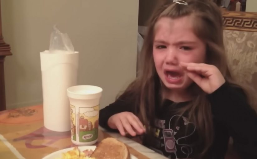
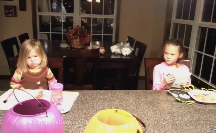
For the third consecutive year, talk show host Jimmy Kimmel challenges the parents of America to prank their kids and pretend that they ate all of their Halloween candy.

As always, parents oblige by the hundreds, and the results of this year’s Halloween Candy YouTube Challenge are compiled into a best-of reel.

A prank designed for mass participation

The mechanism is almost nothing. One line delivered at the worst possible moment, with a camera rolling. The show prompts the setup, parents run it at home, and YouTube becomes the route for collecting clips at scale.

That works because the prompt is so simple that families can recreate it instantly, while the show keeps editorial control by curating the best reactions into one polished reel.

In US pop-culture marketing, repeatable audience-participation formats win because they are easy to copy and still feel personal every time.

The real question is how a one-line prank becomes a yearly entertainment asset people keep recreating for free.

Why this lands

This is a smart participation format, not just a late-night gag. The emotions are instant and unedited. You get a mix of outrage, heartbreak, negotiation, and unexpected maturity, and that variety keeps the compilation watchable. It also feels like a yearly ritual, which helps the segment spread even among people who do not watch the show regularly.

Extractable takeaway: If you want repeatable virality, give people a one-sentence script, a clear capture instruction, and a predictable calendar moment, then let the audience supply infinite variation.

The previous challenge videos can be seen here: 2011 and 2012.

What repeatable participation marketers should steal

  • Make the prompt copyable. One sentence beats a complex brief.
  • Design for home production. If the content requires no special tools, submissions multiply.
  • Compile the chaos. A best-of edit turns scattered clips into a single shareable asset.
  • Repeat annually. Familiar format plus new reactions gives people a reason to come back each year.

A few fast answers before you act

What is the “I ate your Halloween candy” challenge?

Parents tell their kids they ate all the Halloween candy, film the reaction, and submit the clip for a compilation segment.

Why does this format keep working year after year?

The setup stays identical, but the reactions are endlessly different, which creates fresh entertainment without changing the mechanic.

What makes the compilation more shareable than single clips?

A best-of edit increases pace and variety, so viewers stay longer and are more likely to pass it on as a single link.

What is the core growth driver?

Low friction participation. One simple script, one simple recording, and a familiar upload behavior.

What should brands learn from this without copying the cruelty?

Use a repeatable prompt that invites audience variation, and build a clear “submit, then compile” distribution loop around it.

Jimmy Kimmel: Halloween Candy Prank 2012

Last year for Halloween, talk show host Jimmy Kimmel challenged the parents of America to tell their kids that they ate all their Halloween candy and then video tape their reactions and share them on YouTube. The challenge was a huge success and the best-of compilation reportedly passed 34 million views within a year.

So this year, once again, Jimmy Kimmel issued the same challenge. The results are exactly as brutal and hilarious as you’d expect.

A late-night segment built from other people’s cameras

The mechanic is straightforward: a single, repeatable prank with a clear instruction. Tell the kids you ate the candy, capture the reaction, upload it, and label it so the show can find it. The audience does the filming. The show does the curation.

In mass-audience US entertainment formats, recurring viewer challenges turn a broadcast show into a participatory channel.

The real question is how you turn a simple prank into a recurring submission format people want to recreate.

This is smart format design, not just a funny late-night stunt.

Why it lands

It is a format, not a one-off. The joke is simple enough to repeat annually, which makes participation feel like joining a tradition.

Extractable takeaway: Repeatable audience challenges go viral when the instruction is easy, the emotional payoff is immediate, and the show’s role is tight curation. The audience supplies volume. The editor supplies pace and punch.

It scales because the setup is universal. Every family understands the stakes instantly. No explanation needed. Just the moment.

It is engineered for contrast. You get the full spectrum in minutes: outrage, tears, bargaining, moral lectures, and the occasional surprisingly mature response.

What this recurring prank format teaches

  • Write the participation brief like a recipe. One action, one prompt, one deliverable, one label.
  • Design for low production. If it can be filmed on a phone with no setup, you will get scale.
  • Make the headline self-evident. If people can describe it in one sentence, they will share it.
  • Curate ruthlessly. The “best-of” cut is what turns raw clips into a watchable story.

A few fast answers before you act

What is the core idea behind this Jimmy Kimmel challenge?

A simple prank prompt that viewers can easily recreate, then submit, allowing the show to compile the best reactions into a tight, shareable segment.

Why does it work so well as a recurring format?

Because the setup is instantly understood, participation is easy, and each year produces fresh reactions without changing the concept.

Is this “user-generated content” or just a TV bit?

Both. The audience generates the footage. The show packages it into a broadcast-quality narrative through editing and selection.

What makes the compilation feel addictive to watch?

Fast escalation and variety. Each clip delivers a quick emotional hit, and the edit keeps the pace moving before any one moment drags.

What is the transferable lesson for marketers?

If you want mass participation, create a repeatable prompt with an immediate emotional outcome, then invest in curation so the best entries become the distribution engine.

Shell: Pedestrian Ghost

A driver approaches a crosswalk too fast. A “pedestrian” suddenly appears from a manhole cover, then shoots up into the sky like a soul escaping. The only sane response is to slow down.

Speeding cars and pedestrian safety is a huge problem in Ukraine. Ukraine is described as having the highest percentage of pedestrian collisions in Eastern Europe at 56%. To make people think twice about speeding, Shell along with JWT Ukraine created an ambient campaign called the Pedestrian Ghost, a person-shaped helium decoy that appears only when a driver is speeding. The campaign ran during Halloween and generated a lot of buzz over the internet.

A ghost that only shows up when you speed

The mechanism is built for one job. A radar detects an approaching vehicle that exceeds the speed limit. When the threshold is crossed, a hidden device integrated into a manhole cover inflates a person-shaped “ghost” using helium-filled balloons. The figure rises fast and disappears upward, creating a moment that feels like you just hit someone, even though nothing living is harmed.

In dense city streets where drivers routinely treat crosswalks as negotiable, the sharpest safety interventions are the ones that create a visceral consequence in the exact second a bad decision is made.

The real question is how to make speeding feel consequential before harm happens.

Why it lands

It works because it weaponizes surprise without needing explanation. The ghost is unmistakably human-shaped, the timing is unmistakably linked to speed, and the “escape” into the sky reads like consequence. That instant cause-and-effect loop is what resets behavior, at least for the next few blocks. For road-safety messaging, this is the right trade-off: simulate consequence hard enough to reset behavior, but never create real danger.

Extractable takeaway: If you want to interrupt dangerous habits, trigger the intervention only at the violation moment, and make the feedback so immediate and legible that drivers connect cause and effect without being told.

What this crosswalk ghost gets right

  • Trigger only on the infraction. The selectivity makes the moment feel targeted, not random.
  • Use a single, readable symbol. A human silhouette beats a statistic for behavior change.
  • Design for “I have to tell someone”. A story people can repeat in one sentence becomes earned media.
  • Keep the intervention non-injurious. The fear is simulated, the outcome is safe.

A few fast answers before you act

What is “Pedestrian Ghost”?

An ambient road-safety stunt where a ghost-like pedestrian figure rises from a manhole cover at a crosswalk when a radar detects a speeding car, forcing drivers to slow down.

What is the core mechanism?

Radar detects speeding. A concealed device inflates a person-shaped helium “ghost” and releases it upward. The driver experiences an immediate, consequence-like shock without any real harm.

Why does it change behavior better than a warning sign?

Because the feedback is timed to the violation and feels personal. The driver is not being advised. They are being startled at the exact moment of risk.

What is the biggest failure mode if I copy this pattern?

Unreliable triggering. If the effect fires at the wrong time, or too often, people stop believing the cause-and-effect link and the intervention becomes noise.

What is the simplest modern variant?

A violation-triggered intervention that is immediate, physical, and unmistakably tied to speed. For example light, sound, or motion that only activates above a threshold at the crosswalk.