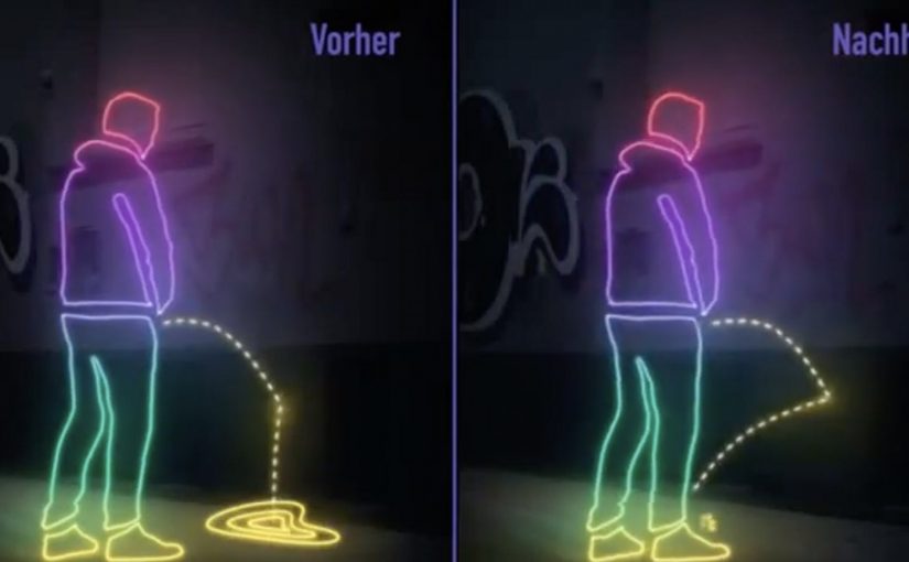
St. Pauli is one of Hamburg’s top entertainment destinations, reported as attracting up to 20 million visitors a year with its nightclubs and legal prostitution. But the steady stream of visitors has many residents and merchants angry, as some visitors relieve themselves against walls, leaving parts of the area smelling like a latrine.
So to combat this, St. Pauli’s merchants fight back by coating the most frequented walls with Ultra-Ever Dry, a superhydrophobic coating that repels liquids (the same type of coating Nissan publicly demonstrated on a “self-cleaning” car prototype). Now when liquid hits the treated surface, it can splash back, soaking the offender’s pants and shoes.
A deterrent that makes the consequence immediate
The mechanism is direct. Identify the walls that get hit most often. Apply a coating that strongly repels liquids. Let physics deliver instant feedback to the person causing the problem. It is not subtle, and that is the point. The “punishment” is immediate embarrassment and discomfort. The real question is how to stop a repeat nuisance behavior when constant policing is unrealistic. The stronger move is to redesign the environment so the consequence happens in the moment.
Why it lands
In European nightlife districts where resident quality-of-life clashes with party tourism, deterrence tends to work best when it changes behavior in the moment, not when it relies on rules people ignore after midnight. This works because it does not require enforcement at scale. There is no need to catch someone, argue, or issue a fine. The wall becomes the deterrent, and the story becomes self-spreading because the consequence is memorable and easy to retell.
Extractable takeaway: If a behavior persists because policing is impractical, shift the intervention from enforcement to environment. Make the unwanted action inconvenient or self-correcting, and the system scales without extra staff.
A broader pattern beyond Hamburg
Similar anti-urination paint trials were also reported in San Francisco, where public works tested superhydrophobic coatings on selected walls as a deterrent. The through-line is the same. When a city cannot police every corner, it experiments with “designing the street” to reduce repeat nuisance behaviors.
What civic teams can borrow
- Target the hotspots. Interventions work best when they focus on the highest-frequency locations, not the whole city.
- Make the rule physical. If the environment enforces the norm, compliance increases without lectures.
- Keep the message legible. People should understand the consequence immediately, even when they are distracted.
- Plan for side effects. Think through splash zones, signage, and whether the deterrent creates any new cleaning burden.
A few fast answers before you act
What does “Pinkelt Zurück” mean?
It means “pees back”. It is a blunt way to describe a wall treatment designed to repel liquid back toward the source.
What coating is used in this idea?
The case describes the use of Ultra-Ever Dry, a superhydrophobic coating designed to repel most liquids.
Why is this more effective than fines?
Because enforcement is hard in crowded nightlife areas. The deterrent works at the moment of behavior, without needing police presence.
Was something similar tried outside Germany?
Yes. Reporting describes trials of similar superhydrophobic coatings on walls in San Francisco as a public urination deterrent.
What is the main lesson for civic or place marketing?
When behavior change is the goal, redesign the environment so the better behavior becomes the easier behavior.