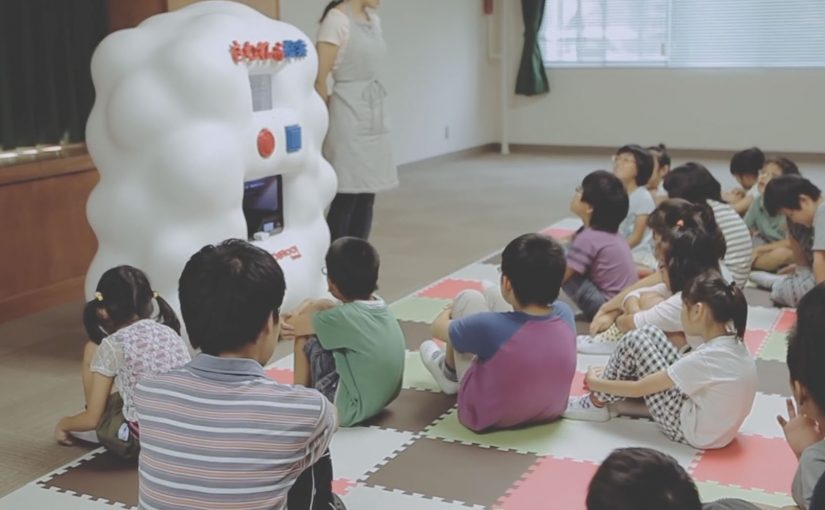
Yahoo! JAPAN introduces what it calls “Hands On Search”. A hands-on search experience that lets visually impaired children explore online concepts through touch, not screens.
A voice-activated kiosk is set up so children can speak what they want to “search” for. The system recognises the verbal request, pulls a corresponding 3D model, and prints a small physical object. For the first time, children can hold what they usually only hear described. From animals to landmarks and buildings.
Search becomes a physical output
The mechanism is voice input plus 3D printing output. Instead of returning text, images, or audio, the search result is manufactured into a tactile model the child can feel in their hands. Because the output is tactile, the child can verify shape and scale directly, which is why the interaction shifts from description to discovery.
In accessible technology design, the strongest innovation is often a translation layer that converts a dominant medium into the sense that an excluded audience can reliably use. That is the pattern worth copying. Change the output medium, not just the narration layer.
In accessible-learning contexts, the constraint is rarely intent but whether the output can be inspected without sight.
Why it lands
It reframes “search” as something more than browsing. It becomes discovery you can share in a classroom. The real question is whether your product can render its core value into the senses your excluded users actually rely on. The moment the object prints is also the moment learning becomes concrete. It is not an abstract promise about inclusion. It is a visible, touchable outcome.
Extractable takeaway: If your experience is inherently visual, do not just add narration. Add an equivalent output that preserves shape and scale in a form people can physically inspect, so learning moves from description to direct exploration.
Tactile-search patterns for product teams
- Design for the missing sense, not the average user. Start with the constraint, then build the interface around it.
- Make the interaction one-step. Voice request in. Physical result out. No menus, no setup rituals.
- Curate the object library. Accessibility fails when content quality is inconsistent. The “catalogue” is part of the product.
- Prototype in real learning environments. Schools and educators reveal whether the tool supports teaching, not just demos.
A few fast answers before you act
What is Hands On Search in one sentence?
It is a concept machine that turns spoken searches into small 3D-printed models, so visually impaired children can “touch” search results.
Why does 3D printing matter here?
Because it converts information into form. For someone who cannot see images, a physical model can communicate shape, proportion, and structure directly.
Is this a campaign or a product direction?
It plays like a campaign film, but the underlying idea is a product direction. Search as an output system that can render to different senses depending on user needs.
What is the biggest risk in copying this idea?
Building a beautiful prototype without a sustainable content pipeline. If the object library is thin, slow to expand, or low fidelity, usefulness drops quickly.
Where should you prototype first?
Prototype where learning happens. Schools and educators will quickly show whether the tool supports teaching, not just demos.


