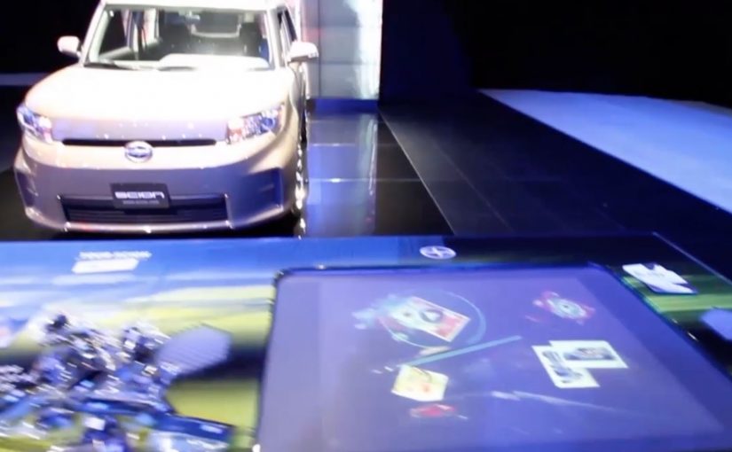
You walk up to a Microsoft Surface table at a Scion auto show stand and pick up one of the collectible cards. You place it on the table and the surface immediately reacts. Photos, video content, regional sales information, and localized events appear around the card. You flip the card over and it triggers a musical element. Beats, bass, or vocals. When all eight cards are on the table at the same time, the full song plays and the table turns into a simple, social remix station.
Auto shows as a lab for new interfaces
At the 2011 International Motor Show in Frankfurt, the pattern is easy to spot first-hand. The brands that win attention make exploration physical and obvious.
The activation. Scion meets Microsoft Surface
If you visit upcoming auto shows late this year or in 2012, you can run into the Scion Surface Experience, built on Microsoft Surface tables. Toyota’s agency Juxt Interactive designs the experience to let visitors explore Scion’s product, racing, and cultural affiliations in an unexpected way.
How it works. Eight cards, two sides
The interaction is built around a deck of eight collectible cards:
- Place a card on the Surface and the table reveals photos, video content, regional sales information, and localized events.
- Flip the card over and it triggers one element of a song, such as beats, bass, or vocals.
- Place all eight cards on the Surface at once and the full song plays.
Once the full track is unlocked, guests can remix the song in their own way. It reinforces the self-expression that sits at the core of the Scion brand story.
In auto show environments, where multiple brands compete for brief attention in the same hall, interfaces that make participation obvious outperform passive display messaging.
The take-home loop. Physical tokens for digital content
The cards do not end when the stand visit ends. Guests can take their cards home and use them to download digital content connected to the auto show experience. The business intent is clear: use play to pull visitors into deeper product content, then extend recall beyond the booth with a take-home trigger.
Why this works. Exploration first, messaging second
This is a clean example of experiential design where the interface creates the interest. The collectible cards make the first step easy, the Surface makes the response immediate, and the “complete the set” mechanic rewards curiosity. The “complete the set” mechanic means each added card reveals more value, so the interaction naturally pulls people toward finishing the sequence together. Because each added card changes the output immediately, the table turns product exploration into a visible group activity, which keeps people engaged longer than a passive stand screen.
Extractable takeaway: When you want people to explore branded content, give them a physical trigger, an immediate digital response, and a group reward for going deeper.
The real question is how to turn product exploration into something people want to start, continue, and share with the people beside them.
What to steal from this interface-led booth
- Make the first move physical. Use a tangible trigger that is obvious, low-friction, and instantly responsive.
- Turn content into discovery. Let people unlock information through curiosity, not a forced linear demo.
- Design for small groups. Build in a reason to collaborate, compare, and “complete the set” together.
- Extend the moment beyond the booth. Give visitors a take-home token that continues the experience after the event.
A few fast answers before you act
What is the Toyota Scion Microsoft Surface Experience?
An auto show installation that uses Microsoft Surface tables and eight collectible cards to explore Scion content and trigger a music remix experience.
What happens when a card is placed on the table?
The Surface reveals photos, video content, regional sales information, and localized events tied to the stand experience.
What happens when the card is flipped?
It triggers a part of a song, such as beats, bass, or vocals.
Why are there eight cards?
Placing all eight cards on the Surface at the same time unlocks the full song, and turns the table into a simple remix station.
What is the lasting value beyond the booth moment?
Visitors can take the cards home and use them to download digital content related to the auto show experience.