
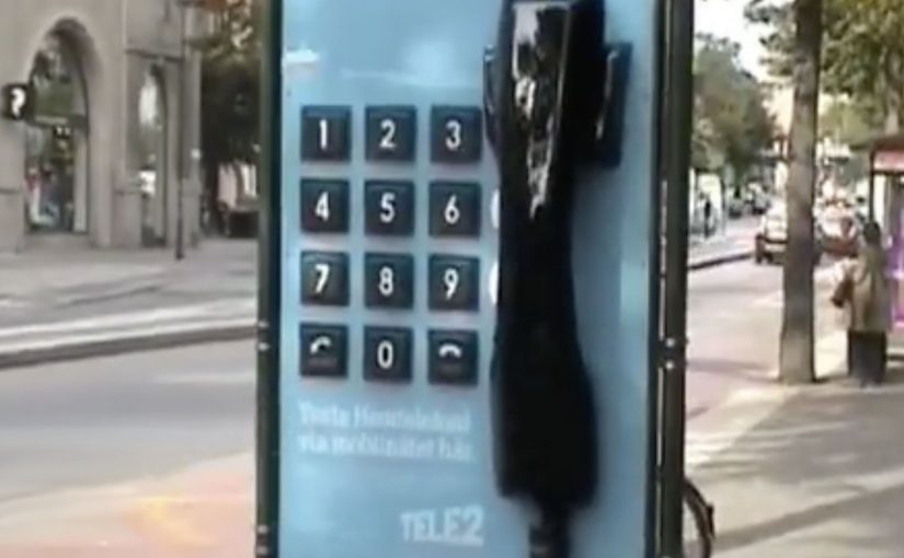
Tele2: Giant Phone

Tele2 is launching a new offer that sounds technical on paper. Fixed telephony delivered through the mobile network. In plain terms, that means a home-phone style service carried over the mobile network instead of a traditional fixed line. The fastest way to make that believable is to let people use it like a normal landline.

So Forsman & Bodenfors builds giant, working phones in Sweden’s three biggest cities. Passersby can pick up the handset and call whoever they want for free, whether that is a friend, a taxi, or the first number that comes to mind.

To keep the street theatre alive, Tele2 occasionally calls the giant phones. Whoever answers at that moment wins a prize.

The giant-phone mechanic

The mechanic is a physical demo of a simple promise. A “home phone” style service that rides the mobile network behaves exactly like the thing people already understand: pick up, dial, talk. The oversized installation does two jobs at once. It acts as out-of-home media you cannot ignore, and it removes friction by turning product education into a one-step trial.

In technical product launches, the most reliable shortcut to trust is an immediate, public, hands-on trial that converts jargon into a familiar behavior.

Why the simplicity message sticks

This works because the audience does not have to believe a claim. They verify it themselves in seconds. The scale makes it socially safe to participate, because the act of “trying it” is also the entertainment. The prize-call twist adds intermittent reward, which keeps attention and creates a reason to stay nearby a little longer.

Extractable takeaway: When your value proposition is hard to explain, design a live interaction where the user completes the core promise in one obvious action, then let the environment do the storytelling.

What Tele2 is really selling

The obvious message is “it’s easy.” The real question is whether the new delivery model feels familiar enough to trust. The deeper message is “it’s close enough to the old thing that switching feels low-risk.” The activation reframes a potentially abstract network feature as continuity: you still have a phone experience, just delivered differently.

Launch lessons from the giant-phone demo

  • Prototype the promise. Build a demo that behaves like the old habit, even if the technology underneath is new.
  • Make the demo the media. If the unit cannot be ignored, you buy awareness and comprehension with the same spend.
  • Keep participation effortless. “Pick up and call” beats any explanation panel.
  • Add a timed trigger. A random callback, reward, or live moment gives people a reason to linger and talk about it.

A few fast answers before you act

What was Tele2 trying to prove with the giant phones?

That its fixed-telephony offer delivered over the mobile network feels as straightforward as a traditional landline. You pick up a handset, dial, and it works.

Why use giant phones instead of a standard street team?

The scale creates instant attention and makes the demo impossible to miss. It also turns the product trial into a public spectacle that others notice and join.

What makes this an effective “technical product” launch pattern?

It replaces explanations with verification. A user experiences the core benefit directly, which reduces skepticism and increases recall.

How does the prize-call element help the concept?

It creates anticipation and a reason to stay engaged, while adding a simple narrative hook people can repeat to others.

Where does this approach work best today?

Any launch where the promise is “this new infrastructure behaves like the old familiar thing,” such as networks, payments, or connected services that need trust before adoption.

McDonald’s: Everyone Saves for Something

When a low price becomes a citywide signal

McDonald’s and ad agency DDB Budapest launched a campaign to promote an offer of two cheeseburgers for one Euro. The positioning is simple. A price so low it gives the target audience room to save for things they want.

The twist: turn wrapping paper into media

The challenge is standing out from the usual low-price playbook. Instead of shouting numbers louder, the campaign uses the most recognizable asset McDonald’s already owns. Its iconic cheeseburger wrapping paper.

They wrap “cool stuff” in the same paper, partner with different shops around the city, and turn those places into unusual touchpoints that visually encode the offer without needing to repeat the offer everywhere.

In European QSR value campaigns, price messaging sticks better when it is turned into a tangible object people encounter in everyday places.

The real question is how you make a low-price offer feel noticeable without turning it into just another louder discount ad.

Why it lands

This works because it makes value feel physical. The stronger move is to let a distinctive brand asset carry the value message instead of repeating the price claim more aggressively. People are trained to ignore price claims, but they notice an object that looks out of place. The wrapping paper acts like a visual shortcut. If you recognize it, you decode the brand instantly. If you do not, you still feel the oddness and look closer. The partner locations add credibility because the idea appears to have “escaped” the ad slot and entered the city.

Extractable takeaway: If your message is “cheap,” avoid saying “cheap” more often. Use a distinctive brand asset as a portable visual language, then place it where people already shop, browse, and compare.

What to steal from this value stunt

  • Make one brand asset do the heavy lifting. A recognizable wrapper can outperform another headline about price.
  • Build distributed touchpoints. Partner locations create repeated exposures that do not feel like repeated ads.
  • Let the audience complete the message. Recognition is satisfying. It increases memorability with less copy.
  • Keep the offer legible, but not loud. The stunt earns attention. The offer converts it.

A few fast answers before you act

What is “Everyone Saves for Something” for McDonald’s?

It is a value campaign that promotes an ultra-low cheeseburger deal by wrapping everyday objects in McDonald’s iconic cheeseburger paper and placing them across partner shops as unusual city touchpoints.

What is the core mechanic?

Use distinctive packaging as a portable visual language, then deploy it outside the restaurant to make the offer feel present across the city.

Why does wrapping objects work better than another price poster?

Because it turns a price message into a curiosity trigger. People notice the anomaly first, then decode the brand and offer.

What’s the transferable principle for other brands?

If your message is functional and easy to ignore, embed it inside a recognizable asset and place it where people already make choices.

What is the main risk with this approach?

If the asset is not instantly recognizable, or the placements feel random, the idea becomes decoration instead of a decodable message.

Daffy’s: The Undressing Room

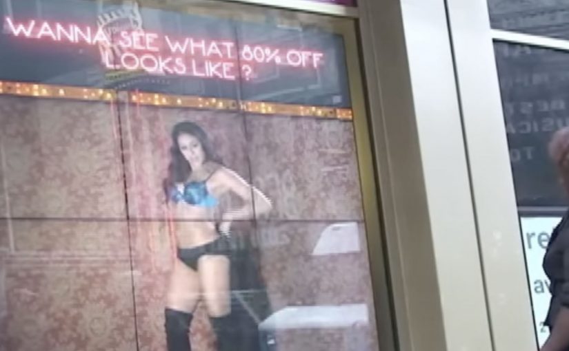
You are walking past a Daffy’s store window in Manhattan and it looks like a fashion show has moved onto the street. Models are inside the display. A crowd is outside. And the public is controlling what happens by text message.

Daffy’s is a fashion retailer from NYC. For their fall fashion launch, they created a street-level event that blended window shopping, a fashion show, and an interactive peep show, meaning passers-by could text outfit requests to models inside while the exchange played out publicly on the glass, to create live interaction from hundreds of passers-by for an entire day and night.

The idea was simple. Put great-looking models in the window with items from the new range. Ask the public at street level to text a special number for each model, requesting specific items to try on and then change out of. Each message was projected onto the store window, letting the crowd follow the conversation, while the models used phones to interact with people on the street.

That shift from window to stage is what turns a shopfront into a live media channel when footfall competes with endless distractions.

Why the mechanism pulls a crowd

The mechanism is a tight loop. You text. Your message appears publicly. The model responds with an immediate, visible action. That creates instant feedback, plus social proof, because everyone can see that participation changes the experience.

Extractable takeaway: When participation is public and the response is immediate, bystanders become an audience because they can see cause and effect in real time.

It also turns fashion into a game with a scoreboard you can read. The projected message stream makes the crowd feel like a single audience, not scattered individuals passing by.

In high-traffic retail corridors, the format works best when the interaction loop is visible to everyone, not just the person who texts.

What Daffy’s is really buying

This is not just “engagement” for its own sake. It is earned attention at street level, then a shareable story that travels beyond the location. The activation is designed to make people stop, watch, talk, and tell others to come over.

The real question is whether you are designing for fast, visible participation that creates social proof, or just staging a spectacle.

This pattern is worth copying only when you can keep the loop tight and keep people safe once the crowd forms.

According to Daffy’s communications, more than 1,500 text messages were received between 6:00 p.m. and 9:30 p.m., and the event was suspended twice by NYC police due to crowd overflow impacting pedestrian and vehicle traffic.

Practical takeaways for interactive storefronts

  • Make the audience the controller. Participation should change something real, not just “send a message”.
  • Project the input publicly. Visibility creates social proof and gives bystanders a reason to join.
  • Design for fast feedback. The shorter the gap between action and response, the bigger the crowd gets.
  • Let the store be the medium. If the window is already the brand’s stage, use it as one.

A few fast answers before you act

What was Daffy’s “Undressing Room”?

A storefront window event where passers-by texted requests to models inside the window, and the messages were displayed publicly so the crowd could follow along in real time.

Why does projecting messages onto the window matter?

It turns private participation into a public feed. People see that the experience is live, and that others are actively shaping it, which increases curiosity and crowd growth.

What’s the core interaction design pattern here?

Public input plus immediate physical response. The text is the trigger. The window action is the payoff.

What makes this more effective than a normal fashion show?

Viewer control. People do not just watch. They influence what happens, and that makes them more likely to stay, share, and bring others.

What’s the biggest operational risk with this kind of activation?

Crowd control. If the moment works, it attracts more people than a normal storefront can safely handle, so permits and on-site management matter.