IKEA Manland

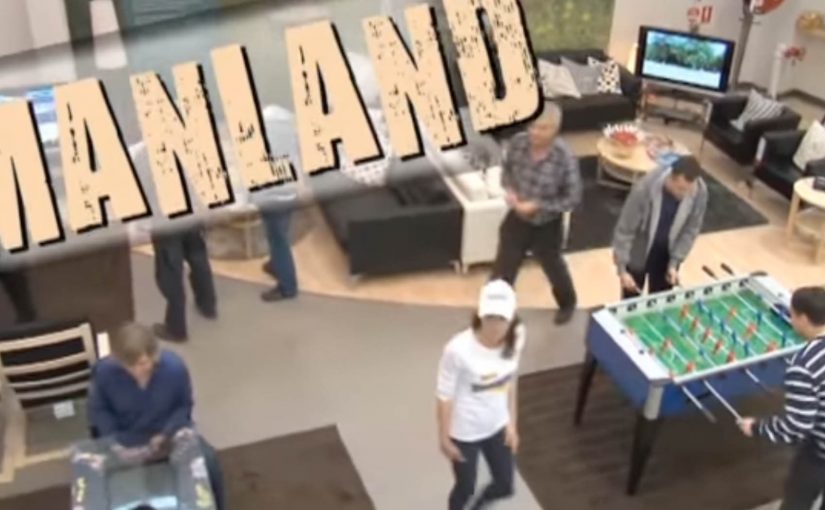
Last month IKEA in Sydney, Australia ran a four-day trial of Manland. They created a dedicated area in the store which men with short retail attention spans could use to escape the pains of weekend shopping at IKEA. In simple words, it was day-care for husbands and boyfriends who wanted to take a break from the shopping.

The store offered free hot dogs, Xbox consoles, pinball machines and nonstop sports action on TV. IKEA even handed out buzzers so women would get reminded to come back and pick up their men after a short session.

Turning “waiting time” into a branded service

Manland works because it is not pretending men suddenly love shopping. It acknowledges the reality. Some people will be there for the relationship, not the retail. So IKEA reframes the pain point as a service, the same way Småland turns “kids are restless” into a solved problem.

The mechanism is deliberately low-effort. You do not need an app, a QR code, or an explanation. You just drop in, decompress, and rejoin the trip with less friction and fewer arguments.

In big-box retail, weekend shopping is often a couple activity, and boredom is a conversion killer for the accompanying partner.

Why this becomes press, not just a gimmick

It is instantly legible. A “day-care for men” is a headline. The imagery does the distribution work. Consoles, sports, hot dogs, and a buzzer are all recognisable symbols, so the concept travels across cultures even if you have never been to an IKEA.

Extractable takeaway: If you want earned media from an in-store experience, design one idea that reads in a single photo and a single sentence.

It is also slightly provocative, which helps. People argue about whether it is funny, patronising, or brilliant. That debate is oxygen for earned media.

The business intent: protect dwell time and reduce walk-outs

The practical goal is simple. Keep groups in-store longer, reduce the urge for someone to storm out, and make the trip feel easier, especially on peak weekend traffic. The PR upside is a bonus. But the operational benefit is the real value.

The real question is whether you can remove that boredom without turning the idea into a stereotype.

If your store relies on group shopping, design for the bored companion as deliberately as you design for the primary buyer.

Steal the companion-lounge playbook

  • Solve a real friction. If it does not remove pain, it will not spread.
  • Make the rules obvious. The best retail ideas need zero onboarding.
  • Build a “photo truth”. If the experience photographs well, it earns its own distribution.
  • Use time limits to keep it fair. A short session keeps it accessible and stops it becoming a hangout that blocks capacity.

A few fast answers before you act

What was IKEA Manland?

Manland was a short trial inside an IKEA store in Sydney. It offered a staffed, game-and-sports lounge where men could take a break while their partners shopped.

Why did the buzzer matter?

The buzzer turned “come back later” into a simple timing system. It made pickup predictable and helped manage capacity without complicated queueing.

Is this primarily an ad idea or an operations idea?

Both. It is an operations idea that creates PR. The experience removes friction inside the store, then the simplicity of the concept turns it into a shareable story.

What makes this kind of activation risky?

Stereotypes. If the tone feels insulting or dated, the press flips from amused to critical. The safest version is to frame it as optional decompression, not a judgment.

What should you measure if you do something similar?

Dwell time, drop-off rates, and satisfaction in exit feedback. For comms, track earned pickup and social sharing, but only after the in-store metrics look healthy.

REHAU: Money Rain

Someone opens a window in winter and starts throwing banknotes into the street. Not a metaphor. Actual money, drifting down like confetti.

That is the demonstration Voskhod builds for REHAU windows. Utility bills keep climbing, and poorly sealed windows turn heat into waste. So the campaign makes the waste visible by “throwing money out of the window”, literally, from low-quality windows. It is a street-level proof that translates heat loss into something anyone can recognize instantly.

Making heat loss look like cash loss

The mechanic is blunt by design. If heat is leaking through your window, your heating budget is leaking too. The stunt turns an invisible inefficiency into a visible spectacle, then ties the solution to REHAU windows and the campaign line “Heatonomy”, a label for treating heat-saving as household economics rather than technical performance.

In cold-climate home improvement markets, the most persuasive product stories convert invisible energy inefficiency into a simple, observable loss that people can picture in their own home.

The real question is how do you make invisible energy waste feel immediate enough that people stop treating better windows as a technical upgrade and start seeing them as basic household economics?

Why it lands as public theatre

The idea works because it skips technical education and goes straight to lived consequence. People do not need U-values or thermal imagery to understand money falling onto the pavement. The spectacle also makes the press angle easy. A strange, concrete act in a familiar setting, with a clear explanation attached. The legacy write-up describes extensive earned coverage and a nationwide reach figure, framed as the campaign’s outcome.

Extractable takeaway: When your product fixes an invisible problem, create a one-scene demonstration that makes the cost of “doing nothing” undeniable, then anchor the solution in a single line that people can repeat.

What REHAU is actually selling

It is not just windows. It is control over household economics in winter. The campaign positions better windows as a direct hedge against rising heating costs, and it gives people a language hook, “Heatonomy”, to describe the benefit without getting technical.

What home-efficiency brands should steal

  • Turn abstraction into a physical proxy. Heat loss becomes cash loss, instantly understood.
  • Build a stunt the media can summarize in one sentence. If it cannot be repeated cleanly, it will not travel.
  • Keep the solution adjacent to the spectacle. The product has to be the obvious answer, not an afterthought.
  • Give the audience a compact label. A coined term can help people remember and share the benefit.

A few fast answers before you act

What is the “Money Rain” idea?

A public stunt that demonstrates heat loss by throwing real money out of low-quality windows, framing wasted heat as wasted cash, then linking the fix to REHAU windows.

What does “Heatonomy” mean in this context?

It is presented as a shorthand for heating economy. A way to express savings from reduced heat loss without technical explanations.

Why does a stunt work better than a technical comparison here?

Because the problem is normally invisible. A visceral proxy creates instant understanding and makes the message repeatable by viewers and press.

What results did the campaign claim?

The legacy description reports broad media pickup, a total of 240,000 rubles thrown, and reach “over 40 million Russians”. Treat these as campaign-reported figures unless you have primary reporting you want to cite.

When should brands use a “visible loss” demonstration?

When the benefit is preventative or efficiency-based, and the audience undervalues it because they cannot see the problem day to day.

ROM: The American Takeover wrapper switch

ROM, made by Kandia Dulce, is the traditional Romanian chocolate bar wrapped in the national flag. It has a nostalgic consumer base. But with younger Romanians it was losing ground to cooler American brands.

So McCann Erickson Bucharest launched “The American Takeover.” ROM’s familiar wrapper was replaced with an American-flag version to provoke the country’s ego and force a reaction. It is a risky deception, because the packaging is the product’s identity.

The trick was not the wrapper, it was the public reflex

The campaign doesn’t try to persuade with copy. It creates a cultural irritant and then lets people do the storytelling for it. By “cultural irritant,” I mean a small, unmistakable provocation that triggers public commentary. The outrage, debate, and defensiveness are the mechanism that “refreshes” ROM back into relevance for the people who had stopped paying attention.

In heritage FMCG categories, packaging is a symbol people feel they own.

The reveal is what makes the stunt more than trolling. The brand flips the wrapper back and turns the backlash into a point about identity, pride, and what it means when local icons try to imitate foreign cool.

The real question is whether you can trigger that reflex and still earn forgiveness when the reveal lands.

This approach is worth attempting only when the reversal is pre-planned and the reveal carries a clear meaning.

Why it worked: it made “cool” feel like betrayal

Younger audiences often default to global brands because the signals are easy. ROM makes that default choice emotionally expensive for a moment. When you see a national icon wearing another flag, you are forced to pick a side, even if you didn’t plan to care.

Extractable takeaway: If you want to revive a heritage brand with youth, you can borrow attention from the culture war around it. But you must do it with a clear reversal and a clear message, otherwise you just burn trust.

What McCann actually engineered

  • A single visual change that could be understood instantly.
  • A provocation that invited discussion beyond advertising channels.
  • A redemption arc that lets the audience feel proud again, and lets the brand look clever rather than cynical.

A legacy-brand refresh playbook

  • Change one symbol, not everything. One sharp deviation creates clarity and talkability.
  • Build a reversible stunt. You need a planned way back to safety once the reaction peaks.
  • Let people carry the message. When the audience argues for you, the brand feels revalidated.
  • Respect the sacred bits. If the brand has a national or cultural role, treat it like identity, not aesthetics.
  • Make the reveal the moral. The stunt is the hook. The reveal is the brand meaning.

A few fast answers before you act

What is “The American Takeover” for ROM?

It is a campaign where ROM replaced its Romanian-flag wrapper with an American-flag version to provoke public backlash, then used the reaction to reassert Romanian pride and renew interest in the brand.

Why was the wrapper switch so risky?

Because ROM’s wrapper is a national symbol as much as a pack design. When you touch that symbol, people react emotionally, not rationally.

What did the campaign win?

It is reported to have won top honours at Cannes Lions, including the Grand Prix in Promo & Activation, and it is also credited with winning the Direct Grand Prix.

What is the core lesson for consumer brands?

If your brand is culturally owned, you can regain relevance by staging a public argument about what it stands for. But the argument must end in a respectful reaffirmation, not a cheap shock.

When should you not copy this approach?

If you cannot control the reversal, if the symbol you are provoking is too sensitive, or if your brand does not have enough goodwill to survive a week of anger.