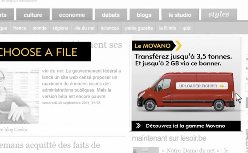
To promote the Opel Movano van range, McCannLowe created a banner that is both useful and innovative. Working like file transfer services such as YouSendIt or WeTransfer, the banner lets users upload up to 2GB of data “into the rear of the van” and send it to someone across the web.
The recipient then gets an email to download the file and learn about the Opel Movano. Simple, practical, and spot-on for the target audience. This is the right kind of B2B creativity because it turns “capacity” into something you can use.
In B2B and SME logistics markets, utility-based advertising wins when the ad itself performs a real job for the viewer. Here, “utility-based advertising” means the ad unit delivers a small, real service before it asks for attention.
When the ad behaves like a service
The smart move is that the interaction mirrors the product story. The Movano is built to carry stuff. So the banner becomes a carrying service for digital “stuff.” That alignment makes the message feel proved, not claimed. The real question is whether your creative can earn attention by doing a job your audience already needs done.
Extractable takeaway: If your product promise is functional, build a functional ad. A banner that does a real task can earn attention without needing a hard sell.
The mechanism: upload, send, deliver
The mechanic is easy to explain and easy to repeat. Choose a file. Upload it into the banner unit. Send it to a contact. The brand payload arrives as part of the delivery moment, which is when the recipient is most attentive. Here, “brand payload” is the branded context and message that rides along with the delivery. Because the brand arrives at the exact moment the task succeeds, the mechanism turns utility into positive brand proof.
In B2B commercial vehicle marketing, utility-first creative tends to work best when it removes friction inside an existing workflow.
Why this is a strong commercial vehicle play
Commercial vehicle advertising often struggles because capabilities blur together. This execution dramatizes “capacity” in a way people can feel immediately, and it does it in the same environment where business users already move files and coordinate work.
Service-first takeaways for B2B banners
- Make the benefit experiential. If the product carries, let the ad carry.
- Keep the flow obvious. One task, one outcome, no learning curve.
- Use the recipient moment. Delivery creates a second touchpoint that feels useful, not intrusive.
- Match the utility to the audience. File sending is naturally relevant for business users.
- Keep branding inside the service. The brand should feel like the enabler, not the interruption.
A few fast answers before you act
What is the Opel Movano “File Mover” banner?
It is an interactive banner that works like a file transfer tool. Users upload a file into the banner, send it, and the recipient receives an email to download the file along with Opel Movano information.
Why is “utility” such a strong creative strategy in B2B?
Because it earns attention through usefulness. A business audience is more likely to engage when the ad helps them do something real, even briefly.
What makes this different from a standard lead-gen banner?
The value exchange is immediate. The user gets a working service, and the brand message is attached to the service delivery rather than gated behind a form.
What’s the biggest execution risk in a “service banner”?
Reliability and trust. If uploads fail, emails do not arrive, or the experience feels unsafe, users abandon quickly and the brand takes the blame.
How could a brand update this idea today?
Keep the same principle. Offer a real micro-service inside the ad unit. Then design the handoff so it is fast, secure, and clearly permission-based.