URA.RU: Make the Politicians Work

URA.RU: Make the Politicians Work

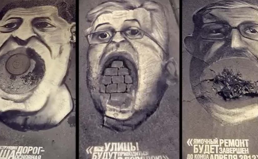
The quality of roads is an eternal problem in Yekaterinburg, described as one of Russia’s largest cities. A local news website, URA.RU, decided to pressure local politicians to do something about it.

One night, with the help of ad agency Voskhod, they drew the faces of the governor, the mayor and the vice-mayor on three potholes in the city center. The next day the caricatures became a sensation, and with the intense PR around them the politicians could no longer sit idle.

Potholes as portraits

This is a brutally simple flip. If a pothole is “nobody’s problem”, make it somebody’s face. The street becomes a front page, and the damage becomes personal, visual, and impossible to ignore once it is photographed and shared.

How the mechanism creates pressure

The mechanism is pure ambient PR. Here, that means using the street itself as the media surface and public attention as the distribution layer. Pick a small number of highly visible road holes. Paint recognizable leaders onto them overnight. Let morning traffic and pedestrians do the distribution by taking photos and talking. Once the story is moving, officials are forced to respond because the issue now has a daily reminder and a public symbol.

In local accountability campaigns, reframing infrastructure neglect as a public symbol is often the fastest way to turn complaints into action.

Why it lands

It lands because it is legible in one glance and sticky in memory. The portraits convert an abstract civic problem into a shareable image with a clear target, without needing a long argument. It also escalates pressure without escalating cost. The “media buy” is the city itself, and the amplification is the public’s instinct to photograph the outrageous.

Extractable takeaway: If you can turn a slow-burn community frustration into a single, repeatable visual metaphor, you give press and citizens an easy story to carry. That story becomes the lever that forces a response.

What URA.RU is really doing

This is not art for art’s sake. It is agenda-setting. The real question is not how to complain louder, but how to give the complaint a symbol the city cannot stop seeing. URA.RU uses a small physical intervention to manufacture a news moment that keeps the road problem in the spotlight until something changes. The painted potholes are the trigger. The sustained coverage is the engine.

How to turn civic neglect into a pressure symbol

  • Make the issue visual. If it cannot be photographed, it will not travel.
  • Choose a small number of high-impact placements. Concentration beats spread for PR.
  • Use a metaphor that explains itself. The best ambient ideas need no captions.
  • Design for morning discovery. Overnight installs maximize surprise and coverage.
  • Plan the follow-up story. The goal is not attention. The goal is a visible response.

A few fast answers before you act

What is “Make the Politicians Work”?

An ambient PR action where a news site and an agency painted leaders’ faces onto potholes so the road problem became a public symbol and a media story.

Why is this more effective than a petition or complaint thread?

Because it produces a visual headline that spreads fast, keeps pressure on officials, and is difficult to ignore once it becomes widely photographed.

Is this activism or advertising?

It behaves like both. The tactic uses advertising craft to create civic pressure, with PR distribution doing most of the work.

What is the biggest risk with a “shame-based” stunt?

Backlash. If it is perceived as defamatory, unfair, or unsafe, the story can flip against the organizers instead of against the problem.

How can a city issue campaign copy the approach safely?

Keep the metaphor clear, avoid personal attacks beyond what is necessary, and anchor the action to a solvable request so the pressure has a practical endpoint.

Philips Russia: The Art of Ironing

Philips Russia: The Art of Ironing

Earlier this year I had covered a couple of novel approaches to art. Joining that collection is this film from Philips Russia, where the performance of its irons and steamer products is demonstrated by recreating famous Dutch paintings on a plain piece of white cloth.

It is a simple setup with a surprising payoff. A sheet. A tool you already understand. Then, with pressure, heat, and steam, the fabric starts behaving like a canvas.

When fabric becomes a canvas

The craft trick is that wrinkles and flattened areas act like light and shadow. Steam relaxes fibres, pressure fixes the fold, and controlled temperature makes the result repeatable. In other words, the “brushstroke” is not pigment. It is texture, created and locked in by the iron.

In global consumer electronics and home appliance marketing, the hardest job is to make small performance differences feel tangible in seconds.

Why it lands

This works because it makes an invisible promise visible. Most iron claims are abstract. More steam. Better glide. Fewer wrinkles. Here, the demonstration turns those claims into a proof you can read from across the room. That is why the idea persuades so quickly: the same steam, pressure, and temperature control needed to shape fabric into a portrait also signals control over everyday wrinkles. If an iron can reliably “draw” with fabric, it can reliably handle a shirt collar.

Extractable takeaway: When your product benefit is hard to evaluate (speed, precision, consistency), design a demo where the benefit becomes a visible artefact. The artefact should be legible instantly and hard to fake without the real capability.

What Philips is really selling

The paintings are the hook, but the real message is controllability. Consistent steam output. Predictable temperature. Even pressure. The art is not the point. It is the credibility vehicle that lets viewers infer performance without needing specs.

The real question is how to make product control visible before a viewer has to trust the spec sheet.

The spot is credited to DDB Moscow, which fits the overall approach. Make the proof the story, not the claim.

What to steal for your next product demo

  • Pick a “hero capability” and exaggerate it safely. If precision matters, show precision at a level nobody expects in the category.
  • Use a familiar reference. Famous paintings function as a built-in quality benchmark. Viewers know what “good” looks like.
  • Make the proof readable without explanation. If the demo needs narration to work, it is probably not a demo yet.
  • Engineer for repeatability. The best demos look like magic, but behave like a process.

A few fast answers before you act

What is “The Art of Ironing”?

It is a Philips Russia film that demonstrates iron and steamer performance by recreating classic Dutch paintings using wrinkles and flattened texture on white cloth.

What product point does the demo prove?

Control and consistency. Steam output, temperature stability, and pressure control are implied by the ability to create repeatable, detailed fabric texture.

Who is credited for the campaign?

The campaign is credited to DDB Moscow.

Why use famous paintings instead of an original design?

Recognition compresses understanding. Viewers instantly know the reference, so they can judge the fidelity without being taught the criteria.

How can another brand use this approach without copying it?

Translate the principle, not the prop. Choose a culturally familiar benchmark in your category, then create a visible artefact that only your real capability can produce.

REHAU: Money Rain

REHAU: Money Rain

Someone opens a window in winter and starts throwing banknotes into the street. Not a metaphor. Actual money, drifting down like confetti.

That is the demonstration Voskhod builds for REHAU windows. Utility bills keep climbing, and poorly sealed windows turn heat into waste. So the campaign makes the waste visible by “throwing money out of the window”, literally, from low-quality windows. It is a street-level proof that translates heat loss into something anyone can recognize instantly.

Making heat loss look like cash loss

The mechanic is blunt by design. If heat is leaking through your window, your heating budget is leaking too. The stunt turns an invisible inefficiency into a visible spectacle, then ties the solution to REHAU windows and the campaign line “Heatonomy”, a label for treating heat-saving as household economics rather than technical performance.

In cold-climate home improvement markets, the most persuasive product stories convert invisible energy inefficiency into a simple, observable loss that people can picture in their own home.

The real question is how do you make invisible energy waste feel immediate enough that people stop treating better windows as a technical upgrade and start seeing them as basic household economics?

Why it lands as public theatre

The idea works because it skips technical education and goes straight to lived consequence. People do not need U-values or thermal imagery to understand money falling onto the pavement. The spectacle also makes the press angle easy. A strange, concrete act in a familiar setting, with a clear explanation attached. The legacy write-up describes extensive earned coverage and a nationwide reach figure, framed as the campaign’s outcome.

Extractable takeaway: When your product fixes an invisible problem, create a one-scene demonstration that makes the cost of “doing nothing” undeniable, then anchor the solution in a single line that people can repeat.

What REHAU is actually selling

It is not just windows. It is control over household economics in winter. The campaign positions better windows as a direct hedge against rising heating costs, and it gives people a language hook, “Heatonomy”, to describe the benefit without getting technical.

What home-efficiency brands should steal

  • Turn abstraction into a physical proxy. Heat loss becomes cash loss, instantly understood.
  • Build a stunt the media can summarize in one sentence. If it cannot be repeated cleanly, it will not travel.
  • Keep the solution adjacent to the spectacle. The product has to be the obvious answer, not an afterthought.
  • Give the audience a compact label. A coined term can help people remember and share the benefit.

A few fast answers before you act

What is the “Money Rain” idea?

A public stunt that demonstrates heat loss by throwing real money out of low-quality windows, framing wasted heat as wasted cash, then linking the fix to REHAU windows.

What does “Heatonomy” mean in this context?

It is presented as a shorthand for heating economy. A way to express savings from reduced heat loss without technical explanations.

Why does a stunt work better than a technical comparison here?

Because the problem is normally invisible. A visceral proxy creates instant understanding and makes the message repeatable by viewers and press.

What results did the campaign claim?

The legacy description reports broad media pickup, a total of 240,000 rubles thrown, and reach “over 40 million Russians”. Treat these as campaign-reported figures unless you have primary reporting you want to cite.

When should brands use a “visible loss” demonstration?

When the benefit is preventative or efficiency-based, and the audience undervalues it because they cannot see the problem day to day.