Durex Fundawear

Durex Fundawear

If t-shirts can be digitised, then why can’t underwear. Durex Australia has unveiled “Fundawear”, billed as a first-of-its-kind wearable electronic underwear concept that allows touch to be transferred over the internet while maintaining comfort, sexiness and flexibility. The idea is simple. People in long-distance relationships can tease, tickle and tantalise even when apart.

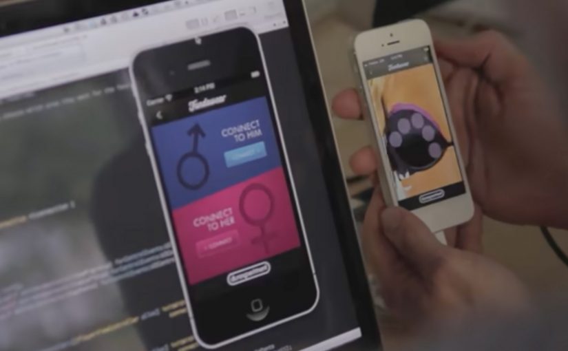
To replicate the nuances of touch, each garment houses touch technology that connects with a real-time server to communicate between touchscreen devices and the garments. Interaction happens through a smartphone interface, translating inputs into sensation on the connected wearable.

A prototype that behaves like a campaign

What makes this work stand out is the choice to launch as an experiment, not a finished product. Fundawear is framed as a prototype, which gives the brand permission to be bold, invite participation, and trigger debate, without pretending the tech is already mainstream.

Extractable takeaway: When a product concept is unfamiliar, framing it as a prototype lowers disbelief and lets curiosity do the distribution work.

The real question is whether people can understand the use case quickly enough to talk about it.

It also shifts the job of the communications. Instead of persuading people that “remote touch” is a good idea, it makes people imagine use cases. That imagination is the marketing engine.

How the technology story earns attention

The campaign leans on a clear mechanism. Touch input on a phone maps to specific zones, then the garment responds, creating a feedback loop, meaning the phone input and garment response feel connected in the same moment rather than as a delayed message.

When wearable technology is explained this clearly, it stops sounding like science fiction and starts sounding like an interface decision. That is when people share it.

In consumer innovation marketing, the leap from novelty to adoption happens when a physical interface makes a digital promise feel immediate, controllable, and consent-led.

Distribution strategy: invite the internet to co-author the idea

Fundawear is described as still in the experimental stage, with no confirmed release date at the time. But Durex uses that uncertainty as a hook. If you provide a creative reply to “How would you use Fundawear with your partner?” at the Durex Facebook page, you might win a free prototype.

That is a smart move. It turns the public into contributors, and it generates word of mouth that carries the concept further than a conventional product launch could.

What to steal if you are launching an unfamiliar product concept

  • Prototype publicly. Experiments can travel faster than “finished” products because people argue, imagine, and remix.
  • Explain the mechanism in one breath. If the audience cannot repeat how it works, they will not share it.
  • Design for participation. A prompt like “how would you use it?” converts curiosity into content.
  • Keep the tone playful, not clinical. For intimate categories, playfulness lowers the barrier to talk about it.

A few fast answers before you act

What is Fundawear, in plain terms?

Fundawear is an experimental wearable concept from Durex Australia. It pairs smart underwear with a smartphone interface so a partner can send touch inputs over the internet in real time.

What kind of technology does it rely on?

It relies on wearable haptics, meaning small actuators in the garment respond to signals from an app. A server connection synchronises inputs between two partners’ devices and garments.

Why launch a prototype instead of waiting for a finished product?

Because a prototype creates permission to experiment, earn press, and test cultural appetite. It also turns uncertainty into participation, which can generate more talk than a polished launch.

What is the biggest brand risk with intimate wearable tech?

Trust. The concept has to feel safe and consent-led, and the communication has to avoid any hint of surveillance or misuse. If trust breaks, the idea becomes a cautionary tale.

What is the core marketing lesson from Fundawear?

When the product is unfamiliar, the first job is not persuasion. It is making the mechanism and the imagined benefit instantly understandable, so people do the distribution for you.

Nokia: Mixed Reality interaction vision

Nokia: Mixed Reality interaction vision

A glimpse into Nokia’s crystal ball comes in the form of its “Mixed Reality” concept video. It strings together a set of interaction ideas: near-to-eye displays (glasses-style screens close to the eye), gaze direction tracking (sensing where you look), 3D audio (spatial sound), 3D video, gesture, and touch.

The film plays like a day-in-the-life demo. Interfaces float in view. Sound behaves spatially. Attention (where you look) becomes an input. Hands and touch add another control layer, shifting “navigation” from menus to movement.

Future-vision films bundle emerging interaction modalities into a single, easy-to-grasp story.

What this video is really doing

It is less a product announcement and more a “stack sketch”, meaning a quick story that layers several interaction technologies into one routine. Concept films are useful for alignment, but they are not validation until the interaction is prototyped and tested.

The mechanism: attention as input, environment as output

The core mechanic is gaze-led discovery. If your eyes are already pointing at something, the system treats that as intent. Gesture and touch then refine or confirm. 3D audio becomes a navigation cue, guiding you to people, objects, or information without forcing you to stare at a map-like UI. This works because it turns existing attention into a low-effort selection signal, then uses deliberate actions to reduce accidental activation.

In product and experience teams building hands-free, glanceable interfaces, this shift from menu navigation to attention-led cues is the core design trade-off.

Why it lands: it reduces “interface effort”

By “interface effort” I mean the mental and physical work of hunting through apps and menus. Even as a concept, the appeal is obvious. It tries to remove that friction by bringing information to where you are looking, and actions feel closer to how you already move in the world. The real question is whether you can make attention-led interfaces feel stable and trustworthy in everyday use.

Extractable takeaway: The fastest way to communicate a complex interaction future is to show one human routine and let multiple inputs, gaze, gesture, touch, and audio, naturally layer into it without heavy explanation.

That is also the risk. If a system reacts too eagerly to gaze or motion, it can feel jumpy or intrusive. The design challenge is making the interface feel calm while still being responsive.

What Nokia is positioning

This vision implicitly reframes the phone from “a screen you hold” into “a personal perception layer”, meaning a persistent interface that sits closer to your senses than a handset UI. It suggests a brand future built on research-led interaction design rather than only on industrial design or hardware specs.

What to steal for your own product and experience work

  • Design around one primary input. If gaze is the lead, make gesture and touch supporting, not competing.
  • Use spatial audio as a UI primitive. Direction and distance can be an interface, not just a soundtrack.
  • Show intent, then ask for confirmation. Let the system suggest based on attention, but require an explicit action to commit.
  • Keep overlays purposeful. Persistent HUD clutter kills trust. Reveal only what helps in the moment.
  • Prototype the “feel,” not just the screens. Latency, comfort, and social acceptability decide whether this works in real life.

A few fast answers before you act

What is Nokia “Mixed Reality” in this context?

It is a concept vision of future interaction that combines near-to-eye displays with gaze tracking, spatial audio, gesture, and touch to make navigation feel more ambient and less menu-driven.

What does “near-to-eye display” mean?

A near-to-eye display sits close to the eye, often in glasses-style hardware, so digital information can appear in your field of view without holding up a phone screen.

How does gaze tracking change interface design?

It lets the system infer what you are attending to, so selection and navigation can start from where you look. Good designs still require a secondary action to confirm, to avoid accidental triggers.

Why include 3D audio in a mixed reality interface?

Because sound can guide attention without demanding visual focus. Directional cues can help you locate people, alerts, or content while keeping your eyes on the real environment.

What is the biggest UX risk with gaze and gesture interfaces?

Unwanted activation. If the interface reacts to normal eye movement or casual gestures, it feels unstable. The cure is clear feedback plus deliberate “confirm” actions.