Chevrolet: Then & Now

Chevrolet: Then & Now

As a way to celebrate turning 100, Chevy creates a spot titled “Then & Now” that shows people staying connected to iconic moments, locations, and Chevrolet vehicles as if those moments are with them right there, right now.

A simple device that does the heavy lifting

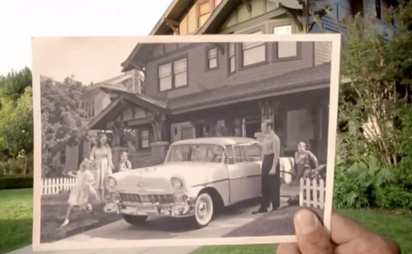
The mechanism is beautifully restrained: vintage photographs of Chevrolets and the people around them are held up to the camera in the exact same locations today, aligning past and present into a single frame.

In automotive heritage storytelling, the fastest way to communicate longevity is to make time visible with a device that needs almost no explanation.

In heritage-heavy categories, anniversary storytelling lands best when it helps the audience locate their own memories in the present, not when it asks them to admire the brand.

Why it lands emotionally

The film does not argue that the brand matters. It shows that memory matters, and lets the vehicles sit naturally inside that truth. The hand-held photos are the emotional bridge. They make nostalgia feel personal, not corporate.

Extractable takeaway: If you can make time visible with one repeatable in-scene device, you can earn nostalgia without turning the work into a corporate victory lap.

The business intent behind the sentiment

A centennial can easily become self-congratulation. This avoids that trap by focusing on the audience’s continuity. The brand is the thread that runs through people’s lives, places, and rituals, rather than the subject demanding applause. The real question is whether your anniversary work makes the audience feel time passing in their own life, not whether it proves you have been around. Anniversary work should prioritize the audience’s continuity over brand self-congratulation.

Transferable moves for anniversary work

  • Choose one visual metaphor and commit. One repeatable device beats a collage of “greatest hits”.
  • Let people be the hero. Heritage feels earned when the customer’s life is the storyline.
  • Use restraint as a quality signal. Minimal copy and slow pacing can make the work feel more truthful.
  • Anchor the past in the present. Showing the same place now keeps nostalgia from drifting into museum mode.

A few fast answers before you act

What is “Then & Now” in one line?

A centennial film that aligns vintage Chevrolet photos with the same real-world locations today to show continuity across generations.

What is the core creative mechanism?

Hand-held historical photographs matched precisely to present-day scenes, creating a single frame that contains both time periods.

Why does this approach work for anniversary advertising?

It makes time visible instantly, and it ties the brand to lived memory rather than to corporate milestones.

What should you avoid in centennial storytelling?

Avoid making the milestone the hero. If the audience cannot see their own continuity in the work, the film risks reading like self-congratulation.

What is the most transferable takeaway?

If you can show the passage of time with one simple, repeatable device, you can tell a heritage story without overexplaining it.

Newcastle Brown Ale: Shadow Art Billboard

Newcastle Brown Ale: Shadow Art Billboard

Newcastle Brown Ale’s Shadow Art has debuted in San Diego’s nightlife hub, the Gaslamp district, now through the end of September. Using only a single light source and thousands of Newcastle Brown Ale bottle caps, two New York shadow artists partnered with Newcastle to bring to life a shadow sculpture spanning 128 square feet. Shadow art is an installation that reads abstract until a specific light angle casts a deliberate image.

How it works when the sun goes down

By day it reads like an abstract field of caps. By night, the light angle does the magic. The caps become a pixel grid, and the shadow resolves into a clear image that connects directly to the brand world and the “Lighter Side of Dark” idea. Because the image only resolves under the right light angle, it invites a second look and conversation in a noisy street.

In dense entertainment districts where outdoor media competes with movement, neon, and noise, physical interactivity that rewards a second look beats anything that needs time to decode.

The real question is whether your outdoor idea earns a second look without asking for extra attention.

Why it lands

It makes the reveal the reward. The billboard does not shout at you. It waits until the conditions are right, then surprises you with an image that feels like you discovered it.

Extractable takeaway: Out-of-home becomes memorable when the medium changes state based on real-world conditions like light and viewpoint. If the message only appears when the environment cooperates, the audience feels like they unlocked it.

It uses the product as raw material. Bottle caps are not a metaphor. They are literally the building blocks, which makes the craftsmanship feel inseparable from the brand.

It turns a static surface into a time-based experience. You do not just “see an ad”. You experience a transformation. That shift is what creates talk value in public spaces. Talk value here means it gives people a simple reason to bring it up to others in the moment.

Borrow from Shadow Art billboards

  • Design for a two-stage read. First glance should intrigue. Second glance should reward with clarity.
  • Make the material part of the story. When the build uses brand-native ingredients, the proof feels baked in.
  • Choose locations where “stop and stare” is natural. Nightlife zones work because people are already scanning, wandering, and socializing.
  • Anchor the payoff to one simple brand line. The reveal should resolve into a message people can retell in a sentence.

A few fast answers before you act

What is “shadow art” in an advertising context?

An installation that looks abstract from one angle or in one lighting condition, but becomes a clear image when a specific light source and viewpoint create the intended shadow.

Why use bottle caps instead of printed graphics?

Caps add texture, depth, and authenticity. They also turn the build into a craft story that people talk about, photograph, and share.

What makes this work in a place like the Gaslamp district?

Because it competes with nightlife the right way. It creates a moment people can discover and show to friends, rather than trying to out-shout the environment.

What is the business intent behind an installation like this?

To generate earned attention and brand distinctiveness by creating a public experience that feels “worth a look”, then “worth a share”.

What is the most transferable lesson?

Build a reveal that is conditional on the real world. Light, angle, and time can do the targeting for you without any data.

Kia: Nail Art Animation

Kia: Nail Art Animation

A car commercial painted on a fake nail

Kia wanted to highlight the micro-features, meaning the small design and usability details, of their smallest car model, the Picanto. So they created a stop-motion car commercial on a fake nail. The film was billed at the time as the world’s first nail art animation.

It reportedly took 25 days to create, and used 1,200 bottles of nail polish across 900 fake fingernails.

The trick: match “micro-features” with micro-scale filmmaking

Stop-motion is an animation technique where you photograph small, incremental changes frame by frame, then play the frames back to create motion.

Here, the canvas is the punchline. By putting the story on a fingernail, the craft becomes the message. Because the viewer has to pay attention to tiny brushwork to follow the motion, the “micro” idea feels experienced, not merely claimed.

Kia’s Picanto Nail Art Animation is a stop-motion commercial created by painting hundreds of miniature frames onto fake fingernails, turning the “micro” idea into a literal production constraint.

In urban small-car marketing, novelty only matters when it directly reinforces the product promise in a way people can retell in one sentence.

The real question is whether your creative constraint makes the product promise feel inevitable, not just interesting.

This kind of craft-heavy micro-format is worth copying only when the constraint directly maps to the attribute you want people to believe.

Why it lands: the medium proves the claim

This is not just “a weird technique”. It is a tight alignment between what Kia wants you to notice and what the viewer cannot help noticing. Patience, precision, tiny details.

Extractable takeaway: When the medium forces attention onto the same detail you are selling, the audience experiences the claim rather than evaluates it.

The result is a feature demo that does not feel like a feature demo, because the viewer is busy admiring how it was made.

What the brand is buying with this level of craft

The intent is simple. Make a small car feel like a smart choice, not a compromise. Micro can mean cheap or micro can mean cleverly designed. This execution pushes the second interpretation.

It also creates built-in distribution. People share the making-of story as much as the spot itself.

Steal this micro-detail storytelling pattern

  • Let the production constraint carry the positioning. If you sell “small but smart,” make the format small but smart.
  • Design for instant explainability. “A car ad on a fingernail” is a headline by itself.
  • Make craftsmanship visible. When the effort is obvious, skepticism drops.
  • Connect novelty to product truth. Weirdness alone fades. Alignment endures.

A few fast answers before you act

What is Kia’s Picanto Nail Art Animation?

It is a stop-motion commercial for the Kia Picanto created by painting animation frames onto fake fingernails, so the car and its features appear in motion on a tiny nail-sized canvas.

How was the stop-motion effect created on nails?

Each frame was painted as a miniature nail artwork on separate fake nails. The nails were then photographed frame by frame, and the images were stitched together to create movement.

Why is this a smart way to communicate “micro-features”?

Because the medium embodies the message. A micro-scale format forces attention onto tiny details, which makes “small but thoughtfully designed” feel proven, not claimed.

How long did it reportedly take, and what made it so labor-intensive?

It reportedly took 25 days and required painting and photographing hundreds of tiny frame changes. The labor is the point. The visible effort makes “micro-details” feel credible.

What should you copy if you want to tell a “detail story” in your own category?

Pick a constraint that naturally spotlights the detail you care about. If the constraint does not reinforce the promise, the craft reads as novelty and the message evaporates.