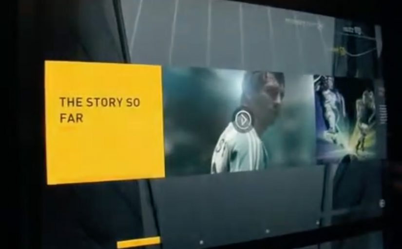
A footwear wall that behaves like ecommerce
The future of instore displays is here. With this example you will see how today’s instore displays are evolving to meet our online experiences.
Adidas has created an in-store digital experience that was described at the time as showcasing over 8,000 Adidas shoes. The technology can be easily deployed to allow almost any retailer to sell the entire Adidas product range without having to be a flagship store in a major city.
How the adiVerse wall runs in-store
The experience is defined by a large footwear wall, made of multiple LCD touch screens that use facial recognition to detect a customer’s gender on approach to the wall. The adiVerse virtual footwear wall then customizes the product experience for that gender, and helps guide them to the perfect shoe.
Alternatively it lets them browse the entire range of products, with each shoe rendered in real-time 3D.
Endless aisle is a retail setup where a store sells the full catalogue digitally, even if only a fraction of it is physically stocked on the shelf.
In multi-brand sporting goods retail, bridging endless-aisle breadth with guided discovery is the difference between “too much choice” and “the right choice”.
Why it feels like online shopping, only bigger
This is essentially ecommerce browsing translated into a shared physical surface. You can scan, filter, compare, and inspect details, but the store controls the pacing and the context.
The mechanism that matters is the blend of quick orientation plus depth on demand. The wall can help you narrow down, then let you dive into a single shoe in 3D with richer content when you care.
Content depth for the winners, speed for everything else
The most popular products in the range get the full content play, including videos, game stats, product specs and even twitter feeds. Everything else stays light, so browsing does not become slow or confusing.
This “tiered content” approach is a practical way to keep performance high while still making hero products feel premium.
The retail play hiding inside the screens
In the end customers can add their selected product into a virtual cart, and check out via an iPad that the store sales staff would have.
That last step is the business intent. Sell the long tail without expanding floor space, while keeping checkout and assistance inside the store experience.
The adiVerse Virtual Footwear Wall is an in-store touchscreen wall that lets shoppers browse a large adidas shoe catalogue, inspect products in real-time 3D, and hand selections to store staff for checkout via tablet.
What to steal for your own digital wall
- Build an endless aisle that feels curated. Offer the full catalogue, but guide to a shortlist fast.
- Use tiered content deliberately. Deep media for hero products. Lightweight data for everything else.
- Make staff checkout the final bridge. Tablets in hand keep conversion human and immediate.
- Design for “public browsing”. Big screens invite group decisions. The UI should support that.
A few fast answers before you act
What is the adiVerse Virtual Footwear Wall?
It is an in-store wall of touchscreen displays that lets shoppers browse a large adidas shoe catalogue, inspect products in real-time 3D, and pass selections to staff for checkout via tablet.
What does “endless aisle” mean in this context?
It is a retail setup where a store can sell the full catalogue digitally, even if only a fraction is physically stocked on the shelf. It expands choice without expanding floor space.
How does it personalize the experience?
It uses facial recognition to detect gender on approach and adapts the interface to that mode, while still allowing shoppers to browse the full range if they prefer.
Why does real-time 3D matter on a digital wall?
Because it supports confident decision-making in-store. Shoppers can inspect details quickly and compare options without needing a physical sample of every model.
What is “tiered content”, and why is it useful?
Hero products get rich media like video and deeper specs, while the long tail stays lightweight. This keeps browsing fast while still making winners feel premium.
How does checkout work in the flow?
Selections are handed to store staff who complete checkout on a tablet. That keeps conversion human and immediate, instead of pushing shoppers to leave the store journey.
What should retailers measure to judge success?
Uplift in conversion for non-stocked variants, assisted sales rates, time to shortlist, and basket size. Also track whether the wall reduces “too much choice” by increasing confident decisions.


