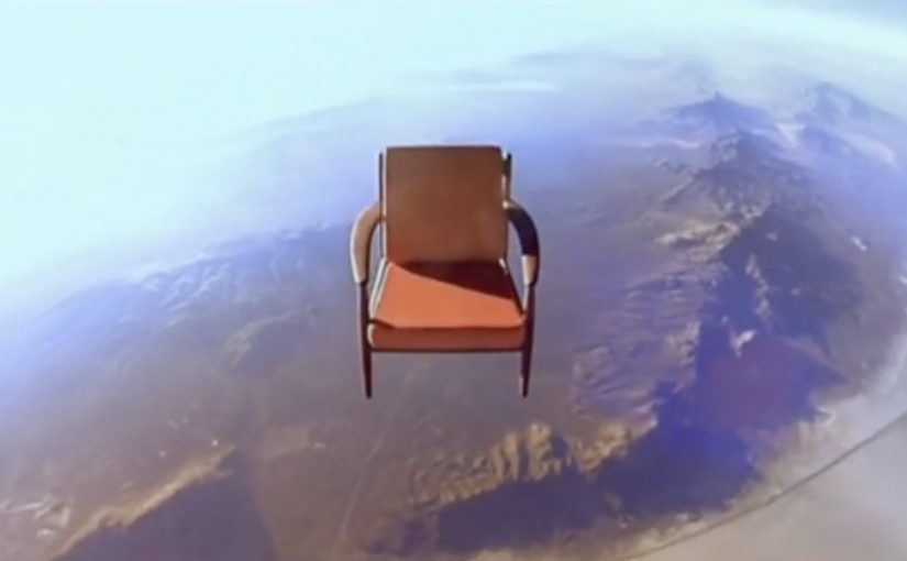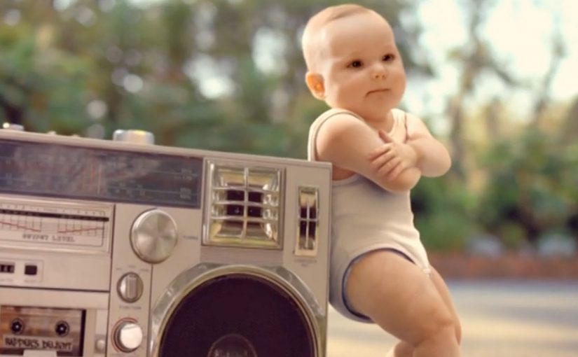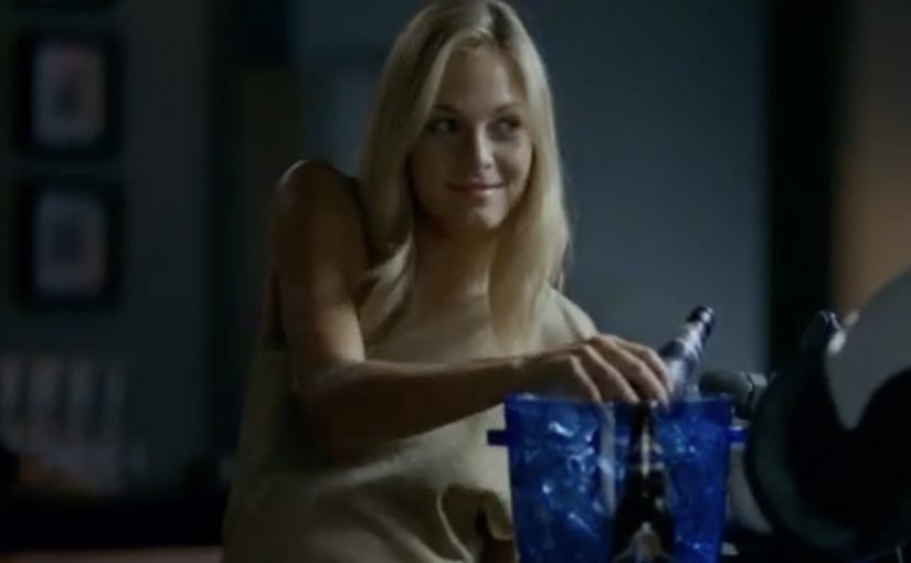
How far would you go for a bottle of Tiger Beer? That is the question posed by the campaign for the brand by Saatchi & Saatchi.
A last-bottle dare, turned into a brand moment
Reportedly, the film plays the “last bottle” scenario as a competitive, larger-than-life showdown, then punctures the testosterone with a dose of feminine charm. It is a simple tension. One bottle. Too many people who want it. Social rules bend fast when scarcity shows up.
From TV tension to small digital interactions
Mechanically, the idea extends beyond the TVC (television commercial) by giving fans lightweight ways to participate: a personality quiz, downloadable avatars, a wallpaper creation function, and a “happy hour” reminder widget that nudges people to take a break after a long day at work.
In Southeast Asian beer marketing, translating a TV story into lightweight, shareable participation is a reliable way to extend reach beyond the media buy.

A useful pattern here is the conversion of one emotional hook into repeatable touchpoints. Identity (quiz result). Self-expression (avatar). Personalization (wallpaper). Timing cue (the reminder widget). Each interaction is small, but it keeps the campaign’s core question alive in moments when people are actually deciding what to do next.
Brands should resist bolting on unrelated features and instead reuse the same tension across every micro-interaction.
The real question is whether the digital layer keeps the same scarcity tension alive at the moment someone can act on it.
What the “happy hour” widget is really doing
Even if someone watches the film once, a time-based reminder can re-open the narrative at the most relevant moment. End of work. Start of social time. This works because the timing cue re-enters a real routine, so the story resurfaces when choices are being made. It is not about “more content”. It is about putting the same story back in front of the user when it can convert into action or talk value.
Extractable takeaway: A timing mechanic is often the highest-leverage digital element because it returns the same story at decision time, not just at viewing time.
How to reuse a scarcity premise in digital
- Start with one tension. If the film’s premise can be summarised in one sentence, it is easier to translate into digital actions.
- Design for replay, not depth. Quizzes and downloads work when they are fast, obvious, and socially legible.
- Add a timing mechanic. A reminder widget or calendar nudge can outperform another “feature” because it re-enters a real routine.
- Keep every interaction tied to the same story. If an element does not reinforce the core question, it becomes decoration.
A few fast answers before you act
What is “The Last Tiger” concept?
A scarcity story. One “last bottle” triggers social competition, and the campaign invites viewers to imagine how far they would go for it.
How does the digital layer support the TV film?
It breaks the central tension into quick actions people can complete and share: a quiz, avatar downloads, wallpaper creation, and a time-based “happy hour” reminder.
Why include a “happy hour” reminder widget?
Because it re-surfaces the campaign at a high-intent moment. The end of the workday. The start of social decisions.
What makes the digital interactions feel connected, not gimmicky?
They all reinforce the same premise. One last bottle, and the social scramble it triggers. If an interaction does not echo that tension, it will not travel.
What is the transferable lesson for other brands?
Turn one strong film premise into three to five tiny interactions that reinforce the same story, and add at least one timing cue that re-enters a routine.