
Raining Polar Bears: Shock Against Short-Haul

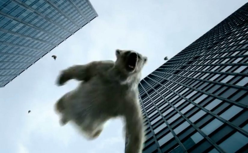
A shocking ad with a brutal message: every short haul flight you take emits four hundred kilogrammes of carbon dioxide. The equivalent weight of an adult polar bear.

This is the promotional film from anti-aviation expansion campaigners Plane Stupid.

It is a hard-hitting piece of communication because it skips the abstract science and goes straight for a physical, imaginable consequence. You cannot “feel” four hundred kilograms of CO₂. But you can picture a polar bear’s mass, and you can picture it falling. The metaphor is deliberately uncomfortable.

A metaphor designed to make emissions feel heavy

The mechanism is simple: translate an invisible output into a visible burden. By mapping a single flight to a single, concrete weight, the campaign turns “carbon” into something that feels measurable and personal. The viewer is pushed to connect a routine choice with an outsized consequence. This works because a weight-based image is easier to remember and retell than an abstract emissions number.

In European organisations where sustainability goals collide with travel habits, this kind of metaphor is used to make the trade-off feel immediate.

In behavior-change communication, metaphors work best when they translate an invisible impact into a concrete, repeatable image people can easily retell.

Why this kind of brutality gets attention

Shock tactics work when they force a moment of interruption. They create a jolt that breaks autopilot. In this case, the jolt is not gore or fear for its own sake. It is moral discomfort. The message implies complicity. It suggests that “small” flights are not small at all when you translate them into a consequence you can carry in your head. Used sparingly and paired with a believable alternative, shock can be a legitimate behaviour-change lever; used without one, it is counterproductive.

Extractable takeaway: If you need to shift norms, convert impact into one vivid unit people can repeat from memory, then make the next step feel doable.

But there is a trade-off. If the audience feels judged or helpless, they can disengage. The campaign therefore depends on whether the viewer sees a plausible alternative, like rail, coach, fewer trips, or simply resisting the idea that every short hop is “normal”. Here, an off-ramp means a clear, doable alternative the viewer can choose instead of flying. Without an off-ramp, shock can become noise.

The real intent: change what feels acceptable

The business intent here is public pressure. Plane Stupid campaigns against aviation expansion. To do that, it needs cultural permission to tighten constraints: fewer runway projects, fewer short-haul routes, and a stronger argument that alternatives should win. The film is a lever to make policy positions feel socially justified.

The real question is whether you can make “short haul” feel unacceptable without making the audience tune out.

What to borrow from this shock metaphor

  • Make the invisible visible. Translate abstract impact into a physical metaphor that is easy to repeat.
  • Anchor to a single action. “One short-haul flight” is specific. It removes debate about averages and totals.
  • Choose a symbol that carries meaning. The polar bear arrives pre-loaded with climate context, for better or worse.
  • Plan the off-ramp. If you want behaviour shift, pair the shock with credible alternatives people can act on.
  • Measure backlash, not just reach. Shock optimizes attention. Track whether it also produces avoidance.

A few fast answers before you act

What is “Raining Polar Bears” trying to say?

It argues that short-haul flights have a disproportionately high carbon cost. It makes that cost feel tangible by equating one flight’s emissions to the weight of an adult polar bear.

Why use a polar bear in a climate campaign?

Because it is an instantly recognized symbol of climate impact. It compresses a complex topic into a single image people remember and retell.

Do shock tactics actually change behaviour?

Sometimes. They can disrupt complacency and create attention. They can also trigger defensiveness if people feel accused or see no realistic alternatives.

How do you make a shock campaign more effective?

Pair the emotional jolt with a clear path to action, and ensure the audience believes the alternative is doable. Without that, the message can be dismissed as moralizing.

What is the practical takeaway for marketers and communicators?

If you want to shift norms, translate impact into something concrete, memorable, and repeatable. Then make the next step obvious so attention converts into action.
Ikea’s Facebook Showroom

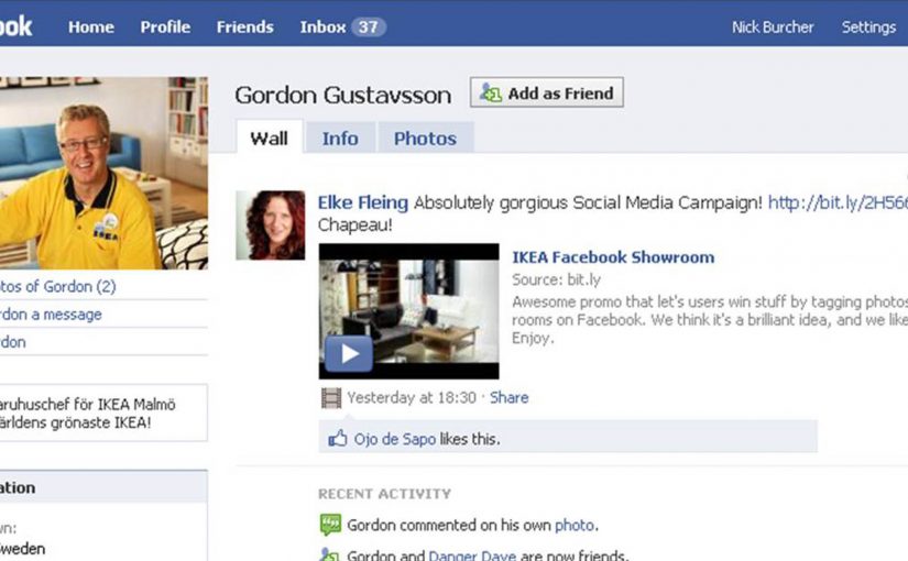
You see a photo of an Ikea showroom in a Facebook album. The caption is simple. Tag the product you want. If you are first to tag it with your name, you win the item. One photo turns into a race. One tag turns into a claim.

The challenge. Breaking through Facebook clutter

Facebook is getting cluttered with brands screaming about themselves. Forsman & Bodenfors from Sweden leans into the platform instead of fighting it. They turn a basic Facebook behavior. Photo tagging. Into the promotional mechanic. Here, the mechanic is the simple rule set that rewards the first tag.

The real question is how to turn a crowded feed into a game people choose to play, not just a message they scroll past.

When the platform already has a native action people do without thinking, build the promotion on that action instead of adding extra steps.

The setup. A manager profile as the campaign hub

To promote the opening of Ikea’s new store in Malmö, Sweden, the campaign starts with a profile for the store’s manager, Gordon Gustavsson. With a small media budget, the experience is designed to spread through participation rather than paid impressions.

How it works. Tag to win

  • Gustavsson uploads pictures of the store’s showrooms into a Facebook photo album.
  • People browse the photos and tag the Ikea items they want with their own name.
  • The first person to tag a specific item wins it.

In European retail launches with tight media budgets, participation mechanics that travel through friends lists can do more work than another round of brand posts.

Why this works. Desire, speed, and public proof

The mechanic converts attention into action immediately. People do not just look at product photos. They interact with them. The tagging action creates public proof that others can see, and it naturally spreads Ikea products across networks without adding extra friction. Here, public proof means the visible tags on each item that signal demand and participation. Because tagging is instant and public, each claim doubles as distribution and social validation.

Extractable takeaway: If you can tie a desired outcome to a native platform action and make the action visible, you get behavior change and distribution in the same move.

Moves worth copying for your next launch

  • Use a native action as the CTA. Pick something the platform already trains people to do, then make that the whole interaction.
  • Make the action public by default. Visibility creates momentum and keeps the experience self-propagating.
  • Reward speed, not form-filling. The shorter the path from desire to action, the less drop-off you create.
  • Let one asset do double duty. A single photo should work as content, interface, and trigger for participation.

A few fast answers before you act

What is Ikea’s Facebook Showroom?

A Facebook campaign for Ikea’s Malmö store opening that uses photo tagging as a “tag first, win the item” mechanic.

What is the core user action?

Browse the showroom album and tag the product you want with your own name. The first person to tag a specific item wins it.

Who runs the profile and album?

The campaign centers on a profile for the store manager, Gordon Gustavsson, who uploads the showroom photos.

What makes it spread without heavy media?

Tagging is already a native Facebook behavior. Each tag is visible and shareable, so participation creates distribution.

What is the transferable pattern for brands?

Turn a native platform action into the promotional mechanic, then let participation create the distribution.

Chubb Nord-Alarm: Hardcore DM via a Balloon

A balloon that turns “DM” into a moment

Here is a direct mailing done for Chubb Nord-Alarm Security Systems by an agency in Germany called Philipp und Keuntje. “Hardcore DM” here simply means direct mail that commits to a physical object. Not a brochure with a clever headline, but a mailed item that changes the mood of a room the second you notice it.

The mechanics behind the balloon

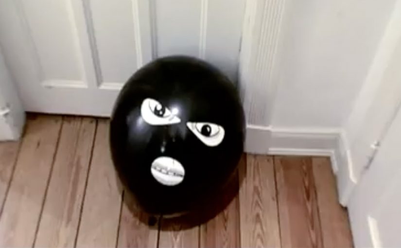
The piece centers on a black balloon printed with a face. It is simple, low-tech, and instantly legible as “something is here” once it is out of the envelope and in your space.

That works because the object turns a printed message into an intrusion cue the recipient experiences in real space.

In European direct marketing, physical mail earns attention when the object itself carries the idea and the reveal happens in the recipient’s hands.

Earlier this year, “Balloon” received major award recognition in direct mail and ambient-style media, which matches what it is doing: turning a familiar household item into a trigger.

Why this lands in the hallway

Security is a category where attention is driven by felt risk, not feature lists. A balloon with a face works because it creates a tiny, harmless violation of normality. That emotional jolt is the message.

Extractable takeaway: If your product protects people, make the first touchpoint feel like the problem entering the room. Then let the brand arrive as the solution.

What it is trying to sell

The business intent is straightforward: make “intrusion” visceral, then attach that feeling to the brand name so the next step, quote request, call-back, or site visit, feels justified rather than optional.

The real question is whether the mailer can make intrusion feel immediate before the brand makes its sales case.

This is strong direct mail because the object does the persuasion before the copy starts.

What to steal for your next direct-mail drop

  • Choose an object people already understand. The less explanation needed, the more the brain focuses on meaning.
  • Make the reveal tactile. If the recipient has to touch it, the message gets encoded as experience, not as copy.
  • Keep the brand role clean. First create the “problem cue,” then let the brand be the relief.
  • Design for shareability without asking for shares. If it looks strange in a home or office, it becomes a conversation starter.

A few fast answers before you act

What makes this “hardcore” direct mail?

It is not “hardcore” because it is expensive or complex. It is “hardcore” because it uses a physical object as the core idea, not as packaging around a printed message.

When does a tactile mailer beat digital?

When you need emotional comprehension fast, especially for categories tied to safety, risk, or trust. A physical cue can create a felt reaction in seconds, before rational evaluation starts.

How do you make direct mail feel like an experience?

Build the message into the object, not into a paragraph. Aim for a single action, a single reveal, and a single meaning the recipient can explain to someone else in one sentence.

How do you know the object is carrying the idea?

If the object still communicates the core tension before anyone reads supporting copy, it is doing the strategic work. If not, it is only decoration.

What are the common failure modes of stunt mail?

If the object needs a long note to explain it, it collapses. If the brand arrives too early, it feels like a gimmick. If the follow-up path is unclear, the attention does not convert.