
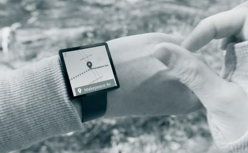
Project Soli: Hands Become the Interface

Google ATAP builds what people actually use

Google ATAP is tasked with creating cool new things that we’ll all actually use. At the recently concluded Google I/O event, they showcase Project Soli. A new kind of wearable technology that wants to make your hands and fingers the only user interface you’ll ever need.

This is not touchless interaction as a gimmick. It is a rethink of interface itself. Your gestures become input. Your hands become the control surface.

The breakthrough is radar, not cameras

To make this possible, Project Soli uses a radar that is small enough to fit into a wearable like a smartwatch.

The small radar picks up movements in real time and interprets how gestures alter its signal. This enables precise motion sensing without relying on cameras or fixed environmental conditions.

In wearable computing and ambient interfaces, the real unlock is interaction that works in motion, without relying on tiny screens.

The real question is whether wearables can move beyond miniaturized apps and make interaction work in motion, without a screen-first mindset.

The implication is straightforward. Interaction moves from screens to motion. User interfaces become something you do, not something you tap.

Why this matters for wearable tech

Wearables struggle when they copy the smartphone model onto tiny screens. Wearable UX should treat the screen as optional, not primary.

Extractable takeaway: When the screen becomes the bottleneck, shift the interface to sensing and interpretation, then keep the gesture vocabulary small enough to learn fast.

Instead of shrinking interfaces, it removes them. The wearable becomes a sensor-driven layer that listens to intent through movement.

If this approach scales, it changes what wearable interaction can be. Less screen dependency. More natural control. Faster micro-interactions.


What Soli teaches about hands-first UX

  • Start with intent, not UI. Define the handful of moments where a gesture is faster than hunting for a screen.
  • Design for motion. Favor interactions that work while walking, commuting, or doing something else with your attention.
  • Keep the gesture set teachable. A small, consistent vocabulary beats a large library that nobody remembers.

A few fast answers before you act

Is Project Soli just gesture control?

It is gesture control powered by a radar sensor small enough for wearables, designed to make hands and fingers the primary interface.

Why use radar instead of cameras?

Radar can sense fine motion without relying on lighting, framing, or line-of-sight in the same way camera-based systems do.

What is the real promise here?

Interfaces that disappear. Interaction becomes physical, immediate, and wearable-friendly.

What should a product team prototype first?

Pick one high-frequency moment where a quick gesture could replace a screen tap, and test whether the sensing feels reliable in motion.

What is the biggest adoption risk?

If gestures feel inconsistent or hard to learn, people will default back to the screen. The bar is effortless, not novel.
FOREO: MODA Digital Makeup Artist

Never got the hang of applying makeup with your own hands? MODA from FOREO is billed as a digital makeup artist that takes the “tutorial” culture online and turns it into an automated, 30-second application moment.

From a chosen look to a mapped face

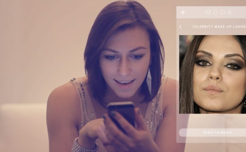
The flow starts in an app: you select a style to emulate. That style can come from MODA’s image library, a celebrity photo, or a picture of a fashionable friend. MODA then scans facial features to align the look. In other words, it maps facial landmarks so placement follows the wearer’s features. MODA then adapts colors and shapes to suit the wearer’s skin tone and face shape.

How the device applies the look

Once the selection is set, the user places their face into the device and MODA “paints” the chosen look directly onto the face, described as using makeup ink that is FDA-approved. Here, “ink” refers to the makeup medium the device dispenses onto the skin. The proposition is speed and repeatability: copy a look, personalize it, apply it, done.

In consumer beauty tech, shifting makeup from manual skill to an automated service experience changes the value from “how well you apply” to “how fast you can experiment”.

Why this idea has an audience

Online videos teaching people to copy celebrity styles are already a mass behavior. MODA’s bet is that many people do not want more instruction. They want a shortcut. Because the device applies the look for you after scanning and personalization, “trying a look” can become as easy as choosing one. The real question is whether the applied result looks credible enough that people will trust it without extra tutorial time. This framing is compelling because it shifts beauty from a practiced skill to a repeatable service moment.

Extractable takeaway: When a category is stuck on “learn the skill,” the highest-leverage innovation is often a service layer that turns inspiration into a fast, repeatable outcome, not another tutorial.

What MODA teaches about beauty UX

  • Collapse inspiration to action. Let people pick a reference look and get to an applied result quickly.
  • Personalize by default. Use scanning and simple adjustments so the outcome fits the individual, not just the template.
  • Design for repeatability. Make it easy to re-run a look, tweak it, and compare outcomes without starting from scratch.

A few fast answers before you act

What is MODA in one line?

A device billed as a “digital makeup artist” that uses an app selection plus facial scanning to apply a chosen makeup look in about 30 seconds.

What makes this different from AR try-on?

AR try-on is an on-screen overlay that previews a look digitally. MODA’s promise is physical application on the face after scanning and customization.

How does a user choose a look?

Through an integrated smartphone app, choosing from a library or supplying a reference image such as a celebrity photo or a friend’s picture.

How does MODA personalize a look to your face?

It’s described as scanning facial features and then adapting the chosen reference look by adjusting placement, shapes, and color choices to better fit the wearer’s face shape and skin tone before applying it.

Who is MODA pitched for?

People who want to experiment with different looks quickly, especially those who do not enjoy the learning curve of manual application and tutorials.

Brake New Zealand: Living Memories

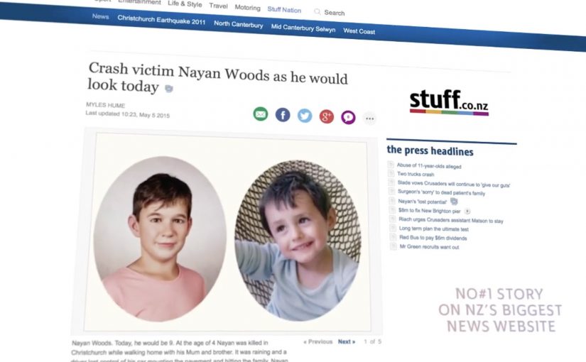
Five families sit down to meet someone they have not seen in years. Not in footage, and not in memory. They are shown a new portrait of what their child would look like today if the crash had not happened.

That is the emotional core of “Living Memories”, a campaign created for New Zealand road safety charity Brake with Y&R New Zealand. Five bereaved families volunteer their stories and photographs. A forensic age progression specialist creates an age-progressed sketch for each child, then Weta Digital applies a film-grade 3D character workflow to render those sketches into lifelike portraits.

From forensic sketch to a portrait that feels real

The mechanics are deliberately simple and respectful. Start with family photos. Build a plausible “today” version using forensic age progression. Then use a VFX-grade craft process to land realism: facial structure, skin texture, hair, lighting, and the small imperfections that make an image feel like a person, not a concept.

In interviews about the project, the team describes avoiding the usual driver-centric shock formula. Instead, the work reframes a fatal crash as a theft of future, not only a loss of life. The portraits are the device that makes that reframing unavoidable, which is why the work lands as empathy instead of another warning people learn to tune out.

In road safety communication, behaviour change work gets stronger when it makes consequences specific, personal, and imaginable, rather than statistical and abstract.

Why it lands without lecturing

The real question is how to make the cost of a crash feel immediate before another family has to imagine the years that never happened. It works because it replaces generic warning language with a concrete counterfactual. That counterfactual means a specific life that should have continued. You are not asked to fear injury. You are asked to face a specific life that could have continued. That shift moves the message from compliance to empathy, and empathy is harder to shrug off. This is a stronger road safety move than another driver-centric shock ad because it turns consequence into empathy instead of noise.

Extractable takeaway: If you need behaviour change, pick one vivid, human “missing future” moment your audience can picture in seconds, and build your creative device around making that moment feel undeniably real.

The brand and charity intent behind the emotion

Brake’s job is awareness plus support for people affected by road trauma. This execution earns attention without spectacle, and it gives the charity a clear platform story to carry through the week. For Y&R, it is a case study in how craft and restraint can outperform volume, especially when budgets are limited.

What to steal for your next high-stakes message

  • Stop telling people to “be careful”. Show the specific, lifelong cost of one decision.
  • Use a single, truthful device. Here, it is age progression plus realism, not a pile of tactics.
  • Cast real stakeholders, not actors. Voluntary participation carries moral weight and credibility.
  • Let craft carry the persuasion. When realism is the point, invest in the details that make it believable.
  • Build the story for earned reach. The reveal moment is inherently newsworthy and shareable.

A few fast answers before you act

What is “Living Memories” in one sentence?

It is a Brake New Zealand road safety campaign that uses forensic age progression and Weta Digital craft to show what five children killed in crashes might look like today.

What is the core mechanism?

Family photos become age-progressed forensic sketches, then those sketches are rendered into realistic portraits so the audience can emotionally grasp “lost futures”, not just “lost lives”.

Why use portraits instead of crash scenes?

Portraits shift the message from fear to empathy. They make the consequence personal and imaginable, which tends to travel further than generic warnings.

How do you keep work like this from feeling exploitative?

Consent and dignity are the guardrails. Participation must be voluntary, families must control boundaries, and the storytelling must centre the person lost, not the brand or the spectacle.

What is the most reusable lesson for other topics?

When you need serious behaviour change, replace abstract statistics with a single, concrete “this is what is missing” moment that people can picture instantly.