ALIS: Election Poster Skate Attack

ALIS: Election Poster Skate Attack

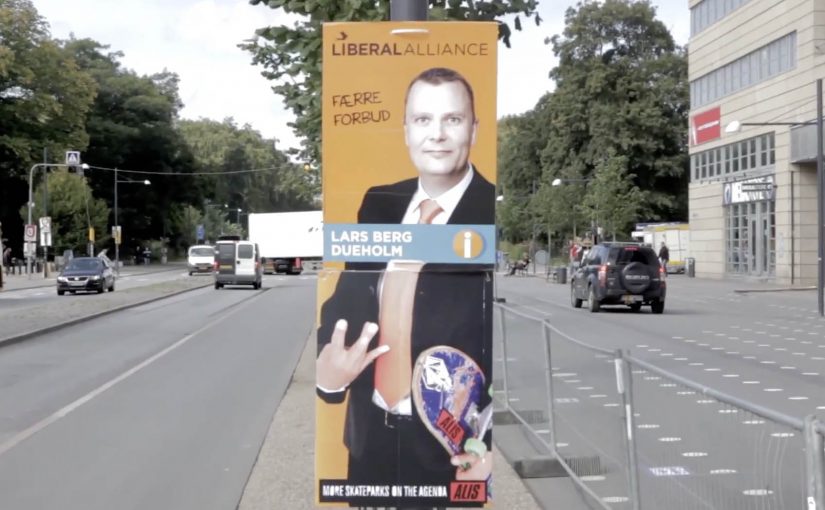
Original Danish election posters go up as usual. Then ALIS adds a few new visual elements that flip the meaning, ending with a simple line: “more skateboards on the agenda.”

“Take action in your life and reALISe your dreams” is the intention behind ALIS, established by Albert Hatchwell and Isabelle Hammerich and grown from an underground movement in Christiania into a company that creates opportunities and inspiration.

In a fun and well-thought guerrilla activity in Denmark, ALIS takes existing election posters and extends them with a skateboarding twist. The result sits right on the boundary between civic campaigning and street culture, using the familiarity of political posters to smuggle in a different agenda.

A guerrilla twist on election season

The mechanic is simple. Start with something everyone recognizes, a candidate poster. Add just enough to reframe it. Then leave it in the wild so people discover it, photograph it, and spread it for you.

In Nordic youth-culture marketing, repurposing civic symbols can earn disproportionate attention when the tone stays playful rather than destructive.

Why it works as shareable street media

It is instantly legible. You do not need to know the brand, the candidate, or the backstory. The “before and after” reads in a second, and the idea feels like a wink rather than a lecture. Because the “before and after” reads in a second, a single photo carries the whole story, which is why it spreads.

Extractable takeaway: Treat this as an ambient execution, meaning you reuse existing public poster inventory as your first distribution layer, then let photography and sharing do the rest.

What ALIS is really buying

This is identity reinforcement. ALIS signals what it stands for, skateboarding and youth culture, by inserting itself into a mainstream moment and making it feel slightly more “theirs”. The real question is whether your reframing is clear enough that strangers do the distribution for you. This kind of remix works best when the intervention reads as playful and reversible. The budget stays low because the distribution is social. The street provides the first audience. Cameras and sharing provide the second.

How to remix a familiar format cheaply

  • Borrow a familiar format. Start with something people already read without thinking.
  • Change one thing that changes the meaning. The smallest edit with the biggest reframe wins.
  • Design for photos. If it does not capture clearly, it will not travel.
  • Keep it non-destructive. Playful add-ons land better than anything that looks like vandalism.

A few fast answers before you act

What is “Election Poster Skate Attack”?

A guerrilla-style ALIS action that adds skateboard-themed elements to existing Danish election posters, ending with the message “more skateboards on the agenda.”

Why use election posters as the canvas?

Because they are already designed to grab attention in public space. A small twist on a familiar political format becomes instantly noticeable.

What makes this feel “earned” rather than “paid”?

The distribution comes from discovery and sharing. People see it, smile, photograph it, and pass it on without needing media spend.

What is the main risk with poster hacks like this?

Being perceived as vandalism. The execution needs to read as a light, non-destructive add-on, not damage.

How can a brand apply the pattern safely?

Borrow a recognizable public format, alter it with a single clear reframe, and ensure the intervention is reversible and legally defensible.

Rajec: Frozen Art to Sell Water in Winter

Rajec: Frozen Art to Sell Water in Winter

Rajec wants people to buy spring water even when it is cold outside, so the brand turns its own product into the medium. Artists use Rajec water to create frosty artworks overnight in high-footfall locations, so the next morning the city wakes up to “Patented by Nature” made visible.

The mechanic is simple and budget-smart. Pick specific public locations, give artists permission to work within the constraints of freezing weather, and let the cold do the production. The result is temporary ice art that looks native to winter, but still unmistakably tied to water.

In Central European FMCG categories, winter is where habitual consumption drops. So a physical, weather-native installation can reframe the product as seasonally relevant instead of seasonally optional.

Why frozen artwork is a strong “Patented by Nature” proof

It makes the positioning literal. The environment “patents” the result, because the cold is doing real work. That gives the campaign an authenticity cue that polished advertising often struggles to achieve, especially for a product as familiar as water.

Extractable takeaway: When your brand promise depends on “naturalness”, build a proof that requires nature to complete it. Then place that proof where people can stumble on it without opting in.

What the campaign is really optimizing for

The real question is how to make bottled water feel worth noticing in the season when people are least inclined to buy it. This is a smart seasonal demand play because it turns winter from a sales headwind into the proof itself.

This is designed to create winter salience with minimal spend. Here, winter salience means staying mentally available in the season when bottled water is easiest to ignore. The installations function as local talk triggers, photo moments, and brand reminders, without needing long media flights. You get attention because it is unexpected and temporary, and you get relevance because the execution only exists in winter conditions.

What to steal for your own seasonal demand problem

  • Exploit the season instead of fighting it. Use weather and constraints as production tools.
  • Make the product physically present. When the product is the material, the brand tie is harder to miss.
  • Design for ephemerality. Temporary work creates urgency and increases the chance people share it.
  • Choose “commuter proof” locations. Busy, repeat-traffic spots do the frequency building for you.

A few fast answers before you act

What is the core idea of Rajec Frozen Artwork?

Use Rajec water to create ice artworks overnight in frequented public places, so winter itself becomes the production method and the brand proof.

Why does this help sell water in winter?

It restores relevance by linking the product to the season people least associate with water buying, and it does so with a physical cue people notice without trying.

What makes the execution feel credible rather than “advertising”?

The cold does real work. The result looks like something the environment caused, which supports the “Patented by Nature” idea.

What kind of location makes this work best?

High-footfall public locations work best because repeat exposure turns a temporary installation into a stronger memory cue without requiring paid media weight.

What is the main risk in copying this approach?

If the brand link is too subtle, it becomes “nice street art” with weak recall. The product-to-art connection needs to be unmistakable.

Mercedes-Benz: Transparent Walls for PRE-SAFE

Mercedes-Benz: Transparent Walls for PRE-SAFE

For the PRE-SAFE® precrash system from Mercedes-Benz, ad agency Jung von Matt in Germany set out to make chaotic traffic intersections safer.

The idea was to let everyone “look around the corner” as if walls were transparent. In this execution, “transparent walls” means projecting a live camera view onto the building edge so the blind spot becomes visible. A camera filmed what was happening out of sight around the corner, and the live images were projected onto an 18/1-format billboard mounted on the building edge for approaching traffic to see.

When out-of-home becomes a live safety interface

This is not an awareness poster. It behaves like infrastructure. The corner. The blind spot. The moment of uncertainty. All become the media placement and the message at the same time.

The real question is whether your safety story behaves like a tool at the decision point, not a slogan people ignore.

How the mechanism creates “transparent walls”

  • Capture. A camera records the street view that drivers cannot see until they commit to the turn.
  • Project. A large-format display on the building corner shows that view in real time.
  • Anticipate. People approaching the intersection get a few extra seconds to recognise a cyclist, car, or hazard.

In urban mobility and automotive safety communications, making risk visible in the moment can change behaviour faster than warning copy.

Why it lands

Safety messages often fail because they arrive as abstract advice. This one arrives as immediate utility. It gives people a concrete, legible advantage at the precise point where bad outcomes happen. Because the live projection turns hidden risk into visible information, the benefit is believed without asking anyone to trust a claim. Safety-led brand work should earn attention through utility, not admonition. The result feels less like advertising and more like “someone fixed a problem.”

Extractable takeaway: The most persuasive safety communication is not a claim. It is a demonstrable reduction of uncertainty, delivered at the exact moment people need it.

What the brand intent looks like underneath

The stunt does double duty. It dramatizes what PRE-SAFE® is for without explaining sensors, thresholds, or system logic. It also signals a brand posture. Mercedes-Benz is not only selling performance. It is selling anticipation.

Steal this pattern: make uncertainty visible

  • Build the message out of the environment. Pick a real-world constraint your audience feels, then solve it visibly.
  • Make the proof self-evident. If people can understand the benefit in one glance, the idea scales.
  • Reduce uncertainty, not fear. Practical clarity outperforms shock in public safety-adjacent work.
  • Choose the right “moment.” Place the intervention where decisions are made, not where people are merely passing through.
  • Design for all road users. Intersections are shared systems. Make the benefit readable for drivers, cyclists, and pedestrians.

A few fast answers before you act

What is “Transparent Walls” in one sentence?

It is a digital out-of-home installation that shows live footage from around a blind corner on a building-edge billboard, so approaching traffic can spot hazards earlier.

How does this connect to PRE-SAFE®?

It demonstrates the value of anticipation. Seeing danger earlier is the human equivalent of what precrash systems aim to deliver technologically.

Why use a live camera feed instead of a scripted film?

Because real-time content makes the utility undeniable. People trust what they can see unfolding right now.

What are the main execution risks?

Latency, visibility in different lighting conditions, weather robustness, and ensuring the display informs rather than distracts drivers.

How would you measure success?

Observed speed adjustments, braking behaviour changes, near-miss reduction at the intersection, dwell/attention metrics, and sentiment around perceived usefulness.