Denon VisYOUalizer: feel the music

Denon VisYOUalizer: feel the music

Denon wants to bring to life the idea that with its line of lifestyle headphones you do not just hear the music, you feel it. So BBDO New York, described alongside Jam3 in production write-ups, creates an engaging experience for younger audiences who are not yet familiar with Denon’s long-running audio heritage.

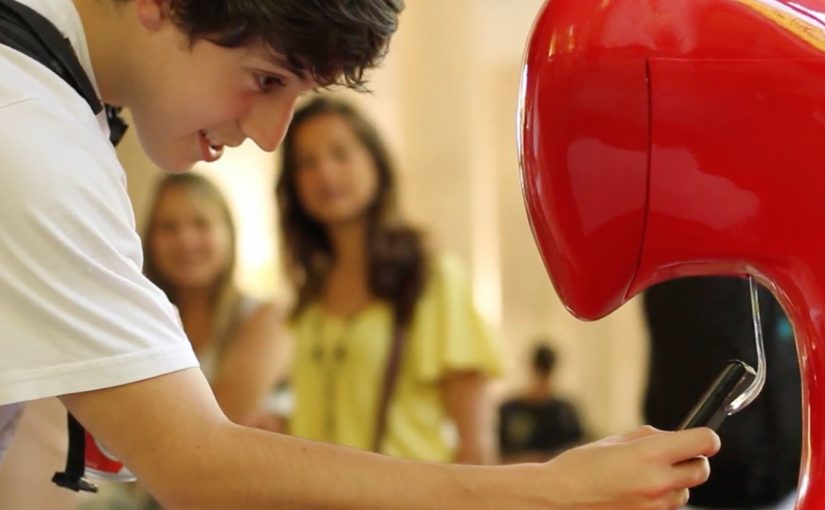
A Denon VisYOUalizer app is created that lets people try on the headphones virtually and turn their faces into a dynamic, customized music visualizer.

How the VisYOUalizer turns “sound” into something you can see

The mechanic is simple. Your face becomes the canvas, the music becomes the driver. You line up to a camera, the headphones snap into place virtually, and the experience maps a moving visual layer to your expression and the track’s energy. Because the visual layer responds in real time to both the track and your expression, the “feel it” promise reads as proof rather than copy.

In consumer electronics and lifestyle brands, face-based interactivity works best when the visual payoff is immediate and the product benefit is embodied rather than explained.

Why it lands for a younger audience

Headphone marketing often leans on specs, heritage, or famous musicians. This goes the other way. It starts with play and self-expression, then backfills the brand story through the experience and its share value. The real question is whether you can make an intangible promise visible enough that people want to play with it before they care who you are. When awareness is the constraint, a participatory demo beats a spec-led pitch.

Extractable takeaway: If your benefit is sensory or emotional, make the user’s own face or movement the proof, and deliver the payoff before you ask for attention to the brand story.

That matters when awareness is the real problem. If people do not know Denon, a participatory demo can earn attention faster than a product film.

What the brand is really doing here

This is a virtual try-on wrapped around a music visualizer. The try-on makes the product tangible. The visualizer makes the “feel it” claim legible. And the combination gives Denon an interaction that people can show to friends without needing to explain anything.

Steal this for your next “feel it” product idea

  • Turn an abstract benefit into a visible response. If “feel” is the promise, show a reaction that moves with the input.
  • Make the first 10 seconds rewarding. The hook should work before anyone reads instructions.
  • Use virtual try-on as the entry point. It lowers friction because people already know what to do.
  • Let personalization do the marketing. When people see themselves in the output, they are more likely to share.

A few fast answers before you act

What is the Denon VisYOUalizer?

It is a face-based interactive experience that lets you virtually try on Denon lifestyle headphones and transforms your face into a music-driven visualizer.

What product message is it designed to prove?

It translates “you do not just hear the music, you feel it” into a visual reaction that changes in real time with the sound and the participant’s presence.

Why combine a visualizer with a virtual try-on?

The try-on makes the product concrete and recognizable on your face, while the visualizer supplies the emotional payoff that makes people stick around and share.

What do you measure to judge success?

Time spent, completion rate, share rate, repeat plays, and click-through to product pages are more meaningful than raw impressions for an experience like this.

What is the biggest failure mode for this format?

If the camera alignment is finicky or the output looks generic, people bounce fast. The experience needs instant feedback and obvious personalization.

Coca-Cola: Happiness Refill

Coca-Cola: Happiness Refill

Connection as currency on Copacabana

For teens, happiness often means one thing: staying connected.

Coca-Cola in Brazil acted on this insight by creating a beachfront store on Copacabana Beach in Rio de Janeiro and installing a soda machine that delivered something more valuable than a drink.

The real question is whether your brand can trade something people have for something they cannot easily get in the moment.

Instead of only dispensing Coca-Cola, the machine rewarded users with free mobile internet credits. For young, emerging middle-class consumers who loved their mobile phones but could not afford generous data plans, the exchange was instantly clear and immediately useful.

How the Happiness Refill machine worked

The interaction was deliberately simple. Users accessed the machine through an exclusive Coca-Cola mobile browser. Completing the interaction unlocked internet credits directly on their phones.

No long registration. No delayed reward. Just a physical interface connected to a digital payoff.

The machine functioned as a bridge between the physical and mobile worlds, using hardware as a trigger and mobile connectivity as the reward.

By turning a quick physical action into instant connectivity, the mechanism created a visible payoff people could copy on the spot.

In mobile-first markets where data is a noticeable constraint, connectivity behaves like a form of currency.

Why free data landed harder than free soda

On a public beach, attention is fleeting. People move quickly, and distractions are constant.

Extractable takeaway: If you reward people with something scarce in their environment, the crowd becomes your distribution channel.

Free data solved a real, present problem. Connectivity was scarce, valuable, and socially visible. Watching someone gain internet access in front of you created instant social proof.

The machine became a gathering point. Not because it was novel technology, but because the value exchange was obvious and human.

The business intent behind Happiness Refill

Coca-Cola’s intent was not short-term sampling.

Utility beats messaging when attention is scarce and the payoff is immediate.

The goal was to make the brand’s long-standing “happiness” positioning tangible for a mobile-first audience by attaching it to everyday utility. Instead of asking teens to emotionally connect with a message, Coca-Cola embedded itself into a moment of real need.

This activation reframed the brand from advertiser to enabler.

What brands can steal from this activation

Here, an activation is a public, in-person brand moment designed to trigger a digital behavior.

  • Translate emotion into utility. Abstract values become powerful when expressed as something people actually need.
  • Design for instant payoff. Immediate rewards outperform persuasion in high-noise environments.
  • Create a public interaction. Physical touchpoints generate social visibility that digital ads cannot buy.
  • Respect economic reality. Value feels bigger when it acknowledges real constraints.

This machine also fits into a broader Coca-Cola pattern. It joins the growing number of Happiness Machines the brand has deployed globally since 2009.


A few fast answers before you act

What insight powered Coca-Cola’s Happiness Refill?

That for teens, happiness is often defined by connectivity. Free data mattered more than another free product.

What made the mechanism effective?

A simple physical interaction with an immediate digital reward. No delay, no complexity.

Why was Copacabana the right context?

The beach favors fast, visible experiences. The activation turned utility into a social moment.

What was the core business goal?

To reinforce Coca-Cola’s happiness positioning by delivering real-world value aligned with mobile behavior.

What is the transferable lesson?

When you make your brand genuinely useful in the moment, people do the distribution for you.

ALIS: Election Poster Skate Attack

ALIS: Election Poster Skate Attack

Original Danish election posters go up as usual. Then ALIS adds a few new visual elements that flip the meaning, ending with a simple line: “more skateboards on the agenda.”

“Take action in your life and reALISe your dreams” is the intention behind ALIS, established by Albert Hatchwell and Isabelle Hammerich and grown from an underground movement in Christiania into a company that creates opportunities and inspiration.

In a fun and well-thought guerrilla activity in Denmark, ALIS takes existing election posters and extends them with a skateboarding twist. The result sits right on the boundary between civic campaigning and street culture, using the familiarity of political posters to smuggle in a different agenda.

A guerrilla twist on election season

The mechanic is simple. Start with something everyone recognizes, a candidate poster. Add just enough to reframe it. Then leave it in the wild so people discover it, photograph it, and spread it for you.

In Nordic youth-culture marketing, repurposing civic symbols can earn disproportionate attention when the tone stays playful rather than destructive.

Why it works as shareable street media

It is instantly legible. You do not need to know the brand, the candidate, or the backstory. The “before and after” reads in a second, and the idea feels like a wink rather than a lecture. Because the “before and after” reads in a second, a single photo carries the whole story, which is why it spreads.

Extractable takeaway: Treat this as an ambient execution, meaning you reuse existing public poster inventory as your first distribution layer, then let photography and sharing do the rest.

What ALIS is really buying

This is identity reinforcement. ALIS signals what it stands for, skateboarding and youth culture, by inserting itself into a mainstream moment and making it feel slightly more “theirs”. The real question is whether your reframing is clear enough that strangers do the distribution for you. This kind of remix works best when the intervention reads as playful and reversible. The budget stays low because the distribution is social. The street provides the first audience. Cameras and sharing provide the second.

How to remix a familiar format cheaply

  • Borrow a familiar format. Start with something people already read without thinking.
  • Change one thing that changes the meaning. The smallest edit with the biggest reframe wins.
  • Design for photos. If it does not capture clearly, it will not travel.
  • Keep it non-destructive. Playful add-ons land better than anything that looks like vandalism.

A few fast answers before you act

What is “Election Poster Skate Attack”?

A guerrilla-style ALIS action that adds skateboard-themed elements to existing Danish election posters, ending with the message “more skateboards on the agenda.”

Why use election posters as the canvas?

Because they are already designed to grab attention in public space. A small twist on a familiar political format becomes instantly noticeable.

What makes this feel “earned” rather than “paid”?

The distribution comes from discovery and sharing. People see it, smile, photograph it, and pass it on without needing media spend.

What is the main risk with poster hacks like this?

Being perceived as vandalism. The execution needs to read as a light, non-destructive add-on, not damage.

How can a brand apply the pattern safely?

Borrow a recognizable public format, alter it with a single clear reframe, and ensure the intervention is reversible and legally defensible.