ERAN: When Facing Distress, Dial 1201

Here is a campaign from ERAN, the National Crisis Intervention Hotline in Israel.

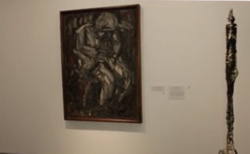
To make people aware of the 1201 hotline, McCann Erickson worked with the Israel Museum in Jerusalem. They identified paintings that express distress, then changed each artwork’s audio guide number to 1201. Dialing that number on the guide gives visitors a customized message that mirrors the emotion of what they are looking at, while quietly pointing to the same number outside the museum.

A hotline reminder that hides in plain sight

The trick is that nothing feels like advertising at first. You are already in “audio guide mode”. You are already entering numbers. The campaign simply reroutes a familiar behavior into a moment of recognition, then uses the artwork’s emotional weight to make the number stick.

How the mechanism earns attention without shouting

This is ambient marketing built from context rather than volume. The museum provides the emotional frame. The audio guide provides the interface. The number provides the bridge between cultural experience and real-world help. It is a one-step interaction, and the message arrives when the viewer is already primed to feel.

Because the visitor is already using the guide as intended, the intervention feels credible rather than intrusive, which makes the number easier to absorb and remember.

In public service communication, the most effective prompts often appear inside routines people already trust, so the call-to-action feels like guidance rather than persuasion.

Why it lands

It lands because it changes the meaning of a number. “1201” stops being a hotline you may never need, and becomes a small, memorable experience tied to a specific feeling and a specific place. The museum setting also lowers defensiveness. People expect reflection, not selling, so they are more open to receiving a supportive message.

Extractable takeaway: If you can place a helpline inside an existing, legitimate interface, and align it with an emotionally resonant context, you turn awareness into recall without relying on fear or shock.

What ERAN is really doing here

This is recall engineering. That means designing a vivid cue so a critical number is easier to remember when it matters.

The real question is how to make a crisis number memorable before someone actually needs it.

ERAN is right to optimize for respectful recall over louder awareness. The value is not the interaction itself. The value is that a visitor leaves with a number that now has emotional meaning.

What to borrow from this hotline recall design

  • Borrow an interface people already use. Audio guides, ticketing kiosks, vending machines, any trusted routine.
  • Let context do the targeting. The environment pre-qualifies the emotional state and attention level.
  • Keep the action to one step. The smaller the action, the higher the completion.
  • Design for respectful tone. Supportive beats sensational when the topic is distress.
  • Make the recall object simple. A short number, a clear phrase, one job.

A few fast answers before you act

What is the core idea of “When Facing Distress, Dial 1201”?

Turn museum audio guide numbers into a hotline reminder by assigning “1201” to distress-themed artworks and delivering supportive messages through the guide.

Why use a museum as the medium?

Because visitors expect emotion and reflection. That context makes the message feel natural, and it helps the number attach to a real feeling rather than a generic PSA.

What makes this more memorable than a poster?

The viewer performs an action. They dial the number. That small act creates muscle memory and meaning, which improves recall later.

What is the biggest execution risk?

If the experience feels like it interrupts the museum visit or trivializes the artworks, it can trigger backlash. The tone has to stay respectful and restrained.

How can other causes apply this approach?

Find a trusted public interface, align the message with the environment’s emotional purpose, and make the action so simple it can happen without instruction.

GranataPet: Check In, Snack Out

GranataPet is one of the innovative leaders of high premium pet food in Germany. Their agency, agenta, was given the challenge to create awareness for GranataPet dog food on a slim budget.

The idea targets dog owners at the exact moment they are most open to noticing pet-related messages. While walking their best friend. Socially activated installations are placed on key walking routes. Dogs catch the scent of treats, stop, and pull their owners toward a billboard that simply says “Check in. Snack out”.

A sampling demo that your dog starts for you

This is a classic trial mechanic with a smart trigger. Instead of asking humans to approach a promoter, the dog does the targeting. The owner follows the leash. Then the message becomes self-evident. Check in with Foursquare to activate a free bowl of dog food.

How the mechanism works

The billboard combines three parts. A location check-in prompt, a connected dispenser and bowl, and a social echo via the check-in behavior, meaning each check-in can create additional visibility beyond the street placement itself. When a user checks in at the billboard’s location, the system releases a portion of food into the bowl. The owner watches the dog’s reaction in real time, which functions as the product demo.

In pet food sampling, the highest-converting trial moments are the ones where the animal can deliver an immediate preference signal in front of the owner.

The real question is whether the brand can turn a routine walk into a low-friction proof moment that the owner trusts more than advertising copy. The stronger move here is to let the dog, not the promoter, make the case.

Why it lands

It is easy to trigger, well-timed, and emotionally loaded. The owner does not have to imagine whether the dog will like the food. They see it. That works because a visible reaction from the dog removes guesswork faster than any product claim can. The social layer then turns one local poster into distributed impressions, because check-ins can surface to friends depending on settings. The most important part is that the “proof” is not the copy on the billboard. It is the dog’s behavior.

Extractable takeaway: If your product decision depends on a third party’s preference, build a live demo where that third party delivers the verdict on the spot, and use a simple location trigger to scale it.

What the brand is really buying

This is awareness, trial, and measurable demand in one loop. The execution creates talk value, it generates trackable interactions per location, and it pushes owners toward retail purchase after a positive in-the-moment test. Trade coverage at the time also described increased local demand following the activation.

What pet food marketers can steal from this

  • Target the moment, not the demographic. Dog-walking routes beat broad reach when the category is specific.
  • Let behavior be the headline. A happy dog is more persuasive than any claim line.
  • Make the trigger simple. One action. One reward. No explanation tax.
  • Use the environment as your interface. The billboard is the call-to-action and the proof point.
  • Instrument the activation. Location check-ins can double as measurement, not just distribution.

A few fast answers before you act

What is “Check in, snack out” in one sentence?

An interactive billboard that dispenses free dog food when a nearby owner checks in using a location service.

Why does this outperform a normal sampling stand?

The dog initiates the interaction, and the product proves itself immediately through the dog’s reaction, which reduces hesitation for the owner.

What makes the social layer valuable here?

Check-ins can create secondary reach beyond the physical location, and they can be used to track which placements generate the most interactions.

What is the biggest operational risk?

Reliability. If the dispenser jams or the trigger fails, the experience collapses and the brand takes the blame.

How would you adapt this without Foursquare?

Keep the same structure. A location trigger plus instant physical reward. Use whatever mobile mechanism your audience already uses for quick opt-in and confirmation.

Vodafone: Banknote Sticker for Roaming

To promote Vodafone’s cheap roaming tariff for Europe, Scholz & Friends chose a medium that does not compete for attention. They modified banknotes with stickers, so the message reaches people in a very specific place, their wallet.

The idea is as low-tech as it is disruptive. Instead of asking travellers to notice another poster, banner, or leaflet, the campaign piggybacks on something they already handle repeatedly while travelling.

Roaming costs are a practical irritation. The sticker works because it shows up when travellers are already handling money.

Why a sticker on cash beats a billboard

Most media fights for a glance. A banknote already has “permission” to be looked at, checked, counted, and passed along. Adding a sticker turns that routine behavior into repeated exposure, without needing a second of extra attention budget.

Extractable takeaway: If the offer is about saving money or reducing travel friction, place it inside a ritual people already repeat, not in a channel that asks for attention first.

It is also inherently portable. Cash moves through hands, venues, and neighborhoods, which gives the idea a built-in distribution logic that feels organic rather than broadcast.

For price-led travel offers, wallet insertion beats billboard spend because it shows up at decision time.

What the mechanic is really doing

  • Context targeting: travellers touch cash, exchange cash, and pay in unfamiliar places.
  • Frequency: one note can generate dozens of impressions across multiple days.
  • Zero clutter: the message lives where ads rarely live, inside the payment ritual.

That is the core “clutter breaking” move. It replaces interruption with insertion.

For European travellers moving across borders, wallet-level touchpoints cut through because they appear at the exact moment people are thinking about money and connectivity.

The real question is whether you can attach your promise to a repeated behavior, instead of paying to interrupt one.

Business intent under the simplicity

The immediate goal is recall for “cheap EU roaming” at the moment a traveller is likely to make a connectivity decision. The deeper goal is brand association with practical travel confidence, meaning Vodafone as the network that makes cross-border usage feel less stressful.

Wallet-level touchpoints to borrow

  • Choose a touchpoint people already trust, then add a light layer of message.
  • Exploit repeated rituals, paying, checking, stamping, validating, not one-off exposure.
  • Keep the promise instantly legible, one benefit, one reading, no decoding.
  • Design for pass-along, so distribution is a property of the medium, not a separate plan.

A few fast answers before you act

What makes this “ambient” instead of traditional advertising?

The message is placed inside an everyday object people already use, rather than in a dedicated ad space that competes for attention.

Why is the wallet a powerful media channel for travel offers?

Because it is handled frequently during travel, and it naturally frames the offer around cost and practicality.

What is the main risk with banknote-based ideas?

Control and coverage. You cannot fully control who receives the notes, and scale depends on distribution logistics and how widely the notes circulate.

How do you measure impact when the medium is not digital?

Use proxies like search lift for the tariff term, store inquiries, roaming plan activations, and time-boxed correlation against the distribution window.

What is the transferable lesson beyond telecom roaming?

If your promise is about saving money or reducing travel friction, placing it inside a payment or travel ritual can outperform louder media because it arrives in-context.