Lexus Hoverboard: Engineering a Brand Moment

Lexus builds a hoverboard. On purpose.

Lexus did not build a hoverboard to sell it. They built it to show what the brand stands for when you strip away the brochure.

The real question is whether you can prove engineering credibility in public without turning it into an ad.

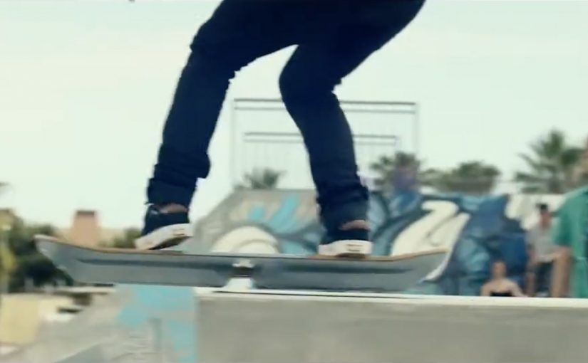
The Lexus Hoverboard is presented as a rideable board that levitates above the ground using magnetic levitation. The campaign frames it as engineered, tested, and demonstrated rather than simulated.

This is brand storytelling executed through engineering, not advertising copy.

How the hoverboard is described to work

The hoverboard uses magnetic levitation technology. Magnetic levitation means the board is held up by magnetic forces rather than wheels or air pressure.

Superconductors inside the board are described as being cooled with liquid nitrogen. When placed above a specially designed magnetic track, the board “locks” into position and floats.

The result is controlled levitation. Not free roaming, but stable, directional hovering that makes riding possible. The constraint becomes part of the proof, because it makes the mechanism legible to viewers.

In premium automotive and consumer technology categories, the fastest path to trust is often a visible demonstration of real capability rather than another layer of messaging.

Why it feels like engineering, not hype

Lexus positions itself around precision, control, and advanced engineering. The hoverboard compresses those values into a single, highly visual artifact. You do not need to read a brochure to understand it. You see it.

Extractable takeaway: If you want people to believe a capability, build a demonstration where the constraints are obvious and the work is hard to fake.

By putting professional skateboarders on a levitating board in a purpose-built environment, Lexus turns technical credibility into a cultural moment.

What Lexus is really doing here

The hoverboard is not positioned as a prototype for future mobility. It is a brand signal.

By “brand signal,” I mean a deliberate proof point that tells the market what you are capable of, even when no one can buy the thing you built.

Lexus frames the execution as complex technology made real and presented with control rather than chaos. In categories where trust in engineering is everything, that framing is the product.

Demonstrations beat declarations when your differentiation is engineering, because they create belief before the copywriting starts.

What this says about modern brand building

Brands increasingly compete on what they can demonstrate, not what they can claim. When technology is real, visible, and difficult to fake, it carries more weight than messaging.

The Lexus Hoverboard works as a brand moment because it is unnecessary. It exists only to make a point.

What to steal for your next credibility play

  • Choose a proof, not a promise. Build one artifact that makes the capability undeniable.
  • Make the constraints visible. If people can see what makes it hard, it reads as real.
  • Turn the demo into a scene. Put the proof in a context people recognize and want to share.
  • Separate “signal” from “SKU.” Treat this as brand equity work, not product pipeline.
  • Design for replay. Aim for a story people can retell in one sentence.

A few fast answers before you act

Is the Lexus Hoverboard real or CGI?

In the campaign, it is presented as a real levitating board demonstrated in-camera, not a visual effects sequence.

How does the hoverboard create levitation?

It is described as using superconductors cooled with liquid nitrogen over a magnetic track, producing magnetic levitation.

Why does it only work in specific locations?

Because the magnetic infrastructure is part of the system. Without the track, the “hover” mechanism has nothing to levitate against.

What is Lexus actually selling with this stunt?

Confidence in engineering. The point is to compress precision, control, and advanced capability into one unforgettable proof moment.

What makes this kind of demo believable to audiences?

Visible constraints plus visible performance. When the audience can see what makes it hard to fake, the claim carries more weight.

When should a brand copy this pattern?

When your differentiation is technical credibility and your category runs on trust. Build a proof artifact that makes the capability obvious in seconds.

Teatreneu: Pay Per Laugh

In mid-2013, Spain’s theatre scene is described as taking a hit when taxes on theatrical shows reportedly rose from 8% to 21%, with audiences thinning out as a result. Teatreneu, an independent comedy theatre in Barcelona, responds with a pricing idea that sounds like a joke until you sit down.

Entrance is free. You only pay when you laugh. Every laugh costs €0.30, capped at €24 for 80 laughs. If the show is not funny, you pay nothing. If it is, you pay for what you consumed.

The mechanism: pricing tied to visible emotion

The model is made possible by fitting each theatre seat with a system that detects smiles during the show and increments the charge. The experience is framed as transparent and immediate. Laugh, the counter moves. Stay straight-faced, the bill stays still.

In European live entertainment, pricing experiments that align payment to perceived value can reset attention fast, because they turn a ticket into a story people want to debate.

Why this lands

This works because it reframes the risk. Instead of “pay up front and hope it’s good,” the audience gets an “only pay if it works” promise. Because the charge only rises when people visibly enjoy the show, the pricing mechanic feels fairer before the first joke lands. The smile-detection counter also adds tension and theatre inside the theatre, because everyone knows their reaction has a price. The result is a show that sells itself through the mechanic as much as through the jokes. The real question is whether performance-linked pricing can turn hesitation into trial without making the experience feel punitive. The stronger idea here is not the sensor but the risk reversal.

Extractable takeaway: If your category suffers from perceived value risk, attach payment to an observable outcome, then cap the downside so people feel safe trying it once.

What the numbers are trying to prove

Reported results claim that the average ticket yield increased by around €6 compared to the prior model, and that attendance rose by about 35% as the concept became widely talked about. Whether or not each figure holds precisely, the intent is clear. Make pricing the headline, and use that attention to refill seats.

What to steal from performance-based pricing

  • Make the deal easy to repeat. “Free entry, pay per laugh” is instantly explainable.
  • Instrument the experience. The detection system makes the promise measurable, not rhetorical.
  • Protect the customer with a cap. A maximum price keeps the mechanic playful rather than punitive.
  • Let controversy do distribution. A pricing model people argue about spreads faster than a standard poster campaign.

A few fast answers before you act

What is “Pay Per Laugh”?

It’s a comedy show pricing model where entry is free and spectators are charged €0.30 per laugh, capped at €24, using smile detection to meter reactions.

How is laughter detected?

The theatre fits seats with a system that detects smiles during the show and counts them toward the final charge.

Why set the cap at €24?

It limits downside and keeps the mechanic in the range of a normal ticket, so the idea feels like a playful wager, not an open-ended penalty.

What problem is this solving?

It addresses audience drop-off and price sensitivity by shifting risk away from the customer and turning ticket pricing into a reason to attend.

What’s the biggest risk with this approach?

Trust and fairness perception. If people doubt the accuracy of detection or feel pressured to suppress laughter, the experience can backfire.

Homeless Fonts: Fonts from Cardboard Signs

When you walk by a homeless person holding a cardboard sign, you usually see an anonymous face struggling to survive. Homeless Fonts flips that moment. It turns the most visible part of street life. The handwriting. Into something people and brands can actually pay for.

From street sign to typeface

The Cyranos McCann teamed up with the Arrels Foundation in Barcelona to launch HomelessFonts.org. The site features fonts built from the real handwriting of local homeless people, available for purchase by marketers who want something more human than a default type library.

Here, a “font” is a downloadable typeface file that designers can license and use across ads, packaging, and digital interfaces, just like any other professional typeface.

In urban European cities, design-led micro-commerce can convert overlooked skills into dignified income streams.

Where the money goes

The money raised from the website is intended to support accommodation, food, social programs, and health care for people experiencing homelessness. For more information visit www.HomelessFonts.org.

Why this lands

It works because it asks brands to buy a useful asset instead of “donating to a cause.” You are not funding an abstract promise. You are paying for a tool that visibly changes the tone of your message, and the purchase itself carries a story your audience can recognize instantly.

Extractable takeaway: If you want purpose marketing to stick, attach the donation mechanic to a practical, reusable brand input (a font, a template, a dataset, a sound pack) so the act of funding also improves the work.

What it’s really trying to change

The real question is whether brands will pay for contribution instead of performative concern.

This is a stronger model than pure cause messaging because it gives people commercial value, not just visibility.

Beyond fundraising, the campaign reframes homeless people from passive recipients to contributors with identity and craft. The typefaces carry names and personality, and that shifts the conversation from pity to participation.

What to steal from Homeless Fonts

  • Sell a tool, not a feeling. Build the fundraising mechanic around something buyers genuinely need.
  • Make the proof visible. The output (handwriting) is instantly recognizable, which makes the story easy to retell.
  • Design for everyday reuse. The more places the asset can live (print, digital, packaging), the more sustainable the model becomes.
  • Keep the transaction simple. Clear product. Clear price. Clear destination for proceeds.

A few fast answers before you act

What is Homeless Fonts?

It’s a collection of purchasable fonts created from the handwriting of homeless people in Barcelona, sold via HomelessFonts.org.

Who created it?

The project was launched by the Arrels Foundation in partnership with Cyranos McCann.

How do brands actually use the fonts?

Like any licensed typeface. Designers can apply them in headlines, posters, packaging, social content, landing pages, and campaign visuals to add a distinctly human texture.

What does buying a font change versus asking for donations?

It turns support into a market exchange for a useful asset. That reduces “charity fatigue” and gives brands a concrete output that carries the story forward every time it’s used.

Where is the money intended to go?

The campaign describes proceeds being used for accommodation, food, social programs, and health care supporting people experiencing homelessness.