Polar Beer: Cell Phone Nullifier

Polar Beer: Cell Phone Nullifier

There is a specific kind of modern annoyance. You go out with friends, and ten minutes later the table is lit by phone screens instead of conversation.

Polar, a regional Brazilian beer brand, decides to treat that as a solvable problem. If phones steal the night, then the beer should give it back.

A beer cooler that changes the rules of the table

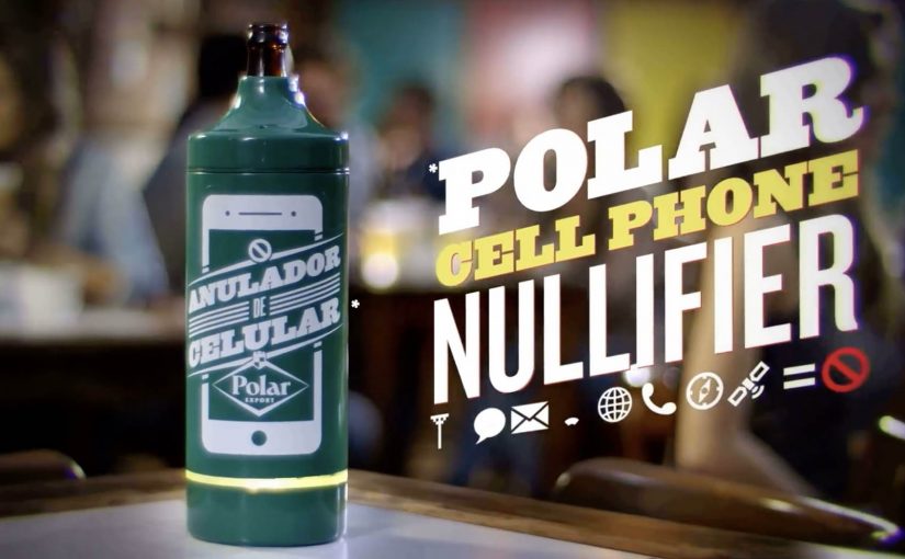
The mechanism is a physical prop with a blunt promise. A special Polar cooler is described as blocking 3G, 4G, Wi Fi, and GSM signals for devices within roughly a five-foot radius. Order Polar. Get served in the cooler. Watch the room look up.

In bar and nightlife settings, the strongest behavior-change ideas work when they attach to an existing ritual and alter it with minimal effort from the audience.

Because the cooler makes the phone temporarily useless at the table, conversation becomes the path of least resistance.

Why it lands, even if people hate it for a minute

This plays with a familiar tension. Everyone complains about “phubbing,” the habit of snubbing people in front of you by focusing on your phone, but nobody wants to be the first person to say “can we put phones away.” The cooler does the awkward social work on behalf of the group.

Extractable takeaway: If a social norm is breaking down, redesign the environment so the better behavior becomes the default. Remove the need for a lecture, and replace it with a small constraint that everyone experiences equally.

The brand benefit is also clean. Polar is not asking for attention. It is buying it back for you, then sitting at the center of the moment it created.

What the stunt is really selling

On the surface it is a gadget. Underneath it is a positioning move. Polar equates itself with real-world connection and the kind of night people say they want, even when their hands keep reaching for the screen.

The real question is whether you can earn attention by subtracting distraction, not by adding more stimulation.

This is a smart positioning move because it delivers the promise through the ritual, not through a slogan.

It is also a reminder that “anti-tech” can be a tech story. The cooler is not anti phone as an identity. It is pro conversation as an outcome.

Steal this for phone-free nights

  • Target the moment, not the attitude. Fix the table behavior, not the entire relationship with smartphones.
  • Use a prop that belongs in the setting. A cooler at a bar feels natural. A lecture does not.
  • Make it equal. The constraint applies to everyone in range, so it feels like a shared game, not a personal attack.
  • Build a story people retell in one sentence. “The beer that makes your phone stop” spreads fast.

A few fast answers before you act

What is Polar’s “Cell Phone Nullifier”?

It is a branded beer cooler concept described as cutting off nearby phone connectivity, so people ordering Polar are nudged into talking to each other instead of scrolling.

Why does blocking the signal work as a behavior-change tactic?

It removes the temptation rather than arguing with it. By changing the environment, it turns “I should put my phone away” into “my phone is not part of the table right now.”

What is the core creative mechanism here?

A familiar bar object is redesigned to enforce a social norm. The product ritual, ordering beer and receiving it in a cooler, becomes the delivery system for the idea.

How can brands adapt this without feeling preachy?

Focus on shared benefits and shared participation. Make the intervention playful and collective, and keep the user action simple and voluntary.

What is the biggest risk if you copy this idea?

If the constraint feels forced or punitive, it becomes the story instead of the conversation it was meant to protect. Keep it lightweight, contextual, and easy to opt into.

Hemoba and Vitória FC: My Blood Is Red and Black

Hemoba and Vitória FC: My Blood Is Red and Black

The state of Bahia was experiencing a shortage of blood. To raise awareness of this problem and increase the blood reserves, Hemoba Foundation (Blood Foundation) in Brazil partnered with Bahia football club Esporte Clube Vitória to run a unique blood donation drive.

For the campaign, the football club changed the stripes of their iconic jersey from red to white. Then over the course of the season as the blood reserves rose, the team slowly changed the white stripes back to the original red.

As a result, the promotion is reported to have helped raise blood donation by 46%.

A club kit that doubles as a public scoreboard

This is a blood drive that refuses to stay in the background. Instead of asking people to donate “because it is important”, it turns the most visible symbol of the club into a live indicator of how the state is doing. This is a stronger behavior-change design than a standard awareness appeal, because the public scoreboard sits inside club identity.

How the stripe mechanic works

The mechanism is one clean promise. Remove the red from Vitória’s shirt, then bring it back only as blood reserves recover. Every step of progress becomes legible in the one place fans naturally look, the team’s colors.

In sports-led community campaigns, changing a core identity asset works because it creates a shared metric that everyone can track without explanation.

Why this lands beyond typical charity messaging

Most donation drives rely on abstract need. This one makes need visible and slightly uncomfortable, because fans are confronted with “missing red” every match week until they act. It also flips motivation from guilt to pride, because the act of donating becomes a way to restore the club’s full identity.

Extractable takeaway: If you need sustained participation, attach the cause to a symbol your audience already protects. Then turn progress into a public, binary signal that updates over time.

What the partnership is really doing

The campaign aligns incentives. The real question is how to turn a one-time act of goodwill into a shared public ritual that people keep joining. Hemoba gets reach and urgency without buying attention in the usual media sense. The club earns meaning and publicity by making its platform materially costly, because it “gives up” part of its kit until the community responds.

What to steal for your next behavior-change campaign

  • Make the metric visible. People act more when they can see progress, not just hear appeals.
  • Use a symbol with real emotional ownership. Identity assets beat posters, because people notice when they change.
  • Turn donation into restoration. “Bring something back” is often more motivating than “add something new”.
  • Design for weeks, not a day. A season-long mechanic sustains attention and creates multiple decision moments.

A few fast answers before you act

What is “My Blood Is Red and Black”?

It is a blood donation campaign in Bahia, Brazil, where Hemoba partnered with Esporte Clube Vitória and used the team jersey’s red stripes as a visible indicator tied to blood reserves.

How did changing the jersey drive donations?

By removing the red stripes and gradually restoring them as reserves improved, the campaign turned blood supply into a public signal that fans could track across the season.

Why does sports identity work for public health?

Because club colors, rituals, and match-week attention are already shared and emotionally charged. The campaign borrows that energy and redirects it into a concrete action.

Why is this stronger than a standard awareness appeal?

Because it does not ask people to care in the abstract. It makes the shortage visible through a symbol fans already watch, defend, and want restored.

What is the transferable principle here?

Make progress tangible. Link participation to restoring a valued symbol, and keep the feedback loop running long enough for people to join when they are ready.

Philips Walita: Fruit Mashup

Philips Walita: Fruit Mashup

Philips launched the Walita Avance, positioned as its most advanced blender in Brazil. With 800W power and ultra-sharp blades, the product promise is simple. It mixes ingredients in a way most consumers have not experienced.

A blender demo that goes beyond the blender

Rather than trying to “prove” performance with expensive media, Ogilvy Brazil brought in a molecular cuisine specialist to create a demonstration people would stop for. The idea: physically blend two fruits into one, as if the blender could do the impossible.

The mechanism: inventing hybrid fruits

After months of experimentation, three “new” fruits were created for the campaign: Pinegrape, Bananaberry, and Kiwigerine. Ogilvy used these hybrids as a proxy for the blender’s core benefit. Extreme mixing power made tangible. By turning mixing power into a visible result people can name and remember, the demo makes the performance claim easier to believe and retell.

In FMCG marketing, turning a functional claim into a concrete, surprising artifact is often the fastest way to earn attention without over-explaining the spec sheet.

Why this lands

This works because it collapses “performance” into an immediate visual. You do not need to understand watts or blade geometry to get the point. You see a fruit that should not exist, and your brain fills in the story: this blender must be intense.

Extractable takeaway: When your product advantage is technical, build a demo artifact that expresses the benefit at a glance, so the audience understands the promise before you ever mention features.

What the brand is really doing

The real question is how you make a technical launch travel beyond people who already care about the spec.

The smart move here is not the fruit gimmick itself, but the decision to turn a hard-to-feel product claim into a demo people can instantly understand and repeat.

The hybrids are not just a stunt. They are a communication shortcut. They turn a launch into a shareable proof object that can live in PR, social clips, retail talk-tracks, and influencer content without changing the message.

Brazilian agencies have a track record of inventive fruit-related communication. Also see the real fruit boxes campaign from Ageisobar Brazil.

What blender marketers should copy

  • Translate specs into symbols. Make one surprising object carry the whole product story.
  • Choose an artifact people can describe in one sentence. “Two fruits blended into one” travels well.
  • Let the demo do the explaining. Reduce copy. Increase show-and-tell.
  • Connect to a category pattern. If you have a related example, link it to create a “watch this space” thread.

A few fast answers before you act

What is the Philips Walita Fruit Mashup campaign?

It’s a product-launch idea that uses engineered hybrid fruits as a metaphorical “proof” of the Walita Avance blender’s mixing power.

What are Pinegrape, Bananaberry and Kiwigerine?

They are campaign-created hybrid fruits used as the central demo objects to communicate extreme blending performance.

Why is this more effective than listing features?

Because the audience understands the benefit visually, without needing technical literacy. The artifact does the persuasion.

What’s the key constraint if you copy this pattern?

The demo must be instantly legible and repeatable on camera. If people need explanation to “get it,” the mechanic weakens.

How do you adapt this to other FMCG launches?

Create a single surprising artifact that makes your benefit obvious. Then design content formats that capture reactions and reveal the mechanism quickly.