Zach King: The Vine Magician

Zach King: The Vine Magician

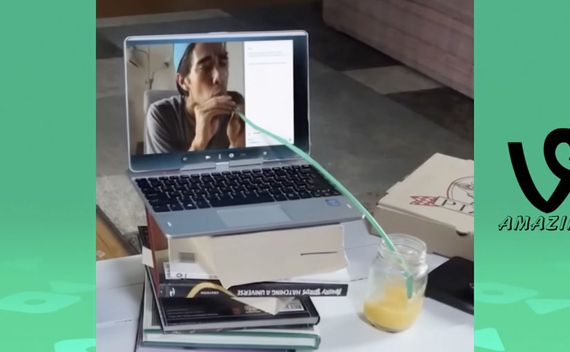
Filmmaker Zach King uses video editing to create six-second Vine clips that give the viewer the illusion of real magic. The charm is that the “trick” feels physical. Someone walks through a door that should not exist. Objects swap places mid-motion. Reality behaves like it has a hidden shortcut.

Here is a Vine compilation of some of Zach’s most mind-bending videos.

How the “magic” works

The mechanism is not supernatural, it is editorial craft. Most of these illusions rely on precise cut points, clean match movement, and staging that hides the seam. Here, the seam is the hidden join between two shots that the edit tries to conceal. A hand passes in front of the lens. A body turns. A prop blocks the frame for a split second. Then the edit swaps the world underneath. Because the hidden cut preserves the sense of continuous physical movement, the illusion feels real instead of purely digital.

In short-form social video, attention is measured in seconds, so the craft has to read instantly without explanation.

Why it lands

It works because the viewer gets a complete story in a tiny runtime. Each clip has a setup, a turn, and a payoff that you can replay immediately. The loop is the distribution mechanic. You rewatch to understand, you share to test whether others can spot the seam.

Extractable takeaway: When your format is ultra-short, stop thinking in “content minutes” and start thinking in “repeat value”. Build a moment that rewards a second view, because the second view is where sharing usually happens.

What this teaches about creative constraints

Six seconds is not a limitation, it is a design brief. You cannot waste frames on context, so the idea has to be visual and the reveal has to be unmissable. That forces discipline. One illusion, one beat, one clean exit.

The real question is how to turn a six-second constraint into a visual idea people want to replay and share.

What to steal from Vine-era illusion design

  • Use motion as cover. If something moves across the frame, it can hide a transition.
  • Design the loop. End on a pose or frame that makes the replay feel natural.
  • Keep the rule simple. The best clips can be explained in one sentence, even if the execution is hard.
  • Make the seam the curiosity. Viewers enjoy not knowing, as long as the payoff is satisfying.

A few fast answers before you act

What is a “Vine magic” video in this context?

A six-second clip that feels like real-world magic, but is achieved through precise editing, staging, and hidden transitions.

Why do these clips get replayed so often?

Because the viewer wants to spot the seam. Rewatching is part of the fun, and that behavior increases sharing.

What is the core creative structure behind most of these illusions?

A fast visual setup, a single impossible change, then a clean frame that lands the joke or surprise.

What should brands learn from this format?

Design for repeat value. A short clip that people replay and forward can outperform longer content that gets watched once.

How do you adapt this without copying the style?

Pick one visual transformation that expresses your message, then execute it with a clean transition that viewers instinctively want to replay.

Coca-Cola: The Happy Flag

Coca-Cola: The Happy Flag

Airports in Denmark have a simple tradition. People welcome arrivals with flags.

Coca-Cola takes a small cultural detail and turns it into a physical interaction. After a discovery that the Danish flag can be seen inside the Coca-Cola script, the brand brings that idea to Denmark’s biggest airport and makes the flag literally tearable from the logo.

The mechanism is a special poster where passers-by can take small Danish flags straight from the Coca-Cola mark, so even people who arrived without a flag can still join the welcome.

A logo that becomes a utility

This is not a poster that asks you to look. It is a poster that gives you something to do. The brand symbol becomes a dispenser. The action is obvious, the reward is immediate, and the result is visible in the room as more people start waving flags. For out-of-home, participation beats passive exposure when the action is effortless.

In global consumer brand portfolios, small rituals scale when you turn them into simple, repeatable behaviors that people are happy to perform in public.

The real question is whether your most recognizable cue can become a public action people do instinctively, not a message they merely notice.

Why it lands in an airport

Airports are full of waiting and scanning. A physical action breaks the autopilot, and the output is social. Because the poster turns the logo into a one-step flag source, the first few waves appear fast and trigger imitation. You do not keep a flag to yourself. You wave it. That makes the message travel without needing an additional media buy.

Extractable takeaway: When your brand asset is already recognizable, turn it into a useful object inside a real-world ritual. Utility creates permission. Participation creates memory.

The intent behind the “happiness” frame

The story is designed to borrow from Denmark’s “happiest country” reputation as described in various rankings and conversations, then translate that abstract label into something concrete. Here, “happiness” is framed as a warmer, more participatory welcome, not a vague claim. A warmer welcome. More flags in more hands. More people involved.

Moves to borrow for participatory out-of-home

  • Start with a local ritual. Find a behavior people already do gladly, then amplify it.
  • Make the interaction self-explanatory. If someone needs instructions, the moment dies.
  • Use a brand asset as the mechanism. When the logo is the tool, branding feels natural, not pasted on.
  • Design for public visibility. The best output is something others can see and copy instantly.

A few fast answers before you act

What is Coca-Cola’s “The Happy Flag” idea?

It is an airport poster activation where people can tear off Danish flags from the Coca-Cola logo, so more arrivals can be welcomed with flags even when greeters did not bring one.

What is the core mechanism that makes it work?

A familiar brand mark is redesigned as a dispenser. The logo becomes a physical utility, and the action produces a visible social signal in the space.

Why is an airport a strong place for this?

The environment already contains anticipation, reunions, and cameras. A simple, shareable gesture fits the emotional context and spreads through imitation.

How can brands adapt this pattern?

Pick a recognizable asset, connect it to a real-world ritual, and redesign it into a simple object people can use. Then make the output visible so participation recruits more participation.

What is the main failure mode to watch for?

If the action is not instantly obvious or the utility runs out quickly, participation collapses and the installation becomes a normal poster. Design the interaction, replenishment, and visibility so the first wave of use is effortless.