Marketing is one of the most creative and toughest industries in the world. Each day, companies are seeking new ways to attract attention and to mesmerize possible clients into becoming loyal customers. At Milan Fashion Week on Sunday, Dolce & Gabbana stunned the watching crowd with a memorable opener that replaced human fashion models with drones.
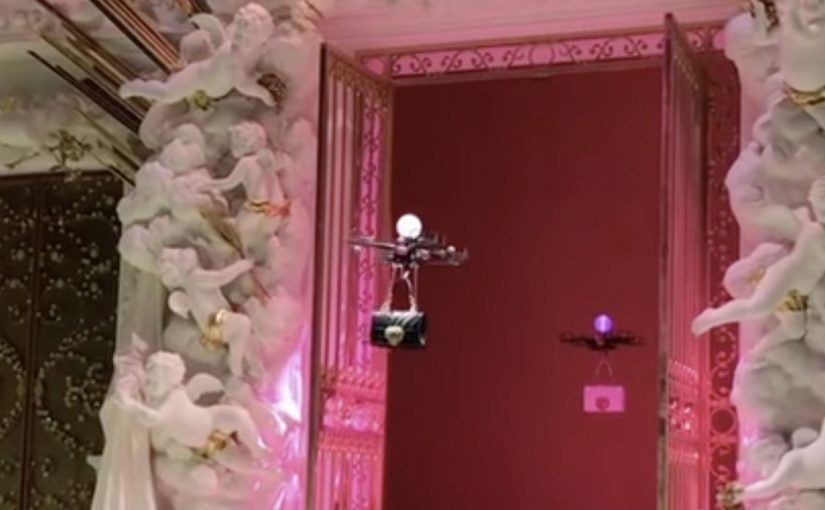
The drones were made to carry Dolce & Gabbana’s latest range of “Devotion” leather handbags as part of its fall and winter collection. Around seven copters hovered along the runway, each with a Dolce & Gabbana handbag dangling beneath it.
How the stunt works
The mechanism is pure stagecraft. Here, stagecraft means using the runway itself as the media device, not just as the place where the product appears. Take the product that matters. Put it in motion. Remove the expected human element. Then let the crowd do the amplification for you. The runway becomes the distribution channel, because every phone in the room turns into a broadcast rig.
In luxury and fashion marketing, runway moments often function as global media events rather than closed-room trade shows.
Why it lands
The drones are not there to “model” the bag better than a person. They are there to create a new mental category for the launch. Tech meets craft. Spectacle meets product detail. It is instantly legible, and that legibility is what makes it shareable. The real question is not whether drones are novel, but whether the launch gives people a visual they can describe and repost in one sentence.
Extractable takeaway: If you want a product launch to travel, engineer one clean, easily described visual rule that can be captured in a single clip and understood without context.
The business intent behind the spectacle
There is a practical strategy under the theatrics. A handbag line needs repetition to build recognition. An opener like this creates an excuse for editorial coverage that would not exist for a standard runway walk. It also frames the collection as a moment, not just merchandise. This is a smart luxury launch because it turns product display into earned-media design.
What luxury brands can steal from this opener
- Lead with the product, not the brand story: put the object at the center of the visual idea, then let everything else support it.
- Design for the camera lens: build an opener that looks good from the audience angle, because that is where the internet gets its footage.
- One rule, repeated: a single, consistent gimmick (bags carried by drones) reads stronger than five different surprises.
- Operational friction is part of the story: if a stunt has constraints, treat them as production discipline, not as an afterthought.
- Make the opener do the PR work: the first 30 seconds should be enough for headlines, clips, and social captions.
A few fast answers before you act
What did Dolce & Gabbana do at Milan Fashion Week?
They opened a runway segment with drones carrying the brand’s Devotion handbags, replacing the expected human “bag parade” with flying copters.
Why use drones instead of models?
Because it creates an immediate, high-contrast visual. It signals novelty fast, it photographs well, and it makes the product launch feel like a cultural moment.
Is this a technology play or a PR play?
Primarily a PR play. The technology is the prop. The real value is attention, recall, and the shareable simplicity of the idea.
What is the transferable pattern for other brands?
Put your product into an unexpected but instantly understandable delivery mechanism. Keep the rule simple. Make it easy for a spectator to capture and repost.
What is the biggest risk with stunts like this?
Execution risk. If the tech introduces delays, safety concerns, or awkward staging, the narrative can flip from “innovative” to “gimmicky”. Production rigor matters as much as the idea.

