Hello bank!: The Mobile Orchestra

Hello bank!: The Mobile Orchestra

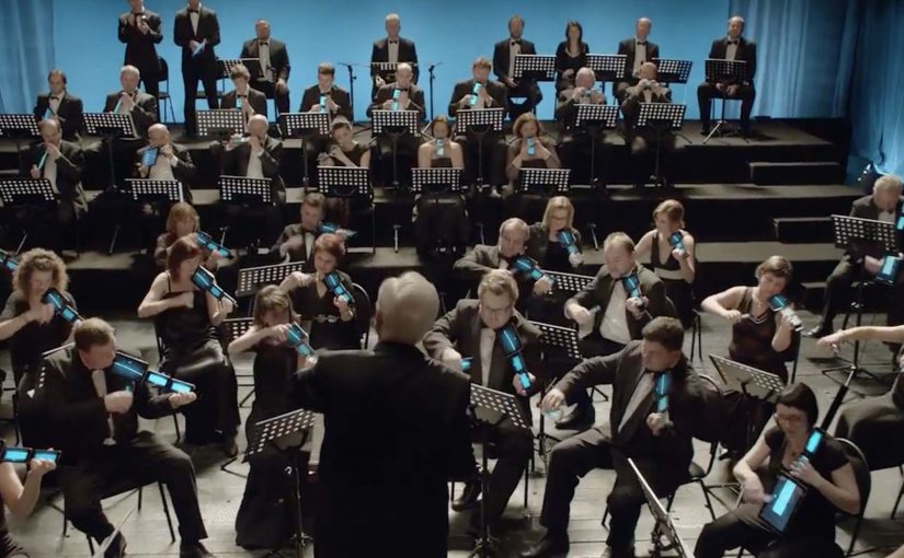
To promote Hello bank!, BNP Paribas and agency B-Roll wired up 60 musicians in the Czech National Symphony Orchestra with smartphones and tablets for a rousing rendition of “Carmen.”

A bank launch that uses devices as instruments

Hello bank! is positioned as an “all-digital” bank in Europe, and the launch film turns that idea into a performance. BNP Paribas and agency B-Roll wire up 60 musicians in the Czech National Symphony Orchestra with smartphones and tablets and stage a rousing rendition of “Carmen.”

The mechanism is not an app demo. It is a symbolic proof. The devices that usually represent distraction and notifications become part of the orchestra, implying that “digital” can be disciplined, coordinated, and human when it is designed well.

In European financial services launches, differentiation is often abstract, so the work has to make the promise visible.

Why it lands

This works because it treats technology as an instrument, not a feature list. Orchestras are the opposite of chaotic. They are synchronized systems where every signal matters. That metaphor is useful for a digital bank that wants to feel trustworthy while still modern. You should lead with a credible system metaphor like this when feature claims would sound generic.

Extractable takeaway: When your product benefit is invisible, translate it into a physical system people already associate with reliability. A performance can do what a product explainer cannot. It makes the promise feel real.

What the brand is really trying to say

Hello bank! is telling the market that “digital-first” does not have to mean cold or fragile. The orchestration suggests competence, control, and a new kind of everyday convenience that still sits on serious infrastructure.

The real question is whether your “digital-first” promise is legible without an app screen.

Moves to borrow for your next launch film

  • Choose a metaphor with built-in credibility. Orchestras communicate precision and trust without needing a voiceover.
  • Let tech be a prop, not the plot. Devices appear, but the story is about what they enable.
  • Make the proof visible. A claim becomes believable when it has a physical analogue the audience can instantly read.
  • Keep the idea retellable. “A symphony played on smartphones and tablets” is enough to earn a click.

A few fast answers before you act

What is the Hello bank! “Mobile Orchestra” campaign?

It is a launch film where the Czech National Symphony Orchestra performs while using smartphones and tablets as part of the instrumentation, created to symbolize Hello bank!’s digital-first positioning.

Why use an orchestra to communicate a bank promise?

Because orchestras represent coordination and reliability. That meaning transfers well to a digital bank that must feel safe while being modern.

Is this an app demo or a brand story?

It is primarily a brand story. The devices are a metaphorical proof of “digital” rather than a walkthrough of product features.

What makes this shareable as branded content?

The premise is instantly understandable and visually unusual. People click to see how it is done, and the brand benefit travels inside the spectacle.

How do you keep a metaphor like this from feeling gimmicky?

Tie the spectacle to a meaning people already trust, then keep the execution disciplined so the “proof” reads as competence, not randomness.

Radio Geister: When the Crash Site Talks Back

Radio Geister: When the Crash Site Talks Back

When you drive past a crash site, the warning follows you

One of the most chilling awareness ideas in recent memory does not start on a screen. It starts at the roadside.

For “Radio Geister” (Radio Ghosts), small radio stations in the shape of wooden death crosses are placed around Hamburg at sites where alcohol-related car accidents had happened. As young drivers approach, these mini transmitters interrupt the signal of popular radio stations. In place of music, the driver hears a radio spot voiced from the perspective of someone who died in a drunk-driving crash.

The mechanic: audio interruption tied to the exact location

The project combines two moves. First, it uses physical markers that already mean something in the real world. The roadside cross. Second, it turns radio into a proximity medium by briefly overriding a station’s signal at the moment a driver is physically passing the place where something irreversible happened.

The radio spots themselves are written as first-person accounts from fatal accident victims, which makes the interruption feel less like an ad and more like a presence.

In European road-safety communication, the fastest way to break through denial is to connect a real place, a real habit, and a real consequence into one unavoidable moment.

Why it lands

This is a stronger road-safety intervention than a conventional awareness spot because it weaponizes context. The message does not arrive while someone is “in awareness mode.” It arrives while they are driving, listening to the stations they actually use, in a location that proves the stakes. The interruption is also proportionate. It is brief, but it is intrusive enough to create a jolt, which is exactly what complacency needs.

Extractable takeaway: If you need to change risky behavior, deliver the warning inside the behavior, not around it. Tie it to a specific place and a familiar channel, and the mind cannot file it away as generic advice.

What the campaign is trying to change

The framing used in campaign write-ups is stark. “One out of eleven deaths caused by car accidents has to do with drinking and driving.” Whether or not you accept the exact ratio, the creative intent is clear. Replace abstract statistics with a felt experience that young drivers will remember the next time they consider driving after drinking.

The real question is not whether young drivers know the rule, but whether the warning can reach them inside the exact driving moment when denial still feels safer than restraint.

What road-safety campaigns can steal from this

  • Use the environment as proof. A crash site is a more credible media placement than any billboard.
  • Interrupt the comfort loop. If the risky habit is paired with entertainment, break the entertainment briefly.
  • Write from a human perspective. First-person voice makes consequences feel immediate, not theoretical.
  • Keep it simple, keep it sharp. One moment of shock can beat a long lecture.

A few fast answers before you act

What is “Radio Geister” (Radio Ghosts)?

It is a road-safety awareness project that places cross-shaped mini transmitters at crash sites to interrupt popular radio stations with warnings voiced from the perspective of drunk-driving victims.

What is the core mechanic?

Location-triggered audio interruption. As drivers pass the crash site, their radio station is briefly overridden by the campaign message.

Why use radio for this instead of posters or video?

Because radio is already in the car, already on, and already trusted as a companion. The message arrives in the exact medium the driver is using in the moment that matters.

Why is the crash-site placement so important?

The location turns the warning into evidence. It signals that this happened here, to someone real, not in a hypothetical scenario.

What is the transferable lesson for behavior-change campaigns?

Do not ask people to imagine consequences later. Insert consequences into the live context where the decision is being made.

Your Music School: Voice-Navigated Website

Your Music School: Voice-Navigated Website

Your Music School is a school for vocal education in Hamburg. To generate more applicants for the school’s vocal coaching courses, ad agency Red Rabbit Hamburg developed a website that can be navigated by using one’s own voice.

The eight menu items on the navigation are arranged on a scale. By singing the appropriate notes, you can directly hit the desired menu item. As a result, the website increased applications to the vocal coaching courses by almost 30%.

When the interface previews the course

This is recruitment as product demonstration. Before you read about vocal coaching, you are already doing a micro-version of it. You listen, you match pitch, you get feedback, and the site responds.

The mechanic: navigation as a singing exercise

The interaction design is a single clear rule. Map menu choices to notes on a scale, then let the user’s voice act as the pointer. It removes the mouse, reduces explanation, and makes the site’s subject matter unavoidable in the best way.

In European education marketing, interactive admissions touchpoints work best when the first interaction proves the promise, and makes the applicant feel capable within seconds.

Why this lands

It turns curiosity into participation. People arrive expecting a standard brochure site, and instead get a playful challenge that feels aligned with the goal of singing better. That alignment makes the brand feel confident, and it lowers the psychological barrier to applying because the visitor has already taken a first “lesson” without committing.

Extractable takeaway: If you sell skill-building, make the first click a tiny skill moment. Let the interface demonstrate the value before the copy explains it.

What it is really optimizing for

The real question is whether the interface proves course fit before the application form appears.

The point is not novelty. The point is qualified intent. Qualified intent means interest from people already comfortable with the core behavior the course demands.

Anyone willing to test their voice to navigate is self-selecting into the right audience, which makes the application uplift more believable than a pure traffic spike.

What to steal from voice-led admissions

  • Turn a site feature into a proof of value. Navigation becomes the product, not a wrapper around it.
  • Use one rule and make it learnable fast. One mapping. Immediate feedback. No instructions-heavy onboarding.
  • Design for confidence. Small early successes are what convert interest into action.
  • Let the interaction pre-qualify. People who enjoy the mechanic are more likely to enjoy the offering.

A few fast answers before you act

What is special about the Your Music School website?

It can be navigated by voice. The main menu sits on a musical scale, and users select items by singing the corresponding notes.

Why does voice navigation make sense for a vocal coaching school?

Because the interface demonstrates the subject immediately. It converts the first visit into a small singing task, which aligns the experience with the promise of the course.

What outcome did the site drive?

The site increased applications to the vocal coaching courses by almost 30%.

Why is this more than a gimmick?

Because the interaction previews the course itself. Visitors are not just exploring the site. They are rehearsing the core behavior the school teaches, which helps qualify interest and reduce hesitation.

When should you use this pattern?

When your product is skill-based and you can translate the skill into a simple, low-friction interaction that builds confidence and qualifies interest.