
Contrex: The Contrexperience

When diet culture repeats, brands look for a better hook

Contrex looked for a way to make the same truth feel like an experience instead of advice.

Every year, magazines announce new fad diets. And each time, the conclusion is the same. It does not work. To lose weight effectively and permanently, one must adopt a balanced diet, drink water, and do regular exercise.

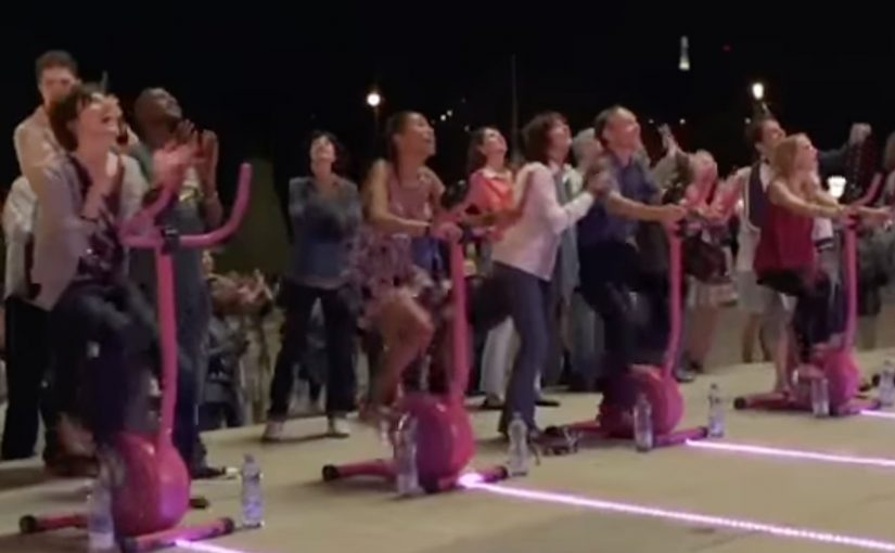
So Contrex, a mineral water brand owned since 1992 by Nestle Waters, decided to create an ambient campaign that showed how losing weight could be fun.

Here, “ambient” means a real-world installation that turns the message into something people do, not something they read.

How the ambient idea turned effort into play

The mechanism was to move the message out of print logic and into physical behavior.

The real question is how to make a wellness behavior feel worth starting now, not merely worth agreeing with.

Rather than telling people to exercise, the campaign created an environment where movement was the point, and where participation delivered a visible, enjoyable payoff. The installation did what most health messaging cannot. It made action feel lighter than intention.

That matters because it turns intention into a felt first step, and felt first steps are easier to repeat.

In European FMCG marketing, “health” messages often fail when they sound like lectures.

Why “fun” can outperform discipline

Fad diets fail for a predictable reason. They demand willpower every day, and they punish slips.

Extractable takeaway: When you need behavior change, design the first step to feel like play, not a test of discipline.

By contrast, play removes friction. When exercise feels like a game, people start without negotiating with themselves. That first step matters because health change is rarely blocked by knowledge. It is blocked by starting.

Contrex used that psychological shift to reframe weight loss from restriction to participation.

The business intent behind making weight loss entertaining

The intent was to connect Contrex with a sustainable, realistic path to wellness, not a temporary fix.

In wellness marketing, lowering the friction to start beats repeating discipline slogans.

By associating the brand with water, movement, and balance, the campaign positioned Contrex as a companion to everyday healthy behavior. In a category where the product is easily interchangeable, that behavioral association is where differentiation lives.

Design moves for your next wellness activation

  • Turn advice into action. If your message is behavioral, build an experience that makes the behavior happen.
  • Design for a low-friction start. The first minute matters more than the perfect plan.
  • Use play as a motivator. Fun can carry people further than discipline messaging.
  • Link brand value to the routine. The brand should feel like part of the habit, not a slogan around it.

A few fast answers before you act

What is Contrexperience?

An ambient campaign by Contrex designed to show that exercise and weight-loss motivation can be fun, not just disciplined.

What problem was Contrex responding to?

Recurring fad-diet cycles that promise quick fixes but do not lead to lasting results.

What was the core mechanism?

Move the health message into a physical, participatory experience that rewards movement and lowers the barrier to starting.

Why does a “fun” approach work in wellness messaging?

Because play reduces friction and gets people moving without requiring constant willpower negotiations.

What is the transferable takeaway for brands?

If your product supports healthy behavior, build experiences that make the behavior feel easy to start and satisfying to repeat.
UNICEF Tap Project: Dirty Water Machine

What if someone bottled the water that millions in developing countries drink every day and offered it on the streets of New York?

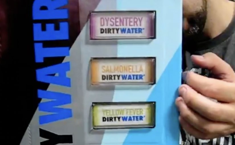
For just a buck, during World Water Week (March 22-29), New Yorkers in the Union Square Park area are invited to “enjoy” the benefits of Dirty Water. It comes in a range of choices like Malaria, Cholera, or Typhoid Dirty Water, and is described as having 900 million consumers.

Dirty Water is not an actual product, but a real problem for millions of children around the world.

A vending machine that sells disgust

The mechanism is a classic reversal: a familiar vending machine is repurposed to dispense bottles labeled with water-borne diseases. The point is not to get anyone to drink it. The point is to make the problem visceral and immediate for people who normally never have to think about it. By keeping the interaction familiar, the reversal lands because it turns moral distance into a physical reaction in seconds.

In global cause marketing, turning an abstract statistic into a physical choice can move more people from awareness to action than another informational poster ever will.

The real question is whether you can turn a distant, abstract problem into a personal encounter that makes action feel unavoidable.

Why “nobody drinks it” is the message

New Yorkers are startled to see options like Yellow Fever or Hepatitis Dirty Water. They look at the machine in disgust. And that disgust is the creative payload, meaning the emotional reaction the campaign is designed to deliver, because it mirrors the reality that millions of families do not have the option to refuse unsafe water.

Extractable takeaway: When the barrier is “I cannot feel this problem,” engineer a harmless encounter that triggers the right emotion on contact, then attach one immediate action that turns that emotion into help.

The donation promise that makes the $1 meaningful

The idea of “selling” dirty water is framed as being inspired by UNICEF’s promise that every dollar donated provides safe drinking water to 40 children for a day. Even if the bottle is never purchased as a “product”, the transaction becomes a small, concrete unit of impact.

How the campaign stays active beyond the street

This Dirty Water initiative is positioned as ongoing, with continued donation options online at tapproject.org or via text message. Text TAP or AGUA to UNICEF (864233) to make a $5 donation.

Steal the Dirty Water pattern

  • Use reversal with familiar UX. Put the message inside an everyday interaction so the emotional hit lands before the rational debate starts.
  • Make the abstract a physical choice. Let people “choose” the problem in front of them, then offer one simple action to refuse it for someone else.
  • Price the action as a unit. Frame the donation as a small, concrete purchase so the person feels immediate impact, not vague virtue.

A few fast answers before you act

What is the “Dirty Water” vending machine in one line?

A public vending machine that dispenses “dirty water” bottles labeled with diseases to shock passers-by into donating for clean water.

Why price it at $1?

Because $1 is a friction-light ask that feels like a purchase, not a pledge, and it maps to a clear “unit” of impact in the campaign story.

What is the main creative trick that makes it work?

Reversal: it sells something no one wants, so the emotional response is disgust, and that response reframes clean water as a privilege rather than a given.

What should brands learn from this without copying the cause?

If the problem is invisible, make it physically encounterable, and tie the encounter to one simple action that feels immediately meaningful.

What is the lowest-risk way to adapt this pattern?

Keep the reversal honest and harmless, avoid sensational claims, and make the action as clear as the emotion: one step, one outcome, no hidden complexity.

CNN International: Go Beyond Borders

A brand message written into a city’s geography

The strongest initiatives do not ask people to remember. They make history physically reappear in the places where it happened.

The Go Beyond Borders Project was an initiative of Heimat Berlin and CNN International, in conjunction with Berlin tape artist El Bocho, created around the 20th anniversary of the fall of the Berlin Wall.

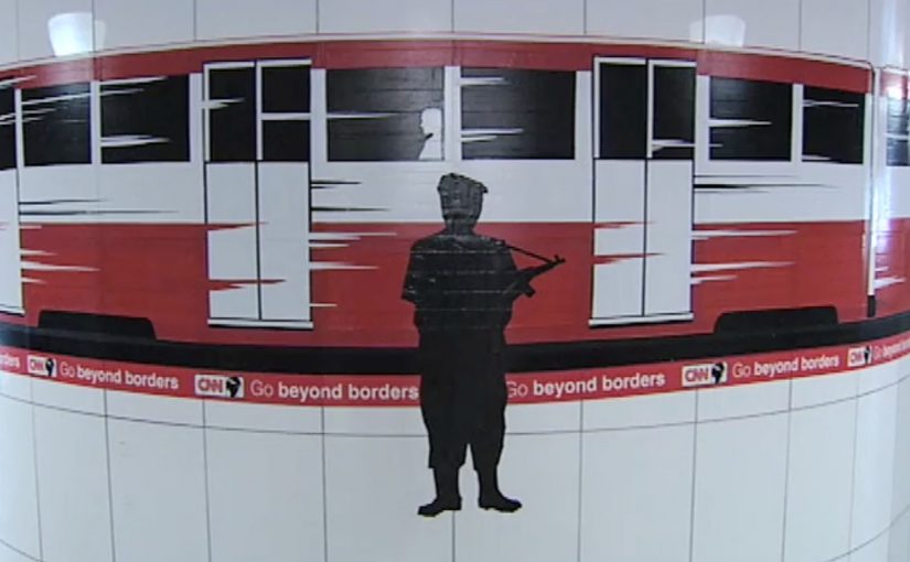
40 km of Go Beyond Borders tape was produced to mark the original position of the Berlin Wall, and eight street art installations told heroic stories of those who conquered the divide between East and West Berlin.

How the project worked as a city-scale marker

The mechanism combined two layers. A city-scale marker is a simple physical rule repeated along a route so the city itself becomes the medium.

First, the tape traced the former Wall line, turning an invisible historical boundary into a visible path you could follow. Second, the street art installations anchored that path with human stories, making the line about people, not only geography.

Because the tape turned an invisible boundary into a route you could walk, it made the former Wall line feel present in everyday movement.

It was simple enough to understand instantly, but large enough to feel unavoidable once you encountered it.

In European cities where collective memory is written into streets and transit, a walkable marker can carry meaning faster than a ceremony can.

The real question is whether your message can be experienced as a physical rule, not merely read as copy.

If the story is spatial, you should build the physical marker first and let media coverage follow.

Why it landed harder than a conventional commemoration

Most anniversaries stay inside ceremonies, speeches, and media coverage. This one put the memory back into the street. The tape created a direct, physical confrontation with “where the divide was.” The art installations made the meaning legible by focusing on courage and crossing, not abstraction.

Extractable takeaway: When meaning depends on place, turn the place into the medium with one walkable marker, then add human stories so the marker carries emotion, not just coordinates.

That shift matters because it turns history into presence, and presence into conversation.

The intent behind “Go Beyond Borders”

The action also marked the launch of CNN’s new international slogan: Go Beyond Borders.

The business intent was to associate the brand with perspective, movement, and crossing divides, using a real-world symbol that already carries emotional weight. Rather than declaring what the slogan means, the initiative demonstrated it through a place-based experience people could encounter and share.

What Go Beyond Borders teaches about place-based branding

A place-based brand initiative uses a physical location or route as the primary medium for the message, not only media.

  • Make the invisible visible. If the story is spatial, mark it in the real world so people can physically encounter it.
  • Pair scale with human narrative. A city-scale gesture earns attention. Stories earn meaning.
  • Use a simple rule. One clear device. Here, tape tracing the line. Makes participation and comprehension effortless.
  • Let the message be demonstrated. If your slogan is about crossing boundaries, show a boundary and what it took to cross it.

A few fast answers before you act

What was the Go Beyond Borders Project?

An initiative by Heimat Berlin and CNN International with artist El Bocho that used tape and street art to mark the former Berlin Wall line and tell stories of crossing East and West Berlin.

What was the core mechanism?

40 km of tape traced the Wall’s original position, while eight street art installations provided narrative anchors and human context.

Why did the tape approach work so well?

Because it turned an abstract memory into a physical, walkable marker that people could encounter in everyday life.

What business goal did this support?

Launching and giving meaning to CNN’s “Go Beyond Borders” slogan by demonstrating it through a culturally significant, real-world experience.

What is the main takeaway?

If you want a message to stick, embed it in a place people can experience, then reinforce it with stories that explain why it matters.