KitKat: The Slooowest Vending Machine

KitKat: The Slooowest Vending Machine

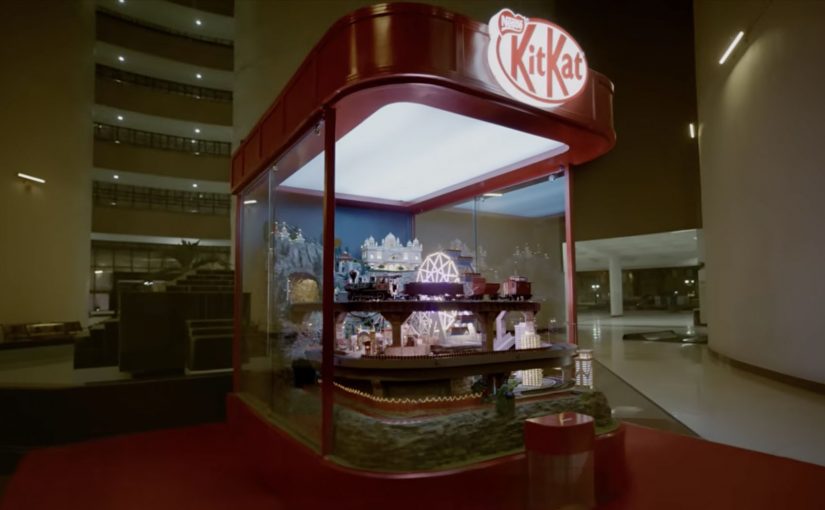
I have covered dozens of unique vending machines over the years. The last one was as far back as 2018, when Ford used a car vending machine in Guangzhou, China. Now fast forward to 2026 and KitKat has successfully reimagined waiting time at a regular vending machine into the brand experience itself.

When a break brand faces a speed problem

KitKat’s reported premise is simple. In a culture of compressed attention, even the break is getting shortened. So the brand in Hyderabad, India took one of the most convenience-coded retail objects possible, a vending machine, and used it to restage “Have a Break” as something you feel, not just something you read. The activation was developed by VML India and VML Netherlands and brought to life with Delhi-based production house The Other Half.

That setup matters because vending machines normally stand for speed, utility, and instant gratification. KitKat flipped that expectation on purpose. Instead of using the machine to remove waiting, it used the machine to make waiting visible, memorable, and unmistakably on-brand.

How KitKat turned waiting into the product demo

Instead of dropping a bar in seconds, the transparent machine sends it through a miniature sequence inspired by everyday Indian life, including a toy train, a Ferris wheel, a truck ride, a river journey, and a festive procession. Reported timings make the contrast do real work. A normal vending machine interaction is framed at about three seconds. This one stretches the moment to around three minutes.

That matters more because the machine sat inside one of Hyderabad’s busiest commercial hubs, where speed is the default behavior and pausing is the unusual act.

The mechanism works because the extra time is not dead time. It is branded time, which turns delay into attention and makes the promise of a break tangible before the product is even consumed.

The smart part is that the machine does not merely slow the transaction. It choreographs the delay. That is why the pause feels closer to a scenic reward than a service failure.

Why the stunt lands harder than a normal activation

This is the rare activation where added friction strengthens the brand instead of weakening it.

KitKat wins here by using deliberate friction. Deliberate friction is an intentional pause or extra step added to an experience so the brand can increase attention, memory, or meaning instead of just reducing effort.

Most friction in customer experience is accidental and expensive. It comes from broken UX, poor orchestration, slow service, or unclear process. KitKat does the reverse. The pause is visibly intentional, visibly crafted, and tightly linked to a long-established brand promise, which is why reported reactions centered on watching, smiling, lingering, and sharing instead of irritation.

There is also a crowd mechanic at work here. The machine is slow enough to create curiosity, visual enough to hold attention, and simple enough for bystanders to understand within seconds. That combination turns one person’s purchase into a shared piece of theatre.

Where the business value actually sits

The enterprise lesson is not that brands should slow down checkout, navigation, or service recovery. The real question is where speed is hygiene and where tempo is part of the value exchange.

For consumer experience platforms and MarTech teams, that translates into a cleaner operating rule. Keep utility moments brutally fast, such as search, payment, account access, and complaint handling. But in moments tied to ritual, reveal, education, reward, sampling, or branded storytelling, controlled pacing can sometimes do more commercial work than raw speed because it increases attention, recall, and distinctiveness.

The business intent here is not transaction efficiency. It is brand encoding. KitKat is defending a recognizable promise in a category where faster is easy to copy, but a meaningful pause is harder to own.

That is the part many teams miss. Brand platforms do not become durable because they are repeated in copy. They become durable when the operating design of the experience makes the promise physically true.

How deliberate friction can strengthen a break brand

Deliberate friction only works when three conditions hold. The pause must express the brand idea, the consumer must understand why it exists, and the wait must be short enough and crafted well enough to feel rewarding rather than defective. Break any one of those rules and the same device becomes irritation, not experience design.

Add friction only when it makes the promise more tangible than speed would. If the delay is not visibly on-brand, clearly signposted, and tightly controlled, it is not experience design but bad service.


A few fast answers before you act

What is KitKat’s Slooowest Vending Machine?

It is a reported experiential installation in Hyderabad that turns a snack vending machine into a three-minute miniature journey, so the wait itself becomes the break.

Why does the idea work?

It works because the delay is visibly intentional and tightly tied to KitKat’s break positioning, so the pause feels like the product experience rather than a machine malfunction.

What is the operator lesson?

Speed is not the only KPI. In selected touchpoints, controlled pacing can increase attention, memory, and brand fit more effectively than pure efficiency.

Where should brands not copy this?

Do not add friction to utility-heavy moments like payment, login, navigation, or complaint handling, where speed and clarity are the promise.

What should CX and MarTech teams measure if they test a similar move?

Measure dwell time, completion rate, abandonment, recall, sharing, and whether the experience strengthened the brand association you intended to encode.

Herta Knacki FootBall: The Football Machine

Herta Knacki FootBall: The Football Machine

Herta, described as a Nestlé brand in Belgium, launched Knacki FootBall. Small meatballs designed to look like footballs. Instead of relying on standard sampling, the brand and BBDO Brussels turned a train-station moment into a game people could not ignore.

At Antwerp Central Station, a vending machine offered the product for free. Then came the twist. Press the button and the machine opened into a miniature football pitch, with Belgian football legend Leo Van Der Elst waiting inside. To walk away with the snack, you had to score.

Free is easy. Earning it is memorable.

The mechanic is deliberately unfair in the right way. People approach expecting a quick handout. The reveal forces a choice. Walk away, or step in and play. That decision point creates tension, and tension creates attention. In high-traffic commuter environments, the best sampling ideas turn “free” into a short challenge with a story-worthy payoff. The real question is whether your sampling moment earns attention before it earns a bite.

Extractable takeaway: Sampling gets retold when it includes a moment of risk or effort. The product becomes a trophy, not a giveaway.

A vending machine that behaves like a stadium

The physical design does most of the communication. The moment the door opens, everyone nearby understands what is happening. It becomes a spectator event, which is crucial in a station setting where most people do not want to stop unless something is already happening.

Why the celebrity opponent matters

Leo Van Der Elst is not a generic “host.” He is the difficulty setting. His presence turns the activation into a genuine duel, and that makes the outcome feel earned whether you win or lose. It also gives the content a built-in headline when the story travels online.

What the brand is really reinforcing

Knacki FootBall is a novelty product, so the job is not deep education. It is instant association. Football. Fun. A quick bite. The machine makes those associations physical, then anchors them to a specific place and moment people remember.

How to copy The Football Machine

  • Build a single, obvious action. Press the button. The rest happens to you.
  • Make the reveal legible from 10 meters away. If bystanders cannot decode it fast, you lose the crowd effect.
  • Turn sampling into a challenge. Effort increases perceived value and shareability.
  • Use a real “difficulty signal.” A credible opponent or constraint makes the game feel legitimate.
  • Design the exit. Winning should end with a clear reward and a clean photo moment.

A few fast answers before you act

What is Herta Knacki FootBall “The Football Machine”?

It is a vending machine activation where commuters expecting a free sample discover a miniature football pitch inside, and must score a goal to win Knacki FootBall.

Where did the activation run?

It is described as being installed at Antwerp Central Station in Belgium.

Why use a vending machine for a food launch?

Because it creates a familiar expectation. Then you can subvert it. That contrast generates surprise, crowd attention, and strong word of mouth while still delivering the product sample.

What makes this work in a train station specifically?

Stations are full of people who are time-poor. A reveal that is instantly understandable, plus a short game loop, one attempt that takes seconds, can stop people without requiring explanation.

What is the biggest operational risk with this kind of live activation?

Throughput and safety. If the game takes too long, queues become friction. If the experience feels unsafe or embarrassing, people avoid participation and the crowd effect collapses.

Coca-Cola: Give a Coke, Be Santa

Coca-Cola: Give a Coke, Be Santa

A vending machine that asked you to choose who you are

The strongest holiday ideas turn seasonal sentiment into a simple action people can take in public. Coca-Cola’s holiday vending machine is a clean example of that move.

Coca-Cola wanted to bring out the Santa in everyone. So for the 2013 holiday season, they created a special vending machine that prompted users to either get a free Coke or give a free Coke.

The two-button mechanic that made sharing the story

If the user chose a free Coke, the machine quickly dispensed the drink for the user to enjoy.

However, if the user decided to share, then the machine did something a little more special. Watch the video below to find out.

In high-traffic FMCG retail settings, a binary choice lets a brand value show up as behavior in seconds.

Why “give” feels better than “get” in December

The psychology here is straightforward. A free product is nice, but it is forgettable. A choice that reflects identity is sticky.

Extractable takeaway: If you want a value like generosity to travel, put it into a visible choice where the “better self” option is easy to pick and easy to witness.

By putting “give” and “get” side by side, the machine turns a small decision into a moment of self-image and social proof, meaning other people can see the choice and validate it. During the holidays, people want to see themselves as generous, and they want to be seen that way by others.

The business intent behind bringing out the Santa

The intent is not simply distribution.

The real question is whether your brand promise can be expressed as a choice people are proud to make in public.

This is a stronger holiday move than a message-only campaign because it makes the value legible and repeatable at the point of interaction.

Coca-Cola uses the vending machine to translate a brand promise into behavior. The brand is associated with warmth and sharing because the consumer enacts it, not because the brand claims it.

How to reuse this give-or-get choice design

  • Turn values into a choice. Make the brand idea something people can do, not just hear.
  • Reward the “better” behavior. If sharing is the story, make sharing the more memorable path.
  • Keep the interaction instantly legible. Two clear options beat complex instructions in public spaces.
  • Design for a public moment. When others can witness the decision, the story travels faster.

A few fast answers before you act

What did Coca-Cola build for the 2013 holiday season?

A special vending machine that offered users a choice: take a free Coke or give a free Coke.

What was the core mechanism?

A simple two-option prompt. Choosing “get” dispensed a Coke immediately. Choosing “give” triggered a more special outcome.

Why does the “give” option matter so much?

Because it turns a freebie into an identity moment. People remember what they chose, and others can witness it.

What business goal did this support?

Making Coca-Cola’s holiday positioning feel real by linking the brand to a visible act of sharing, not just a message about sharing.

What is the main takeaway for brands?

If you want to own a value like generosity, design an interaction where people can demonstrate that value in the moment.