Turismo de Portugal: Cobblestone QR Codes

Turismo de Portugal: Cobblestone QR Codes

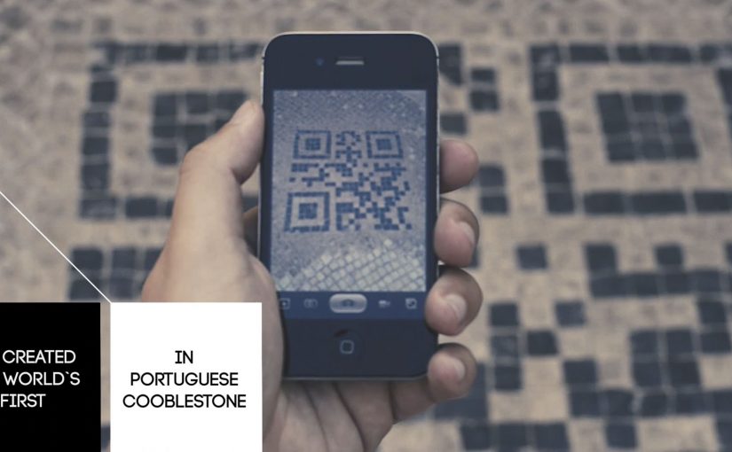
To get into the minds of tourists, Turismo de Portugal decides to fuse QR code technology with Portugal’s historical cobblestone tradition. The result is described as the first QR code made from Portuguese cobblestones.

The first QR code is embedded into the city ground in Lisbon, followed by an installation in Barcelona. Reported write-ups describe the campaign as successful enough to spark plans for similar cobblestone QR codes in other cities such as Berlin, Paris, Tokyo, New York, Vienna, Goa, Lima, and Oslo.

When street craft becomes the interface

The mechanism is simple. A familiar tourist behavior, looking down at the street and looking for cues, is turned into a scan trigger. The QR code is physically “native” to the place because it is built using the same black-and-white stone patterns people already associate with Portuguese streets, especially in historic areas like Chiado.

In destination marketing and city tourism promotion, bridging physical street culture to mobile content is a reliable way to convert foot traffic into deeper engagement. Destination brands should treat the street as the interface, not just the backdrop.

In European destination marketing, the most scalable activations turn street-level cues into a clear mobile doorway.

Why this lands with visitors

It does two jobs at once. It signals “authentic Lisbon” through material and craft, and it gives the tourist an immediate next step through their phone. The real question is how you turn a place’s own cues into a frictionless next step without making it feel like advertising. Unlike a poster or a billboard, the code is part of the ground people are already walking on, so discovery feels like finding something, not being targeted.

Extractable takeaway: If you want mobile interaction in public space, embed the call-to-action into something the place already owns. Local texture first, technology second. The scan should feel inevitable, not imported.

What to steal for your own place-based activations

  • Make the trigger belong to the environment. Use local materials, patterns, or rituals so the interaction feels contextual.
  • Design for tourist attention spans. The best street interactions reward a 5-second decision, not a long explanation.
  • Use “discovery” as the media buy. When people feel they found it, they are more likely to scan, share, and talk about it.
  • Plan for maintenance and legibility. Outdoor codes live or die based on wear, lighting, contrast, and camera-readability.

A few fast answers before you act

What is the Cobblestone QR idea in one sentence?

A QR code built into the street using Portuguese cobblestones, so tourists can scan a piece of the city itself to access content.

Why does making a QR code “physical” matter?

Because it turns a generic tech behavior into a place-specific experience. The scan feels like interacting with Lisbon, not with a random sign.

What makes this different from putting a QR code on a poster?

Placement and meaning. A poster is rented space. A street pattern is owned space. The medium carries authenticity before the message even loads.

What should the QR code open to?

A fast-loading mobile page that confirms you are in the right place and offers one clear next step. If the page feels generic or slow, the “found it” magic disappears.

What is the biggest execution risk?

If the code is hard to scan or the content behind it is weak, the novelty collapses. The physical build earns attention. The mobile experience must repay it.

Misereor: The Power of a Coin

Misereor: The Power of a Coin

A billboard at Hamburg Airport does not just ask for money. It takes a 2-euro donation and immediately shows what that coin can do.

Misereor has been committed to fighting poverty in Africa, Asia and Latin America for over 50 years. To drive more donations, they install a billboard with a donation box built into it. When people put in 2 euros, the billboard brings to life how that coin can help across Misereor’s aid projects.

The billboard also links the offline act to an online conversation. It takes a photo of the donor and posts it to the campaign’s Facebook app. A QR code on the billboard lets donors share the promotion on their own Facebook page.

How the interaction is designed to convert

The mechanism is a tight, three-step loop. Physical donation triggers an immediate visual payoff. The payoff translates “impact” from an abstract promise into a concrete scene. The scene then becomes shareable proof through an automatic photo post and a QR-driven sharing prompt.

In high-traffic public spaces where attention is fragmented and dwell time is unpredictable, donation design wins when it minimizes steps and makes impact visible immediately.

Why it lands

This works because it replaces guilt with clarity. You do not just hear that your money helps. You see a specific outcome the moment you give, which makes the decision feel both meaningful and finished.

Extractable takeaway: If you want more donations, build a “give. see. share.” loop where the act of giving triggers instant, legible impact, and the sharing step is optional but effortless.

The real goal behind the 2-euro choice

The real question is whether a donation ask can feel immediate, visible, and worth doing before the traveler walks away. A 2-euro ask is small enough to feel impulse-safe, especially in an airport moment where people already make small purchases without overthinking. The campaign then uses the experience to recruit advocates, not just donors, by turning each donor into a visible participant online.

What this donation design gets right

  • Make the donation amount frictionless. Small, fixed amounts reduce decision paralysis.
  • Show impact instantly. The payoff must happen before the donor walks away.
  • Bridge offline to online. Capture a shareable artifact, but keep it consent-friendly.
  • Keep the interface obvious. A slot, a prompt, a clear result. No instructions required.

A few fast answers before you act

What is “The Power of a Coin”?

An interactive airport billboard for Misereor where a 2-euro donation triggers an animation that shows how the money helps, and then offers easy sharing via photo and Facebook.

What is the core mechanism?

Donate a fixed amount, get an immediate visual “impact reveal”, then optionally share via an automatically posted donor photo and a QR-enabled share prompt.

Why is the instant animation important?

It turns “trust us” into “watch this”. Immediate feedback reduces skepticism and increases the chance of giving in-the-moment.

What is the biggest risk with the social layer?

Consent and platform drift. If posting feels automatic in a way donors did not expect, or if platform permissions change, the sharing layer can backfire or break.

What is the transferable lesson for other causes?

Design the donation moment like a product demo. One action triggers a clear result, then the donor can share proof without extra effort.