Coke Zero: Unlock the 007 in You

Coke Zero: Unlock the 007 in You

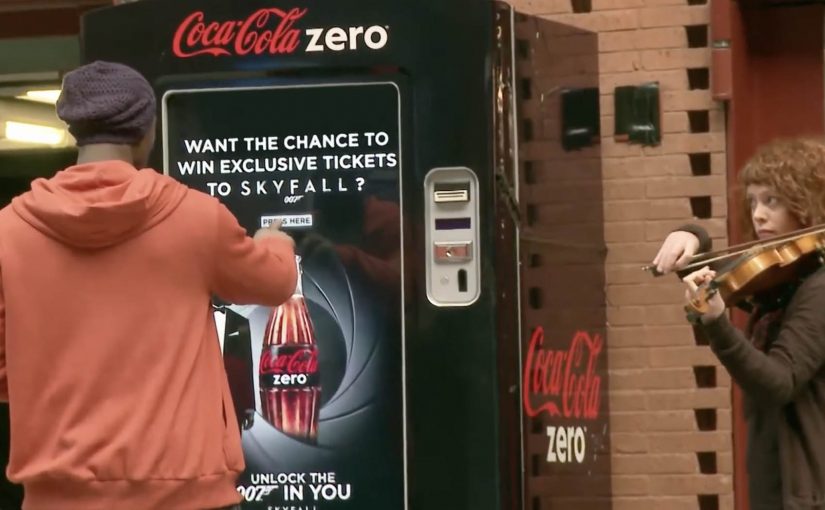
At Antwerp Central Station, Coke Zero challenges unsuspecting passengers to unlock the 007 in them for a chance to win exclusive tickets for the new James Bond movie Skyfall.

The catch is simple. The tickets aren’t free. You have to earn them by going the extra mile and completing the challenge in under 70 seconds.

A station takeover that turns waiting time into play

The setup is built for instant comprehension. A public space. A clear prize. A visible timer. A single instruction: move fast and stay cool.

That clarity matters. In a busy station, you do not have time to explain a brand story. You need a trigger that people understand in one glance and a mechanic that draws a crowd.

The mechanic: a timed “prove you’re 007” sprint

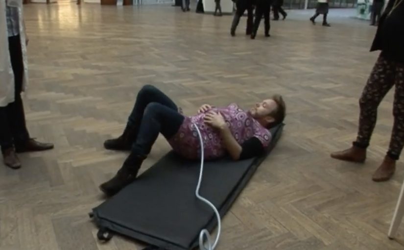
The experience is a countdown challenge. You step in, the clock starts, and you run a sequence of quick tasks designed to test speed, coordination, and composure. Finish within 70 seconds and you win.

This works because the timer turns a movie fantasy into visible stakes that both participants and bystanders can understand instantly.

In high-traffic transit hubs, timed challenges can turn waiting time into a shareable brand moment.

Why it lands: it makes the fantasy feel physical

Bond is not just a character. It is a posture: calm under pressure. The campaign translates that posture into something you can demonstrate with your body, in public, with a deadline.

Extractable takeaway: If your brand borrows meaning from a cultural icon, make the audience perform the meaning in a simple, timed ritual. A clock plus a visible finish line converts “cool story” into “I can do this”.

The station setting also does the work. People already have a reason to be there. The activation adds a burst of purpose to an otherwise idle moment, and the crowd reaction becomes part of the reward.

The business intent: earn attention that travels beyond the station

This is not a subtle idea. It is designed to be watched. Spectators gather, phones come out, and the experience becomes content. Even for people who do not play, the brand still wins a memorable association: Coke Zero equals fast, bold, and game-for-a-challenge.

The real question is whether you can turn borrowed cultural meaning into a public ritual people want to attempt and others want to watch.

What to steal from this timed station challenge

  • Start with a single rule: one sentence that explains how to win.
  • Use an obvious constraint: a countdown is the fastest way to create stakes.
  • Make it watchable: design for a crowd, not just the participant.
  • Reward participation, not perfection: the attempt should feel fun even if people fail.
  • Keep the prize culturally aligned: the reward should match the fantasy you are selling.

A few fast answers before you act

Why do timed challenges work so well in public spaces?

A timer creates instant stakes and makes the outcome easy to understand for both players and spectators. That clarity is what pulls a crowd in seconds.

What’s the core psychological hook in this activation?

It turns identity into action. You are not told to “feel like 007”. You are invited to prove it under pressure.

What should you measure for a stunt like this?

Footfall around the installation, participation rate, completion rate, average watch time for spectators, social shares per participant, and earned media pickup.

What’s the biggest execution risk?

Friction. If onboarding takes too long or rules are unclear, people will not step in. In transit environments, attention is short and drop-off is ruthless.

How do you adapt this idea without a movie tie-in?

Anchor the challenge to any role people want to inhabit: “be the expert”, “be the fastest”, “be the calm one”. Then translate that role into a simple timed sequence with a visible finish line.

Nutricia: Baby Connection

Nutricia: Baby Connection

Young parents all over Belgium rely on Nutricia babyfoods every day. To support mums even before their baby is born, Duval Guillaume helped Nutricia create Baby Connection, an iPhone app designed to get dads more involved in the pregnancy.

Baby Connection works best when you use it as a couple. There is a mum version and a dad version, and everything each parent adds is automatically synced with their partner’s phone. The app can even transform two iPhones into one big screen.

A couples app that turns involvement into habit

The mechanism is simple and deliberate. Split the experience into two roles, then keep both roles in lockstep through syncing. Add a playful physical trick, two phones acting like one screen, to make “doing this together” feel tangible, not just promised.

In Belgian consumer brand building, support tools land best when they reduce friction for both parents and make the dad’s role practical, not symbolic.

Why it lands

This works because it shifts the conversation from “be more involved” to “here is exactly how”. Shared inputs, shared visibility, shared moments. The app design quietly nudges the couple into repeated check-ins, which is where involvement stops being intention and becomes routine.

Extractable takeaway: If you want two people to share responsibility, design the product so both can contribute in small ways, see each other’s contributions instantly, and feel like a team without extra coordination effort.

Launching an app with an experience, not a banner

The real question is how to make shared participation feel real before the baby arrives, not how to advertise another pregnancy app.

To launch Baby Connection, Duval Guillaume backed the app with a campaign designed to be as distinctive as the product itself, and to pull the idea into public conversation beyond the app store listing.

The stronger move is to market the shared behaviour the product enables, not just the app itself.

What pregnancy-support brands can borrow

  • Design for the couple, not the individual. Two roles, one shared narrative.
  • Make syncing the default. Shared visibility is the involvement mechanic.
  • Add one physical “together” moment. A simple device interaction can signal partnership better than copy.
  • Launch the product idea, not only the product. If the behaviour change is the point, market the behaviour.

A few fast answers before you act

What is Nutricia Baby Connection?

A paired iPhone app for expectant couples, with separate mum and dad versions that sync pregnancy updates and activities between both phones.

What is the core mechanism?

Two-role design plus automatic syncing, so both parents can add and see information without manual coordination.

Why does the “two iPhones as one screen” idea matter?

It turns a digital feature into a physical couple moment, reinforcing that pregnancy planning is shared, not solo.

What is the business intent behind this kind of app?

To support and deepen trust with parents before birth, by providing a practical tool that keeps the brand present in daily routines.

What is the most reusable lesson here?

If you want involvement from a second person, make contribution easy, feedback immediate, and shared progress visible.

AXA: Mobile Service Home i-Mercial

AXA: Mobile Service Home i-Mercial

In 2010, AXA was the first insurance company in the market to launch an iPhone application for car insurance. In 2011, AXA took this one step further and developed an iPhone application for fire insurance.

“Mobile Service Home” is described as a first for the Belgian insurance market, so the product was launched with a method designed to feel just as inventive. AXA and ad agency Duval Guillaume Antwerp. Modem developed what they called an i-Mercial, a television spot for viewers to step into.

How the i-Mercial works

The mechanism is a second-screen bridge: the TV spot includes an on-screen code, and the viewer uses an iPhone to scan it. That scan unlocks an extended layer of the story on the phone, so you move from watching the house on TV to exploring what happened inside it on your own screen. Because the scan happens while the spot is still running, the viewer stays in the narrative and experiences the service logic instead of just hearing about it.

In European insurance markets, this kind of second-screen interactivity turns a passive TV spot into a hands-on service demonstration.

The real question is whether the second-screen bridge proves the service promise in the moment, not whether the format feels novel.

Why it lands

It makes “mobile service” tangible. If the promise is speed and guidance in stressful moments, an interactive format is a better proof than a claim.

Extractable takeaway: Interactive advertising works when the phone is used as a second screen to continue the story and demonstrate the service. The TV spot creates the prompt. The mobile interaction delivers the proof.

  • It gives the viewer control. The audience is not asked to remember a URL later. The action happens in the moment, and the phone becomes the interface for continuing the narrative.
  • It turns a CTA into an experience. Scanning is not a bolt-on gimmick. It is the creative idea, because it lets the viewer literally step into the ad.

Second-screen launch moves

  • Design the interaction to be immediate. If the action cannot happen in seconds, most viewers will drop.
  • Make the “next layer” worth it. The mobile extension should add narrative, clarity, or utility, not just extra footage.
  • Ensure the format matches the product. A mobile service is best launched through a mobile-driven interaction.

A few fast answers before you act

What is an “i-Mercial” in this case?

A TV commercial designed to continue on an iPhone, so the viewer can interact with the ad rather than only watch it.

How does the viewer “step into” the TV spot?

By scanning an on-screen code with an iPhone during the broadcast, which unlocks an extended experience on the phone.

Why is this a smart launch method for an insurance app?

Because it demonstrates mobile-guided service behavior immediately, instead of asking viewers to imagine how the app helps.

What is the main risk with this format?

Link rot. If the scan destination or app flow is no longer maintained, the core mechanic breaks and the campaign loses its point.

What is the most transferable lesson?

When you want people to believe a mobile service, make the first brand interaction mobile, interactive, and simple enough to complete in the moment.