McDonald’s Motobike Drive-Thru & Ice Coupons

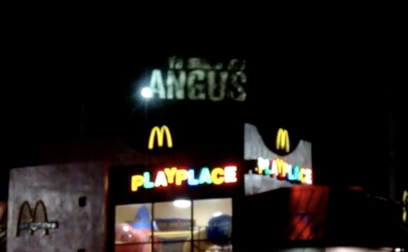
imlovinit24 in Ho Chi Minh City: Motobike Drive-Thru as a Gift

In March, McDonald’s launched imlovinit24. It was framed as “24 gifts in 24 cities in 24 hours”, designed to make the brand feel present in real life, not just in feed. McDonald’s reported more than 40,000 #imlovinit mentions during the activity, described as roughly 850 times the daily average. The push was described as trending globally on Facebook and Twitter, and as the first time McDonald’s reached the top ten worldwide conversation volume on Twitter.

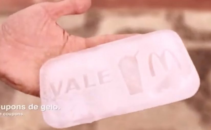
Rio’s “Melting” Ice Coupon: A Giveaway with a Timer

In the video, beachgoers in Rio de Janeiro get a surprise in the form of a slot machine. Press the button, get a chance to win a McDonald’s treat. To qualify, the participant completes a tiny social task, like taking a selfie or doing a quick dance. Winners receive a redeemable ice coupon that has to be rushed to the nearest McDonald’s before it melts. The reward is simple, but the countdown turns the giveaway into a story.

Where the shareability is engineered

Both activations run on the same engine. A clear action in public. A visible reward. A moment that finishes fast enough to feel impulsive. An activation is a time-bound experience designed to trigger participation and earned media. Because the instruction is self-explanatory and the payoff is immediate, people do it without needing persuasion, and bystanders can capture it without missing the punchline.

Extractable takeaway: If the action, reward, and ending are visible in one glance, people will participate without a pitch and record without a script.

The Rio mechanic adds two multipliers. Light social risk (selfie or dance) and time pressure (redeem before it melts). Because the challenge raises arousal and the timer makes the outcome feel scarce, the participant has a reason to perform now, and the observer has a reason to record now. That is the mechanism-to-virality bridge. It is the set of design choices that convert a simple mechanic into behavior people want to record and share.

The Ho Chi Minh City activation flips convenience into a “gift” that fits local mobility behavior. When the participation layer matches how people already move through the city, friction drops, completion rises, and the experience feels native rather than imported.

In global quick service restaurant marketing, the most effective experiential work turns a discount into a public moment that is easy to complete and obvious to film.

The real question is whether your activation creates a camera-ready moment people can finish in one breath and carry straight to a store.

What the brand intent looks like in practice

These are the kinds of activations worth doing when you need a giveaway to become a story that still pulls behavior toward stores.

Both ideas use a giveaway to buy more than reach. They create a short, filmable social proof moment that travels, while still pulling behavior toward stores. Rio hard-wires the visit via redemption. Ho Chi Minh City reframes drive-thru as a celebratory experience, which makes “convenience” feel like brand generosity instead of pure transaction.

Five moves to lift without copying the stunt

  • Make the mechanic legible in three seconds, without instructions, staff explanations, or signage paragraphs.
  • Keep participation frictionless. One button, one action, one outcome.
  • Make the reward feel earned through a tiny challenge, not a form, scan, or registration flow.
  • Use urgency only when it is visible and intuitive. “Melting” works because the timer needs no explanation.
  • Localize the participation layer, not the slogan. Build around real movement patterns, real places, and real habits.

A few fast answers before you act

Are these the same campaign?

No. They are two distinct McDonald’s activations tied to the broader #imlovinit idea, each with its own mechanic and film.

What is the core mechanic in Rio?

A slot-machine-style interaction plus a small social challenge, followed by a time-limited reward. The “melting” coupon forces immediate action and makes the moment worth filming.

What is the core mechanic in Ho Chi Minh City?

A motobike drive-thru activation framed as a “gift” inside the imlovinit24 concept of delivering 24 gifts in 24 cities in 24 hours.

What is the repeatable execution lesson across both?

Design a public moment with a self-explaining action, an immediate payoff, and a story that is obvious on camera without narration or context.

How do you adapt this without copying McDonald’s?

Keep the structure, not the props. Use one obvious public action, one immediate reward, and one reason to act now. Then fit the participation layer to how people already move through the place you are targeting.

Wimpy: Braille Burgers

Wimpy wanted to let visually impaired people know that it offered braille menus in all of its restaurants. Instead of announcing it with a poster, it turned the message into the product itself.

With the help of skilled chefs, sesame seeds were meticulously placed on burger buns so the seeds formed a braille message. The bun becomes a tactile line of communication. You do not have to ask. You can read it with your fingertips.

A message built for the audience

This is a campaign that respects the medium. If the audience reads through touch, the communication should be touchable. The craft is the point. Someone had to care enough to place every seed, because that effort signals the same care the brand claims to have for accessibility.

It is also a quiet reversal of how “accessibility features” often get communicated. Normally, the burden is on the customer to ask for the braille menu. Here, the brand leads with the fact that it is already available.

In mass-market food and retail brands, inclusive design travels fastest when people can discover it in the experience itself rather than having to request it.

The real question is whether accessibility is discoverable by default, or only available to people who already know to ask for it.

Brands should make accessibility features self-revealing inside the product experience, not tucked behind a request.

Why it lands

This works because the message arrives through touch in the moment of use, which removes the “ask” step and makes the accessibility promise instantly usable.

Extractable takeaway: Inclusion marketing lands when the communication channel matches the audience’s access mode. Here, the message is readable by touch at the exact moment of consumption, so the customer discovers the braille-menu promise without needing to ask.

It is specific, not generic. The idea is built around one concrete barrier, then removes it in a way that feels native to the category.

It creates earned attention without begging for it. The story spreads because it is surprising and easily retold. A burger bun you can read is instantly legible as a headline.

It avoids “awareness theater”. By “awareness theater,” I mean symbolic inclusion messaging without a usable change for the customer. The message is not “we support inclusion” in abstract terms. It is “here is the inclusive thing, already made real”.

How to make accessibility discoverable

  • Match the channel to the audience. If your audience cannot access the default channel, redesign the channel. Do not just add copy.
  • Let the product do the talking. The most credible claims show up as a behavior, feature, or ritual inside the experience.
  • Make the proof tactile or visible. When a customer can feel the difference, you do not need to over-explain it.
  • Use craft as a credibility signal. The effort in execution communicates intent more strongly than any tagline.

A few fast answers before you act

What was Wimpy trying to communicate?

That braille menus were available across its restaurants, and that visually impaired customers were welcome without extra friction.

How did the “braille burgers” actually work?

Sesame seeds were placed on the bun in braille patterns that could be read by touch. The braille spelled out a short message or burger description.

Why is this more effective than a standard ad?

Because the audience can directly access the message. It does not depend on sight, and it does not depend on asking staff for information.

What is the business intent behind an inclusion idea like this?

To increase awareness and usage of an accessibility feature, strengthen brand warmth, and reduce the “I did not know you had that” barrier that stops people from choosing the brand.

What is the most transferable lesson?

Build the message in the same mode your audience uses. When the communication format is accessible by design, the campaign becomes self-validating.

McDonald’s Angus Burger: Grill Smoke

When the medium is literally the product moment

A great ambient strategy by Leo Burnett Puerto Rico to launch the Angus Burger for McDonald’s.

The mechanic: “smokvertising” in one move

Here, “smokvertising” means using real grill smoke as the placement. As smoke rises, imagery and copy are projected onto it, so the message appears to live inside the smell and heat of cooking rather than on a static board.

In high-frequency food and beverage categories, ambient work performs best when it hijacks a real-world byproduct of consumption and turns it into a media surface.

Why it lands

This is attention without shouting. People notice it because it behaves unlike advertising, then the sensory context does the rest. Smoke is already a cue for freshness and grilling, so the brand gets meaning “for free” before a single word is read. It also creates a built-in crowd moment: smoke draws eyes, the projection rewards the look, and the whole thing becomes naturally filmable.

Extractable takeaway: If you want a product to feel immediate, put the message inside an existing sensory cue people already associate with the product, then keep the copy minimal and let the environment do the persuasion.

What the brand is really buying

This is not only awareness. It is salience. The work aims to anchor “Angus Burger” to the visceral trigger of grilling, so the next time someone sees smoke, they are primed to think of the product.

The real question is how to bind appetite cues and brand memory in the same instant.

What food brands can borrow from this

  • Start from a native signal. Find the byproduct or ritual your category already owns (smoke, steam, heat, condensation) and treat it as media.
  • Make the trick readable instantly. Ambient placements succeed when the viewer understands the rule in under a second.
  • Keep the craft on-message. The “wow” should reinforce the appetite cue, not distract from it.
  • Design for phones. If it films cleanly, it travels without needing paid amplification.

A few fast answers before you act

What is McDonald’s “Grill Smoke” activation?

It is an ambient out-of-home concept where grill smoke becomes the “screen” and brand visuals are projected onto it to promote the Angus Burger.

What is the core creative mechanic?

Use a real, moving, sensory element (smoke) as the media surface, then overlay a simple projected message that only exists while the smoke exists.

Why does this beat a normal billboard for a food launch?

Because it collapses message and appetite cue into the same moment. The medium already signals “fresh off the grill,” which makes the product claim feel more believable.

What’s the transferable lesson for other brands?

When you can borrow a natural environmental cue, embed your message into it instead of placing your message next to it.

What is the main risk of copying this approach?

If the effect is hard to see quickly, or if the sensory cue does not match the product promise, the execution becomes a gimmick rather than a brand reinforcement.