Lupine: The Brightest Online Ad

A magazine you can only read in the dark

Publicis Germany created a cross-promotion for Lupine’s bike lighting system with BIKE Online Magazine that turns product use into the gatekeeper of content.

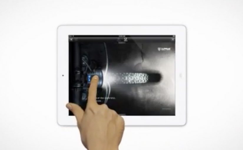
Subscribers could only read the magazine if they switched on a Lupine bike lamp. That simple constraint forces 100% attention onto the lamp because it is literally the way into the content. When readers shared the idea on social networks, their post distributed a link to a sneak preview where the lamp “illuminated” only a small part of the magazine. To read the full issue, users were prompted to order a trial subscription.

Click here to watch the video on the AdsSpot website.

The mechanic that makes it work

This is a clean attention trade. You get the content, but only if you demonstrate the product’s purpose in the moment you want to consume it. The campaign combines a physical trigger (the lamp) with a digital reward (magazine access), then uses sharing to distribute a constrained teaser that naturally pushes people toward the trial subscription step.

In enthusiast categories, tying media access to product behavior is a reliable way to turn curiosity into a demonstration people complete without being asked twice.

Why it lands

It does not ask you to “notice” a product. It makes the product the condition for progress. That flips advertising from interruption to utility, and it also reframes the lamp from a spec-sheet item into a felt experience: bright enough to read, controllable enough to focus, and instantly associated with the moment cyclists actually need light.

Extractable takeaway: When a product’s value is experiential, build a rule that forces the audience to experience it in context, then let sharing distribute a teaser that proves the rule rather than describing it.

What Lupine is buying with the stunt

The immediate goal is obvious: attention and trial subscriptions. The deeper goal is mental availability. The real question is how to make product use inseparable from the value people already want. Once “light equals access” is planted, the lamp is no longer a commodity accessory. It becomes the enabler of something people already value, and that is a stronger buying cue than another brightness claim.

The execution is also the kind of idea awards juries like because the medium and the message are welded together. It is listed with awards recognition including Cannes Lions Mobile Lions Bronze (2013) and The One Show Interactive Merit (2014).

What to borrow from Lupine’s access rule

  • Make the product the permission slip. If you can gate a valued experience with the product’s real function, you remove the need for persuasion copy.
  • Ship a “teaser mode” for sharing. Constrain the preview so it demonstrates the idea, then let curiosity do the rest.
  • Pick a partner with built-in habit. BIKE readers already have a reason to open the magazine. Your job is to attach your product to that routine.
  • Keep the conversion step aligned. Trial subscription is consistent with “try it to unlock it.” Anything more complex would break the spell.

A few fast answers before you act

What is “The Brightest Online Ad” for Lupine?

It is a cross-promotion with BIKE Online Magazine where the magazine is only readable when a Lupine bike lamp is switched on, turning product use into the mechanism for accessing content.

Why does “lamp-gated reading” create 100% attention?

Because the lamp is not adjacent to the content. It is the condition for seeing it. The user must interact with the product to continue.

What role does social sharing play in the concept?

Sharing distributes a constrained preview that demonstrates the idea while withholding the full experience, which naturally pushes interested people toward the trial subscription prompt.

What’s the transferable principle for other brands?

When your product’s value is best understood through use, make it the enabler of something the audience already wants, and let the enabling action become the message.

What would be the common failure mode of copying this?

Gating something people do not care about, or adding friction that feels punitive. The gate must feel like a fair trade, not a trap.

Interactive iPad ads: five touch-first patterns

New research from the IAB has shown that when it comes to advertising on tablets, interactivity is the key. And once you look at what the best iPad units are doing, that conclusion makes intuitive sense.

Take Microsoft’s iAd for Windows Azure. Instead of explaining “code in the cloud,” it lets you touch and change code inside the ad, and the layout responds. That is the core pattern for tablet advertising. Don’t describe the value. Let the reader experience it in seconds.

On tablets, display works best when the ad behaves like a small piece of product UI rather than a static interruption.

The IAB point, translated into creative

If your audience is holding a touchscreen, your ad has an extra superpower. Touch-first is the creative posture where the first meaningful thing the unit asks for is a gesture, and the response delivers the point. Drag, swipe, tap, reveal, simulate. The objective is not “more features.” It is to earn attention by giving the user a simple action and an immediate payoff. Because the payoff is immediate, the value lands without needing a paragraph of claims.

Extractable takeaway: On tablets, design the first gesture so it proves one promise immediately, then let everything else be optional.

In tablet-heavy retail and media environments, the strongest units turn touch into a tiny product moment that pays off in seconds.

The real question is whether your tablet creative proves the promise through a single gesture, or just says it in copy.

Interactivity should be the default assumption for tablet display, not a bonus layer.

Five iPad ad interactions worth stealing

White Collar

As a simple use of touchscreen behaviour, users solve a puzzle by dragging an icon across the screen to locate answers to questions displayed in the banner. It’s lightweight, but it turns a passive placement into an active moment.

Volkswagen Park Assist

To experience the Volkswagen Tiguan’s Park Assist, users touch two targets on the screen. The car then reverses and parks itself between those targets. A feature demo becomes a two-tap “proof” moment.

Visa Signature

Built in HTML5, the ad presents a virtual wallet that lets users browse and plan a holiday, buy theatre or cinema tickets, or reserve a hotel. It behaves like a mini service experience rather than an ad.

Toyota

Using the slogan “Filled with People,” the ad lets users drag a slider to watch an unfinished Toyota move through the factory floor while it is assembled. The interaction makes the narrative feel earned, not narrated.

Microsoft

Microsoft wanted developers to understand that Windows Azure allows code to be created in the cloud. So they built an iAd that lets readers alter its code, which in turn changes the layout. It’s a direct translation of message into mechanism.

What these examples have in common

  • One obvious gesture. Drag, tap, swipe. No tutorial needed.
  • Fast payoff. The response is immediate, so the user feels in control.
  • Feature-as-experience. Parking, planning, building, assembling. The “meaning” is in the interaction.
  • Tablet-native pacing. These units assume longer attention than mobile banners and reward it.

Touch-first moves to reuse in your next tablet ad

  • Make the first interaction the headline. The opening instruction should be one short verb. “Drag.” “Tap.” “Swipe.”
  • Use interactivity to prove one point. Pick one promise and build one satisfying micro-demo around it.
  • Design for fat-finger reality. Targets must be generous. Feedback must be unmistakable.
  • Keep exits graceful. If someone watches but doesn’t interact, the unit should still communicate the core idea.

A few fast answers before you act

Why does interactivity matter more on tablets than on desktop banners?

Because touch is the native input. When an ad uses the same gestures as the device, it feels more like content and less like a bolt-on placement.

What’s the simplest “interactive” pattern that still works?

A single drag or tap that reveals something meaningful. A before/after, a quick feature demo, or a short guided reveal with instant feedback.

What’s the most common way interactive tablet ads fail?

Too much complexity. Multiple steps, unclear targets, or slow loading kills the moment before the user gets a reward.

Do interactive ads always beat static ads?

No. Interactivity helps when it makes the message easier to understand or more satisfying to experience. If it’s interaction for its own sake, it becomes friction.

How do you decide whether a tablet idea should be a “mini app” like Visa’s example?

Only do it when the brand’s value is in navigation and choice. If you need users to explore options, then a mini UI can be the product story. Otherwise, a single micro-demo is usually stronger.

Bradesco Seguros: The Fake iPad Ad

A fake ad that behaves like a real crash

Bradesco Seguros created a cheeky ad in the iPad version of Quatro Rodas, a Brazilian car magazine. When readers swipe the “page,” the car in the ad follows the direction of the gesture and crashes into the side of the screen, unveiling the message: “Unexpected events happen without warning. Make an insurance plan.”

The mechanic: one native gesture, one irreversible consequence

The entire idea is built on the most common tablet behavior: swiping to move on. Instead of letting the user escape the ad, the ad “obeys” the swipe and turns it into the cause of an accident. The crash is the reveal. It is also the proof that the format is touch-native, not a print layout copied onto glass. Here, touch-native means the idea only works because the swipe directly causes the outcome on the screen.

In touch-first publishing, a single gesture-driven interaction can turn an ad into a micro-experience that earns attention the way content does.

Why it lands

It creates a moment of surprise without requiring explanation. The user thinks they are performing a routine action, then the ad responds in a way that feels physical and slightly alarming. Because the message is revealed by the crash itself, the brand does not need to overclaim. The interaction makes the point. The real question is whether the gesture itself makes the risk message feel immediate, inevitable, and brand-relevant. This is a strong use of tablet media because the interaction and the message are inseparable.

Extractable takeaway: If your message is about risk or unpredictability, make the audience cause a small, safe “unexpected event” through a familiar action, then reveal the message as the consequence.

What touch-first ad teams should steal

  • Exploit a default gesture. Build on what people already do, not what you wish they would do.
  • Make the payoff immediate. The interaction must resolve within a second or two, or it feels like a gimmick.
  • Let the mechanic carry the copy. If the interaction proves the point, the line can stay simple and memorable.
  • Keep it brand-safe. Use surprise, not fear. The crash is symbolic, not distressing.

A few fast answers before you act

What is Bradesco Seguros’ “Fake Ad” in Quatro Rodas?

It is an interactive iPad magazine ad where a swiping gesture makes the car in the ad move and crash into the screen, revealing the insurance message about unexpected events.

What is the core creative mechanic?

Gesture mirroring. The ad responds to the swipe like content would, then turns that response into a surprising consequence that delivers the message.

Why is this better than a standard banner or full-page ad?

It uses the tablet’s native behavior, so the attention is earned through interaction, not demanded through interruption.

What is the key lesson for touch-first advertising?

Design around one familiar gesture and make the output feel inevitable and meaningful, not decorative.

What is the most common way this approach fails?

When the interaction is slow, unclear, or unrelated to the message. The mechanic must be the argument.