MINI: The Thrill Bench

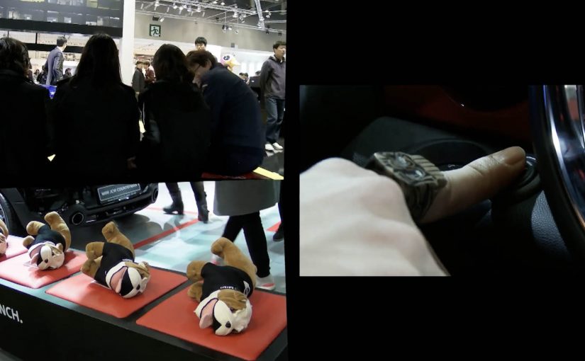
During the Geneva Motor Show 2012, MINI found a novel way to get people talking about the MINI Countryman. A special vibrating bench was installed on the street. Every time someone sat down, a MINI would sneak up from behind and rev its engine. The bench would then vibrate and capture some great reactions.

A bench that turns engine power into a punchline

The mechanism is beautifully low-tech. The car is the soundtrack, and the bench is the amplifier. The moment a passer-by becomes the participant, the installation delivers a sudden physical sensation that is impossible to ignore and hard not to laugh at.

In event-adjacent street activations, the fastest route to earned attention is a one-step setup with an instantly readable payoff.

The real question is whether you can turn a brand cue into a physical joke in under one second.

Why it lands

This works because it creates a clean before-and-after. Calm street moment. Sit down. Surprise rev. The body reacts before the brain explains. That involuntary reaction is the content. It is also brand-consistent. A MINI launch does not need to lecture about features when it can dramatise “fun” through a simple interaction.

Extractable takeaway: If you want people to share, design for an automatic reaction and make the trigger obvious. The best “reaction marketing” needs no explanation and no rehearsal. Here, “reaction marketing” means engineering an immediate, involuntary response that becomes the content.

What MINI is really buying with a vibrating bench

The goal is talkability at the edges of the show, outside the exhibition hall where not everyone will see the product stand. The bench turns the city into a distribution channel, and it gives the model a personality. Playful. Slightly mischievous. Confident enough to sneak up on you. This is a stronger use of attention than explaining “fun” in copy.

Steal the one-step reaction loop

  • Use a familiar object. A bench is self-explanatory, which removes instruction friction.
  • Make the trigger binary. Sit down. Experience the effect. No steps in between.
  • Keep the payoff physical. Tactile moments are more memorable than visuals alone in busy streets.
  • Design for the crowd. The bystanders are the multiplier. They laugh, film, and recruit the next sitter.
  • Protect safety and consent. Surprises should startle, not scare. Calibrate intensity and timing.

A few fast answers before you act

What is the Thrill Bench in one sentence?

It is a street installation where sitting on a bench triggers a nearby MINI to rev, making the bench vibrate and creating a shareable surprise reaction.

Why does this work during an auto show?

It reaches people beyond the show floor and turns the city into a stage, generating attention and social sharing without buying additional media.

What makes this “reaction marketing” effective?

The reaction is genuine and immediate. Viewers trust real behaviour more than scripted claims, and the format is easy to film and share.

What is the biggest execution risk?

Intensity. If the vibration feels aggressive or unsafe, the moment flips from fun to discomfort and sentiment turns negative.

What should you measure in a similar activation?

Participation rate, bystander clustering, video shares, sentiment, and whether the stunt lifts search, dealership queries, or event footfall in the same period.

Obermutten: A Little Village Goes Global

Obermutten is a little mountain village in the Canton of Graubünden, Switzerland. It has around seventy eight residents and is known to virtually no one except a few hikers passing through now and then.

Now, millions of people around the world have reportedly either read about or heard of Obermutten, after Jung von Matt/Limmat created a simple Facebook campaign for Graubünden Tourism that put this small village on the world map. Media reports have reportedly appeared across many countries, including mentions on mainstream TV news in South Korea.

How? It began with a newly created village Facebook page where the local mayor made a remarkable promise via video: click “Like,” and your profile picture will be posted on the commune’s official notice board. In no time, the board was completely covered with fans. To deal with the flood of likes, they reportedly started hanging profile pictures on barn walls in the village. The community has reportedly grown to over 14,000 fans.

A promise that turns a “Like” into a physical souvenir

The mechanism is a simple exchange with a visible payoff. A tiny action online triggers a tangible reward offline. Your profile picture is printed and displayed publicly, which makes the relationship feel real, not symbolic. Each new photo also becomes proof for the next person considering whether to join.

In destination marketing for small places, visible social proof, meaning a growing wall of real faces that proves the promise is being kept, and low-friction participation can outperform paid reach when the reward is concrete and inherently shareable.

The real question is how a tiny place turns a one-click action into public belonging people want to share.

Why it lands

This works because it replaces abstract engagement with a human gesture. You are not “following a page.” You are being welcomed by a real village and given a public spot on a real wall. That emotional upgrade is what converts a novelty into a story, and a story into press and sharing. This is a smarter tourism idea than a bigger media buy because the participation itself becomes the attraction.

Extractable takeaway: When you turn a digital action into a physical, publicly visible reward, participation becomes contagious. People join to see themselves included, and the growing display becomes the marketing.

What destination marketers should steal from Obermutten

  • Make the reward tangible: if the payoff can be photographed, it spreads without asking.
  • Keep the promise binary: one action, one guaranteed outcome, no fine print in the core idea.
  • Design for accumulation: the “wall filling up” is the compounding asset that makes the story stronger over time.
  • Use a human voice: a mayor speaking is more believable than a brand slogan.
  • Let the proof do the persuasion: the growing number of displayed faces sells the idea better than any ad copy.

A few fast answers before you act

What did Obermutten do on Facebook?

They invited people to like the village Facebook page, with the promise that each fan’s profile picture would be printed and posted on the village’s official notice board, and later on barn walls as the number grew.

Why did this become global news?

The idea is easy to explain and easy to visualize. A tiny village publicly “welcoming” thousands of strangers creates an inherently newsworthy contrast, and it produces strong images for media coverage.

What is the core mechanic marketers can reuse?

Convert a low-friction digital action into a tangible, visible reward that accumulates over time. The accumulation becomes both proof and content.

Is this a tourism campaign or a social media campaign?

Both. It uses a social platform to generate participation, then translates that participation into offline visibility that functions like a tourism invitation and a PR engine.

What is the biggest risk with this approach?

If the reward is not genuinely delivered, the story collapses. The format depends on the promise being kept consistently, and on the physical display being maintained with care.

MINI: The Art of Omission Posters

A “MINI” has only the things it really needs. That means getting rid of the superfluous and keeping an eye on the essentials. MINI calls this “Minimalism”.

So Draftfcb/Lowe Group in Zürich creates a poster series across Switzerland that demonstrates the MINI art of omission in an intentionally simple way. Here, “art of omission” means the idea is carried by what you remove, not what you add. Reportedly, more than 20 executions appear in the wild, framed as genuine, unique works of art rather than disposable tactical print.

Minimalism as a communication system, not a slogan

The mechanism is straightforward: take the brand’s “minimum necessary” philosophy and express it through omission, letting what is missing do as much work as what is shown.

In European automotive advertising, stripping a message down to a single visual point is often the fastest way to win attention in cluttered public spaces.

Why omission cuts through

Most posters fight for attention by adding. More copy. More product shots. More badges. Omission flips that logic. The real question is whether your idea is strong enough to survive subtraction. If simplicity is part of the product truth, omission beats piling on claims. The viewer has to resolve the idea themselves, and that small moment of mental completion makes the message stick.

Extractable takeaway: If the audience can reconstruct the meaning from what you remove, the idea is strong. If they need you to explain it, you are not done simplifying.

What the street placement adds

Putting the work across Switzerland turns “Minimalism” into a repeated encounter, not a one-off reveal. Repetition is the multiplier here, because every new variation reinforces the same discipline: remove anything that does not earn its place.

How to apply omission in your next poster

  • Use subtraction as the creative device. If you cannot remove an element without losing the point, it is probably essential.
  • Let the format carry the proof. A minimalist brand idea is more believable when the execution is minimalist too.
  • Design for one-second comprehension. The fastest posters are the ones that do not ask for reading.
  • Build a series, not a single hero. Variations teach the audience the “rule” of the campaign.

A few fast answers before you act

What is this MINI “Minimalism” poster idea in one line?

A Swiss poster series that communicates MINI’s “keep only what you need” philosophy by using omission as the main creative device.

Why does omission work better than adding more message?

Because it interrupts expectations in public space and forces a quick mental “solve”, which increases recall.

What makes this feel clutter-breaking?

The work reduces visual noise instead of competing with it, so the absence becomes the attention trigger.

When should a brand use this pattern?

When the brand truth can be expressed as one visual point, and when simplicity is a credible part of the product story.

How do you decide what to remove without losing meaning?

Strip the execution until the message breaks, then add back only the one element that restores the point. If you need multiple add-backs, the idea is not single-point yet.