Skittles: Telekinize the Rainbow

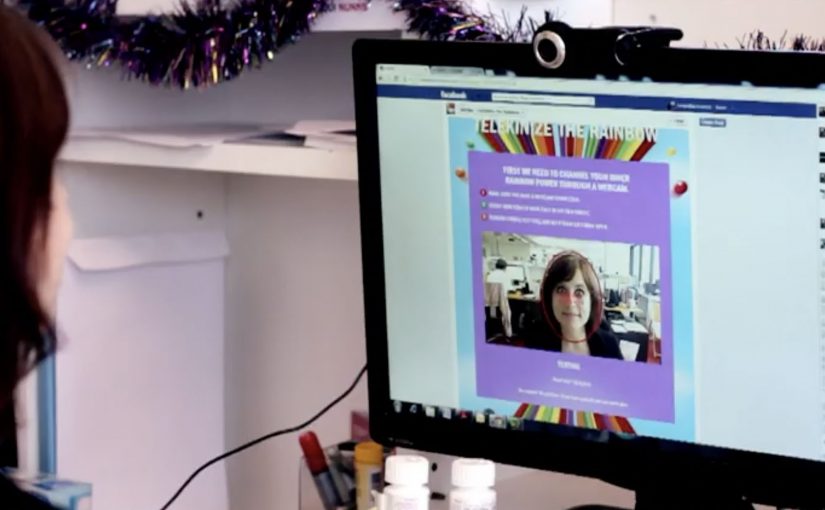
You look at a single Skittle on a white surface, and it starts to move. The moment plays like telekinesis, the illusion that your mind can move an object. It is not a visual trick on a screen. It is a live feed of real Skittles being nudged around in the real world.

Skittles Australia and Clemenger BBDO build this as a Facebook experience because, as the case frames it, only a small minority of fans engage with a brand’s page after liking it. The goal is to make “like” feel like a superpower, not a dead end.

The trick is not mind control. It is eye control

The mechanism is webcam tracking plus a physical rig. Your eye movements, captured via webcam, are translated into commands sent to Wi-Fi-controlled robots attached to Skittles, so the candy moves in response to where you look.

In global consumer brands on social platforms, “engagement” only scales when interaction feels immediate and personal.

The real question is whether your activation turns a passive like into an active loop in under ten seconds.

In social platforms, turning passive likes into active participation usually comes down to one thing. Give people an interaction loop that feels immediate, personal, and worth showing to someone else.

Why it lands

It creates a clean “I need to try this” reaction in seconds. The live camera feed removes skepticism, and the physical motion makes the experience feel bigger than a typical Facebook app. It also bakes in a share-worthy narrative: the fan is not consuming content. The fan is controlling a real object.

Extractable takeaway: If you want engagement rather than reach, stop asking for attention and start granting control. A tiny moment of viewer control, tied to a brand asset, can outperform bigger content drops because the audience feels like the protagonist.

Campaign write-ups report that users spent an average of around four minutes interacting with the experience, and that page growth and app ranking spiked during the run.

What to steal for your next social activation

  • Make the mechanic visible. Live proof beats claims. If the audience can see it is real, they trust it faster.
  • Turn the brand into the interface. Here the “UI” is literally the product. That keeps the experience on-brand without extra messaging.
  • Design for one-person amazement and second-person sharing. The first user is impressed. The second user wants to replicate it.
  • Keep the loop short. Look. Move. React. Repeat. The faster the feedback, the longer people stay.

A few fast answers before you act

What is Telekinize the Rainbow?

A Facebook experience that lets people move real Skittles through eye movements captured by a webcam, with the motion executed by Wi-Fi-controlled robotics.

Is it actually mind control?

No. The “telekinesis” framing is the story. The control signal is eye movement, translated by software into physical movement.

Why is the live webcam feed important?

It proves the effect is happening in real space, which makes the experience feel more magical and more credible than a purely on-screen interaction.

Do you need eye tracking to borrow the pattern?

No. The transferable pattern is a tight input-to-output loop where the audience action clearly changes what they see, fast enough to feel like “power,” not a UI.

What is the main risk in copying this approach?

If setup friction is high or latency is noticeable, the illusion collapses. Experiences built on “power” need instant response to feel real.

Volkswagen: Rock in Rio Drumset

A banner ad you can actually “play”

To celebrate Rock in Rio, Volkswagen built a banner execution that uses your webcam as the input device. Instead of asking you to watch, it invites you to perform, like a tiny drum solo inside a media placement.

How the mechanism earns attention

The core mechanic is simple: webcam permission turns a standard banner into an interactive surface, where your movement becomes the “controller” for the drum kit. That shifts the experience from passive exposure to active participation in a few seconds. Because the unit reacts to a single, instantly legible gesture, it earns attention before the viewer has time to move on.

In brand-led entertainment marketing, the smallest possible interaction can turn a paid unit into something people choose to engage with.

Why it lands in a festival context

Rock in Rio is already about energy, performance, and communal hype. A drum kit inside a banner borrows that emotional language and makes it personal. You are not being shown “festival vibes”. You are generating them, even if it’s just for a moment at your desk.

Extractable takeaway: When a paid unit lets people create a recognizable mini-performance in one step, the creative feels like entertainment, not media.

The payoff is not the complexity. It’s the contrast: banners normally ask for a click, this one asks for a gesture. That little shift makes the format feel fresh again.

The real question is whether your paid placement gives people something to do, not just something to click.

This is the right kind of interactivity for display: opt-in, one-step, and instantly legible.

Takeaways for webcam-controlled banners

  • Use one input. A single action users already understand (movement, tap, swipe) beats multi-step instructions.
  • Make the first five seconds obvious. If the user can’t “get it” instantly, they drop. Here, the drum metaphor does the teaching.
  • Match the interaction to the moment. Music festival content should feel performative. The interaction mirrors the cultural context.
  • Keep the reward emotional. The win is “I played it”, not “I learned a feature list”.

A few fast answers before you act

What is a webcam-controlled banner ad?

It’s a display ad unit that asks for webcam access and uses the camera feed as a live input, usually via motion detection, to let the viewer interact with the creative.

Why use a webcam in a banner at all?

Because it turns a standard media placement into an experience. That can increase attention and memorability when the interaction is instantly understandable.

What makes this Rock in Rio execution work?

The interaction fits the occasion. A drum kit is a native “festival” object, and the gesture-based control makes the format feel playful instead of intrusive.

What’s the main risk with webcam-based ads?

Friction and trust. If the value isn’t obvious, users will refuse permissions or bounce. The creative must communicate intent and payoff immediately.

What’s the simplest modern takeaway?

Give the audience a one-step action that creates a visible result. If the interaction is clear and rewarding, the format becomes the message.

Nissan: Create Your Terrain

You hold your hands up to the webcam, and the landscape changes. Peaks rise, valleys drop, and a Nissan SUV gets challenged to drive across whatever terrain you just “sculpted” in mid-air. It takes an off-roading mindset and translates it into a simple piece of viewer control. Here, viewer control means your gestures directly shape the terrain in real time. Build a route. See if the car can handle it.

That is the core idea behind Nissan’s “Create Your Terrain,” built by TBWA\RAAD to help launch Nissan’s SUV family in the Middle East. Instead of showing capability with another glossy montage, it invites off-roaders to invent the terrain first, then watch the vehicle conquer it.

Create Your Terrain uses webcam detection as the input method. In plain terms, the camera reads your gestures and turns them into a terrain editor, so you can shape dunes and obstacles without a mouse or controller.

In automotive marketing, the strongest digital launches turn enthusiast culture into an interaction loop, not a viewing moment.

The microsite (www.createyourterrain.com) was reported to have attracted thousands of user-made terrains, adding up to more than 80,000 square kilometres of created landscape. The build is also credited with recognition at Dubai Lynx 2011 (Bronze, Microsites & Websites) and a GEMAS Effies 2011 finalist placement (Automotive), which fits the ambition. Make the product story feel earned through play, not told through claims.

Why this mechanic fits off-roading

Off-roading is personal. Everyone has their own “perfect line,” their own idea of what counts as a challenge, and their own pride in tackling terrain others avoid. This activation borrows that psychology. The viewer creates the course, so the payoff feels like their test. Nissan just shows up to pass it.

Extractable takeaway: When you let enthusiasts define the test, the brand’s proof point feels like a response to their standards, not a claim the brand asks them to accept.

What Nissan is really buying with “Create Your Terrain”

This is not only a tech demo. The real question is whether your mechanic makes the capability story feel earned, not asserted. It is a positioning move. The message is that Nissan’s SUVs can handle anything, including terrain you have never seen before. And because the experience is interactive, it naturally increases dwell time, encourages sharing, and gives people a reason to return and try a “harder” build.

What to borrow for your own interactive launch

  • Let the audience create the challenge. Self-made tests feel more authentic than brand-made obstacles.
  • Use input that matches the story. Gestures and a webcam make “hands-on terrain” feel physical, not like another web game.
  • Keep the loop tight. Create. Challenge. Watch. Repeat. The shortest loop is the one people replay.
  • Design for bragging rights. The shareable unit is not the ad. It is “my terrain” and “my result.”

A few fast answers before you act

What is “Create Your Terrain” in one sentence?

It is an interactive Nissan microsite where webcam-based gestures let viewers build a digital off-road landscape and then challenge a Nissan SUV to drive across it.

Why does viewer-created terrain matter?

Because it flips the usual launch pattern. Instead of the brand defining the challenge, the audience defines it. That increases personal investment and makes the capability story feel more credible.

What does “webcam detection” mean here?

It means the experience uses the camera feed to interpret basic gestures as inputs, turning the viewer’s hands into a simple controller for shaping the terrain.

What is the key takeaway for digital campaign design?

Build an interaction loop that mirrors real-world behaviour. When the mechanic matches the passion, like building and conquering terrain here, people stay longer, replay more, and share more naturally.

What is a common failure mode for experiences like this?

Overcomplicating the first minute. If setup is fiddly, calibration is fragile, or the payoff is slow, people bounce before the “magic” lands.