3D holograms are a great way to attract and engage consumers. Here, “3D holograms” refers to hologram-style displays that use animation to create a depth illusion in a physical setting. They can be quite effective if your brand is having trouble getting noticed or if your product’s capabilities can best be described using images and animation.
Though brands find it daunting to venture into this, there are still some brands out there bold enough to try it. Here are some nice examples.
Why holograms can cut through
The strength of a hologram-style display is that it behaves like moving product theater. Because it behaves like moving product theater, it can stop people mid-walk, and it can compress a lot of “show, do not tell” explanation into a few seconds. In retail aisles and brand events, it competes against the surrounding noise, not against other media placements.
Extractable takeaway: Use depth and motion only when they reduce explanation time or make the core action instantly legible. If depth is not doing work, you are paying for novelty.
The real question is whether motion plus depth makes the story easier to grasp than a flat screen or static print. When the answer is yes, the format can earn attention fast.
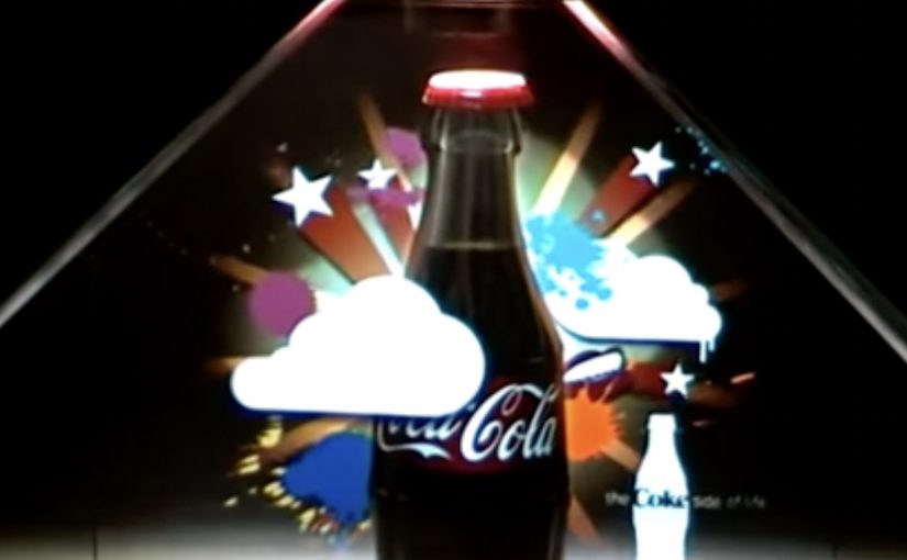
Coca Cola In-Store Display
This example shows how a hologram-style display can work as an in-store attention magnet. The content is pure visual storytelling, which makes it easy to understand at a glance and easy to remember later.
Samsung Jet Launch
At launches, holograms can do a different job. They help dramatize product capability and create a sense of spectacle that standard stage content often struggles to match. That spectacle then becomes a shareable proof that something “big” happened.
What to steal if you are considering holograms
- Pick one message that benefits from depth. If depth is not doing work, you are paying for novelty.
- Design for walk-by comprehension. People should get it in under three seconds.
- Keep the loop tight. Short, repeatable sequences beat long narratives in retail and event contexts.
- Make the hero action visible. If the product feature is the star, animate that feature, not abstract brand graphics.
A few fast answers before you act
When do 3D hologram displays make sense for marketing?
When you need fast attention in a physical space, or when animation plus perceived depth explains the product better than flat media.
What is the main advantage over a normal screen?
Presence. The illusion of depth makes the content feel more like an object in the space, which can increase stop power and recall.
What is the biggest execution risk?
Paying for the format without a story that needs it. If the creative is not designed around depth and motion, the result feels like expensive wallpaper.
How should success be measured?
Dwell time, footfall impact near the unit, assisted recall, and any downstream action that matters to your context, like store inquiry, trial, or social amplification.
What is a practical way to keep cost under control?
Start with one hero unit and a short content loop, then scale only if you can prove incremental attention and understanding versus simpler formats.